
Build a Style Guide Straight from Sass. Easily manage projects with monday.com Last fall, our dev team wanted to get started with style guides.
We had added a new member to the team, and as he was getting up to speed, we realized how lacking our project documentation was. If you've ever been a new developer on a team with weak documentation, you know how confusing it can be to try to familiarize yourself with a dozen projects without documentation. In deciding on a style guide method, we came up with two main requirements: Low FrictionThe style guide should be easy to find, easy to read, and easy to maintain. #The Basics of Node-KSS To achieve our goals of a platform agnostic, low-friction style guide, we landed on kss-node, which is itself a Node.js implementation of Knyle Style Sheets (KSS), a Ruby library that: ... provides a methodology for writing maintainable, documented CSS within a team. The basic principle is that your style guide is generated via comments you create in your CSS, SCSS, Sass, LESS, etc. Let's get started! Adam Lynch. CSS Reference.
Building Production-Ready CSS Grid Layouts Today. Advertisement Today, too many websites are still inaccessible.
In our new book Inclusive Design Patterns, we explore how to craft flexible front-end design patterns and make future-proof and accessible interfaces without extra effort. Hardcover, 312 pages. Get the book now! Industries often experience evolution less as slow and steady progress than as revolutionary shifts in modality that change best practices and methodologies seemingly overnight. Today, we are in the early stages of such a revolutionary shift, brought about by CSS Grid1 Layout. Progressively Enhancing CSS Layout Link Can we use CSS Grid already, and what about IE9? Much has already been said about the technical aspects of CSS grid and its one-dimensional cousin flexbox by people smarter than me.
My examples and focus will be on WordPress themes, but the practical approaches and code examples are agnostic and can be used in any web project, regardless of CMS, technology stack or tool. Let’s get crackin’! <css-doodle /> The syntax of css-doodle is no different from CSS, except for convenience sake, it provided several extra utility functions.
Grid The size of the grid is defined by the "grid" attribute on the element, range from 1 to 16. If no size or 0 is given, the size is set to 1x1. The following formats of size are recognizable: grid = "0" grid = "5" grid = "20" grid = "5x7" grid = "5 x 7" grid = "5,7" grid = "5,7" Selectors :doodle The :doodle or :host is a special selector indicates to the component element itself. @even Select cells like :nth-child(even) but shorter.
@odd Select cells like :nth-child(odd). @nth(n) Select the nth cell like :nth-child(n). @at(x, y) Select by coordinate. @row(n) Select the nth row of the grid. The odd and even is supported. @col(n) Select the nth column of the grid. You can use odd and even too. Functions @index() Returns the current index value of the cell. @row() Returns the current row number of the cell. @col() Returns the current column number of the cell. Get Started – Pure. Add Pure to Your Page You can add Pure to your page via the free unpkg CDN.
Just add the following <link> element into your page's <head>, before your project's stylesheets. The viewport meta element lets you control the the width and scale of the viewport on mobile browsers. Since you're building a responsive website, you want the width to be equal to the device's native width. Add this into your page's <head>. Understand Pure Grids. 5 Beautiful Image Effects With CSS Shapes and Filters. Danny Markov Today we’ve prepared for you five background images showcasing the power of modern CSS.
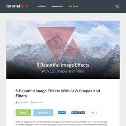
They can be used as desktop wallpapers, eye-catching landing pages, and even as printed posters. In the article below we’ll also go over some of the key CSS techniques, so that you can customize them to your liking or make your own ones from scratch. The Designs A Polyscape (poly = many, scape = scenery) is an image that contains multiple pictures mixed into one, creating very pleasing surrealistic visuals.
You can view the designs in a demo app we created. The demo uses some experimental CSS properties which might not work in all browsers. Polyscape of a mountain with CSS shapes and filters. Making these polyscapes was very easy and we had a lot of fun in the process. CSS Shapes The designs use a variety of geometrical shapes made out of CSS. Squares – HTML blocks are rectangular by default. Tilted squares with transparent background and image border.