
INFOGRAPHIC: A world of languages - and how many speak them. 10 sites pour créer une infographie. Les infographies permettent de visualiser plus facilement un ensemble de données parfois complexe. Une image est parfois plus parlante qu’un long discours ! Elles permettent de comprendre en un coup d’œil les principaux enseignements d’une étude quantitative par exemple.
Certains utilisent également ce type de visualisation pour présenter leurs compétences au sein d’un CV original. De nombreux services existent pour réaliser facilement une infographie : nous en avons sélectionné dix. Réaliser une infographie en ligne Infogr.am Une référence, puisque l’outil a déjà permis de créer plus de 340 000 infographies ! Piktochart Ici aussi, il s’agit d’une référence : plus de 100 000 comptes ont été créés sur le site, vous pouvez donc utiliser le service les yeux fermés !
Easel.ly Il s’agit d’un outil très facile à prendre en main, qui permet de réaliser une infographie facilement. Une infographie représentant l’activité sur les réseaux sociaux What About Me Visual.ly Vizify Get About Me CV Gram Kinzaa. Which fossil fuel companies are most responsible for climate change? – interactive. Turn autoplay off Edition: <span><a href=" Beta About us Today's paper Subscribe This site uses cookies.

APerspectiveonTime_526027e81ba41.png (1300×12517) Timeline of the entire universe. Apple Product Design: 35 Years of Consumer Electronics [INFOGRAPHIC] When it comes to industrial design, few consumer electronics or computer makers have the legacy or influence of Apple, Inc.
![Apple Product Design: 35 Years of Consumer Electronics [INFOGRAPHIC]](http://cdn.pearltrees.com/s/pic/th/electronics-infographic-13521881)
In the last 35 years, Apple has introduced a myriad of products and devices, some very successful, some, not so much. Artist Mike Vasilev created this infographic for Mashable, highlighting the major Apple product releases and design changes from 1976 through 2011. With rumors of the iPhone 5, iPhone 6 and a smaller, lower-cost iPhone all spreading through the technosphere, we feel certain that at least one more item will be added to the "redesign" list before 2011 closes out. What is your favorite Apple design of all time? Let us know in the comments.
Graphic created by Mike Vasilev. Infographics. Awesome Infographics. Fabriquez des infographies en vrai. HTML5 + WebGL. Smileys de los clicks de PLAYMOBIL de Smile the web. I should really get out more. Most popular infographics generalized. Log in or Become a Member Job Opening Digital Designer, Editorial Content for Bauer Media See more openings on the FlowingData Job Board Data Underload Most popular infographics generalized September 30, 2011 | Miscellaneous Yep, still amusing.
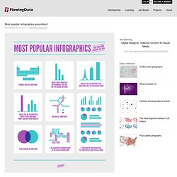
Related Posts 6 Comments Patrick — September 30, 2011 at 8:27 amThey forgot “Global map of who cares?” About FlowingData explores how designers, statisticians, and computer scientists are using data to understand ourselves better — mainly through data visualization. As for me, I'm Nathan Yau, and I have a PhD in statistics, with a background in eating. More... Books Follow Twitter • Facebook • Email • RSS Miscellaneous Contact • Sponsorship • Shop Unless otherwise noted, graphics and words by me are licensed under Creative Commons BY-NC.
Browser Evolution – The History of Web Browsers [Infographic] Infographics. Chrome Experiments - Home. Mr.doob's blog. The HTML5 Experiments of Hakim El Hattab. Experiments This is my creative lab and interactive playground.
It's focused on the exploration of interaction, visual effects and technologies. Flipside Flipside A button that seamlessly transitions from action to confirmation Monocle List Monocle List Scroll the page and see list items expand under the magnifying area. Checkwave Checkwave Check a checkbox to generate a wave of checkboxes. Device Loop Animation View the device loop A device loop animation that I created for the new slid.es home page.
Flexing Pagination View Flexing Pagination A UI experiment with pagination arrows that "flex" when you hover or press them. Assorted CSS Animations I've been having a lot of fun creating these small CSS-only animations lately. View Cloud Animation View Spinner Animation View Hole Animation Ladda Open Ladda A UI concept which merges loading indicators into the action that invoked them. Kontext Open Kontext A context-shift transition inspired by iOS. Hypnos Open Hypnos Kort View demo Fokus Linjer Avgrund meny Radar Coil.