
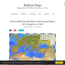
Athènes au Vème siècle av JC : de l'hégémonie à l'empire. - Cartolycée. An Incredibly Detailed Map of the Roman Empire At Its Height in 211AD. Map created by Sardis Verlag.
Link.medium. Roman Roads – Sasha Trubetskoy. If you think this would make a cool poster, follow this link and send me a few bucks.
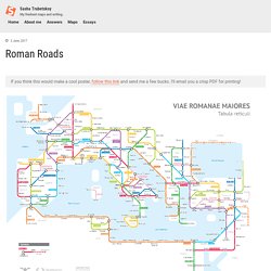
I’ll email you a crisp PDF for printing! It’s finally done. A subway-style diagram of the major Roman roads, based on the Empire of ca. 125 AD. Creating this required far more research than I had expected—there is not a single consistent source that was particularly good for this. Huge shoutout to: Stanford’s ORBIS model, The Pelagios Project, and the Antonine Itinerary (found a full PDF online but lost the url). The lines are a combination of actual, named roads (like the Via Appia or Via Militaris) as well as roads that do not have a known historic name (in which case I creatively invented some names).
How long would it actually take to travel this network? However, no sane Roman would use only roads where sea travel is available. Creative liberties taken The biggest creative element was choosing which roads and cities to include, and which to exclude. La Méditerranée antique : les empreintes romaines. Un article récent proposait deux cartographies pour aborder la période grecque de la Méditerranée antique.
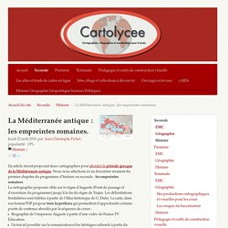
Nous nous attachons ici au deuxième moment du premier chapitre du programme d’histoire en seconde : les empreintes romaines. La cartographie proposée cible sur le règne d’Auguste (Point de passage et d’ouverture du programme) jusqu’à la fin du règne de Trajan. Les délimitations frontalières sont établies à partir de l’Atlas historique de G. Duby. La carte, dans son format PDF propose trois hyperliens qui permettent d’approfondir certains points de contenus abordés par la séquence de cours :
ORBIS: The Stanford Geospatial Network Model of the Roman World. L'impero romano, altrove. Quanto era grande l'impero romano?
Beh, abbastanza... prendiamo l'apice dell'estensione territoriale dell'impero, sotto l'imperatore Traiano nel 117 d.C. una mappa ben conosciuta, direi. beh, adesso spostiamo l'impero in altri continenti e vediamo i risultati... SUD AMERICA! Niente male! Andiamo da Panama all'Uruguay!! AFRICA! Mapa interactivo de “La Odisea” – Aprendizaje de griego moderno. The Romans: From Village to Empire (2nd edition; 2011) A second edition of Mary T.
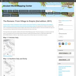
Boatwright, Daniel J. Gargola, Noel Lenski, Richard J. A. Talbert The Romans: From Village to Empire: A History of Rome from Earliest Times to the End of the Western Empire has appeared from Oxford University Press (2011). The following list provides access to digital (.pdf) versions of the maps that appear in the text. The maps below were originally created by the Ancient World Mapping Center. Map 1.1 Archaic Italy [Full-size .pdf version] Map 1.2 Southern Italy and Sicily [Full-size .pdf version] AWMC: À-la-carte Map. Digital Map of the Roman Empire. Les Rendez-vous de l'Histoire de Blois. Retrouvez notre carte sur la Chute de l'Empire Romain, L'Histoire n°416.
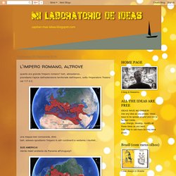
Omnes Viae: Tabula Peutingeriana - Itinerarium Romanum / Planificateur d'itinéraire. Roman Empire GDP Per Capita Map Shows That Romans Were Poorer Than Any Country in 2015. Map by the NEP-HIS Blog, found via Reddit.
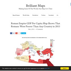
What a difference 2,000 years makes. The map above shows the GDP per capita in 14AD of the various provinces of the Roman Empire in 1990 PPP Dollars. On average, the GDP per capita across the whole Empire, was only $570. This would make the average Roman in 14AD poorer than the average citizen of every single one of the world’s countries in 2015. Wondering how that’s possible?
According to the World Bank, the Democratic Republic of the Congo is currently the world’s poorest nation with GDP per capita in constant 1990 PPP dollars of $766 in 2012. However, as the map above shows GDP per capita varied widely across the Empire. In contrast, the Empire’s poorest provinces were only half as wealthy, which dragged down the average. According to the United States Bureau of Economic Analysis, Delaware has the highest GDP per capita of any state at $61,183 in 2012 vs Mississippi’s much smaller $28,944 or just a little less than half as much. Methodology. Pomponius Mela. Reconstruction of Pomponius Mela's world map by Konrad Miller (1898).
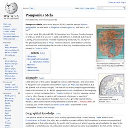
Pomponius Mela's description of Europe (F. Nansen, 1911). Pomponius Mela, who wrote around AD 43, was the earliest Roman geographer. He was born in Tingentera (now Algeciras) and died c. AD 45.[1] His short work (De situ orbis libri III.) occupies less than one hundred pages of ordinary print. Biography[edit] Little is known of the author except his name and birthplace—the small town of Tingentera or Cingentera in southern Spain, on Algeciras Bay (Mela ii. 6, § 96; but the text is here corrupt). Geographical knowledge[edit] Maps Maps Maps - TurkicWorld.