
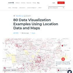
ACS Commute Map. United States Commutes and Megaregions data for GIS. This Figshare dataset contains the files created by and used in a related PLOS ONE paper, entitled 'An economic geography of the United States: from commutes to megaregions', by Garrett Dash Nelson and Alasdair Rae, published 30 November 2016.
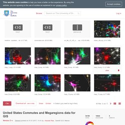
Update: 27 January 2017 - see item 7. below In addition to the files listed below, we have also provided a series of maps here, as high resolution PNGs. The fifth file below can be styled in QGIS using the QML style file provided in number 6. 1. A us_ttw_v3_US_only_epsg5070v2 zipped shapefile (for use in GIS software such as ArcGIS or QGIS) containing individual census tract to census tract commuter links for the entire United States, based on the 2006-2010 American Community Survey dataset, as cited in the paper. 2. 3. 4. 5. An Economic Geography of the United States: From Commutes to Megaregions. Abstract The emergence in the United States of large-scale “megaregions” centered on major metropolitan areas is a phenomenon often taken for granted in both scholarly studies and popular accounts of contemporary economic geography.
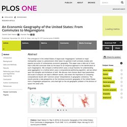
This paper uses a data set of more than 4,000,000 commuter flows as the basis for an empirical approach to the identification of such megaregions. We compare a method which uses a visual heuristic for understanding areal aggregation to a method which uses a computational partitioning algorithm, and we reflect upon the strengths and limitations of both. We discuss how choices about input parameters and scale of analysis can lead to different results, and stress the importance of comparing computational results with “common sense” interpretations of geographic coherence. Citation: Dash Nelson G, Rae A (2016) An Economic Geography of the United States: From Commutes to Megaregions. Editor: Joshua L. Commute Maps Reveal a US Divided by Megaregions. Even if you don’t hate your commute—even on the days free of gridlock, packed buses, and sweaty uphill bike rides—it’s probably tinged by a least a little drudgery.
Not your favorite part of day, perhaps? Maybe, though, you'll feel better knowing you're taking part in a powerful economic movement. Like, literally. “The best way to measure functional economic geography is through commutes,” says Alasdair Rae, an urban and regional analyst with the University of Sheffield. Commutes, for all their crumminess, double as a measure of local health and wealth. That’s why Rae and Dartmouth College geographer Garrett Dash Nelson zoomed in on commutes in their newest study of American megaregions, published this week in PLoS ONE.
Sidebar, for math: The researchers started with an American Community Survey dataset of more than four million commuter flows, marking the travel patterns of 130 million Americans. Visualize large geographic datasets with the “Point map” template. Visualizing large geographic datasets can be tricky.
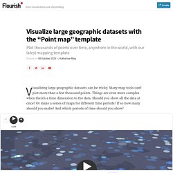
Many map tools can’t plot more than a few thousand points. 80 Data Visualization Examples Using Location Data and Maps. As the importance of location data continues to grow so do the ways you can visualize this information.
We’ve scoured the web in search of data visualizations showing the value of location data in its many varieties, and have compiled this mega list to bring you the very best examples. The 80 entries below surprised us, taught us, inspired us, and drastically changed the way we understand location data. We grouped these 80 data visualizations into thematic categories, and then listed each entry (click on the name of the visualization to open it). The six categories include: From data visualizations on global breathing patterns, to fan reactions to the latest episode of Game of Thrones, to international diplomacy and humanitarian crises, these 80 data visualizations are only a small glimpse into the different ways location data is being used around the world.
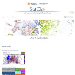
Enjoy! Conflict Zones. Mapping Daily Work Travel: Your Commute Never Looked So Good. The daily commute to work and back might be the last thing you want to see more of, but sometimes it helps to see things in a new light: Here’s your daily traffic torment, subway sardine-fest or bus-stop hustle, represented in candy-colored motion.
Michigan-based data wrangler Mark Evans shows us the workday migrations of American commuters using census data so that they resemble a jubilant gathering of rainbow dots, expanding and contracting from each county with the day’s open and close (h/t Citylab). From Evans’ blog we’re instructed that the dots vary in size based on how many commuters there are, and are color-coded by the county from which they’re commuting. Select a county from the drop-down menu at the top of the map, and toggle between “home” and “workplace” to see what the back-and-forth looks like for those who live or work in that county.
Data Visualizations. Web Series Data visualizations created by us (but often inspired by other people’s work) Power and money: Why the census is important The interactive map displays the loss or gain in seats from the previous census, along with the projected change following the upcoming 2020 count.
Visualizing the nation’s future population View this post for a few examples of how you can use the tool to visualize some of the key demographic trends reflected in the national projections. 502 607. ACS Commuter Data Visualizations – I Like Big Bytes. This blog concerns an interactive visualization I put together that, for technical reasons, isn’t directly imbedded in this blog post.
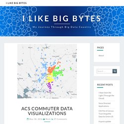
Go to to see and play with the visualization. Creating Interactive Charts with Python Pygal. Visualizing statistical relationships — seaborn 0.9.0 documentation. Statistical analysis is a process of understanding how variables in a dataset relate to each other and how those relationships depend on other variables.
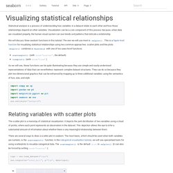
Visualization can be a core component of this process because, when data are visualized properly, the human visual system can see trends and patterns that indicate a relationship. We will discuss three seaborn functions in this tutorial. The one we will use most is relplot(). This is a figure-level function for visualizing statistical relationships using two common approaches: scatter plots and line plots. relplot() combines a FacetGrid with one of two axes-level functions: scatterplot() (with kind="scatter"; the default)lineplot() (with kind="line") As we will see, these functions can be quite illuminating because they use simple and easily-understood representations of data that can nevertheless represent complex dataset structures.
Census Infographics & Visualizations. 17+ Impressive Data Visualization Examples You Need To See - Maptive. By visualizing information, we turn it into a landscape that you can explore with your eyes, a sort of information map.
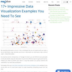
And when you’re lost in information, an information map is kind of useful. ―David McCandless As a business owner, entrepreneur, or manager of a team, you can’t afford to try to persuade or educate people using raw data alone. It’s just not an effective way to to get a point across. Instead, you need to present your data in a way that people can quickly examine and understand. Tutorials. How to Use IPUMS Extraction Tools to Download Survey Data Almost all of my visualization projects that use data from the Census Bureau comes via IPUMS. In this guide, I provide five steps to getting the data you need using their tools. How to Make Animated Visualization GIFs with ImageMagick Using the library command-line gets you more flexibility to highlight the important parts of the data.