
How the BBC Visual and Data Journalism team works with graphics in R. Over the past year, data journalists on the BBC Visual and Data Journalism team have fundamentally changed how they produce graphics for publication on the BBC News website.
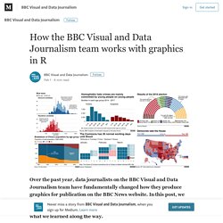
In this post, we explain how and why we have used R’s ggplot2 package to create production-ready charts, document our process and code and share what we learned along the way. Data journalists on the BBC News’ Visual and Data Journalism team have been using R for complex and reproducible data analysis and to build prototypes for some time. For example, we used R to extract, wrangle, clean and explore data from hundreds of spreadsheets on whether NHS targets are being hit, for the award-winning NHS tracker project. R was our go-to when in 2017 we analysed more than eight million residential property transactions in England and Wales for a project looking at how house prices have changed in real terms, a project that received an award from the Royal Statistical Society last year. Corruption Perceptions Index 2018.
The three-degree world: cities that will be drowned by global warming. When UN climate negotiators meet for summit talks this month, there will be a new figure on the table: 3C.
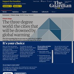
Until now, global efforts such as the Paris climate agreement have tried to limit global warming to 2C above pre-industrial levels. However, with latest projections pointing to an increase of 3.2C by 2100, these goals seem to be slipping out of reach. Global temperature change compared to pre-industrial levels. Optimistic facts and charts that show the world is getting much, much better.
For most Americans, these feel like bleak times. We have a massively unpopular, scandal-plagued president whose aides are being convicted of serious federal felonies. Overt, old-fashioned racism is publicly visible and powerful in a way it wasn’t only five years ago. More than 200 admired, powerful men have been accused of sexual misconduct or assault.
This is all real, and truly alarming. More Americans Voted in the Midterm Elections Than You Thought. As the last states certify their vote totals from the November midterms, it’s become increasingly clear that 2018 was a landmark election for voter turnout.
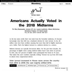
So far, 118 million votes have been certified, meaning that more than half of eligible Americans cast a ballot. That’s the highest turnout in a midterm election in a century. Midterm elections are typically low-turnout affairs. For the past three decades, the percentage of eligible voters casting midterm ballots hasn’t risen above 42 percent. In 2014, only 36.7 percent of eligible voters participated—the lowest in 70 years. Voter turnout increased in House races across the country from 2014 to 2018—the vast majority shifted left👆 What Happened to All the Jobs Trump Promised? Carrier What Trump Promised Carrier stepped it up and now they're keeping – actually the number's over 1,100 people, which is so great," Trump said in a speech at the Carrier plant in Indianapolis on Dec. 1, 2016.
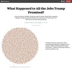
What Happened 800 New or saved jobs 300 Jobs that were promised but not created Mike Pence, then governor of Indiana, began negotiations with Carrier in March 2016, months before he became Trump's running mate, according to briefing materials prepared by the Indiana Economic Development Corporation. News Apps. Republish This Story for Free.

Heroin Addiction Explained: How Opioids Hijack the Brain. Democracy continues its disturbing retreat. Batjo - Bits, Atoms and Journalism. Paying the President. About the data Federal government spending is incomplete because many government agencies have actively fought requests to disclose spending at Trump properties.
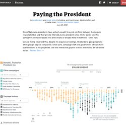
The data we have so far was released, in part, after lawsuits. We’ll continue to update this page as we receive more data. Federal government spending data does not include all expenses from the Secret Service or from Coast Guard protection details. Some federal spending reports we received did not include transaction dates. Sources: Federal government spending was gathered by the Washington-based transparency group Property of the People using Freedom of Information Act requests of more than a dozen agencies and lawsuits against four of them.
Federal taxpayer data is incomplete because agencies are fighting disclosure. - The Washington Post. SA Visual. Making a metric. Economist. Do immigrants lead to crime? A recent study says no. Augmented Reality: Explore InSight, NASA’s Latest Mission to Mars. Visualeyed - A visual journalism magazine. The Stories Behind a Line. Bruises — The Data We Don’t See – giorgia lupi. Then I incorporated Cooper’s skin as observed by Kaki daily, testing how to recall the disease visually with the intensity and spread of different types of brushes and drawing materials.
The intensity of bruises on her body is represented by the purple and green splotches (the bigger, more intense and more colorful, the wider and harsh the bruises). The amount of petechiae (small purple spots caused by bleeding into the skin) are visualized with tiny pink dots on each day (the denser the area, the more present the spots on Cooper’s skin). When Cooper was taking steroids, grey brushes strokes are on top of the day. If Cooper had some incidents that caused her skin to worsen, colored pencils strokes are added. Is There Something Wrong With Democracy? Can an Algorithm Tell When Kids Are in Danger? The call to Pittsburgh’s hotline for child abuse and neglect came in at 3:50 p.m. on the Wednesday after Thanksgiving 2016. Sitting in one of 12 cubicles, in a former factory now occupied by the Allegheny County Police Department and the back offices of the department of Children, Youth and Families, the call screener, Timothy Byrne, listened as a preschool teacher described what a 3-year-old child had told him.
How your worst fears stack up against reality. The Golden State Warriors Owe a Lot to Data. Bussed out: how America moves thousands of homeless people around the country. No Hoax: 2016 Was the Hottest Year on Record. It’s not a hoax.
Gender pay gap: the day women start working for free - Washington Post. Border security – Illegal immigration issues in Europe, U.S. - Washington Post. Nerd Journalism. ONE - Making the Connection. Healthy and happy expectant mothers and new babies is the aim ofMomConnect, a mobile based programme that delivers health messages to new mums and mums-to-be.

Gesunde und glückliche werdende Mütter und Neugeborene sind das Ziel vonMomConnect, einem App-basierten Programm, das junge und werdende Mütter mit gesundheitsbezogenen Ratschlägen versorgt. Gezonde én gelukkige aanstaande moeders en nieuwe baby's: dát is het doel vanMomConnect, een app voor de mobiele telefoon die gezondheidsboodschappen aan kersverse en aanstaande moeders stuurt. Users can sign up for weekly texts about their pregnancy, with health related information and updates about what they should expect to be experiencing. They can also ask questions about anything they need to know about their baby or pregnancy and register the birth once the new baby has arrived. Every year 1,500 mothers and over 34,000 infants die during childbirth in South Africa. Cape Town, South Africa. Cassini's Grand Tour. Solar system graveyard. Cassini: The Grand Finale: Grand Finale. Data visualization and the media: Journalists, computer scientists must collaborate. By Michael Martinez More than ever, the nation’s 83,000 working journalists are being pressed to explain complicated information in an easy-to-understand graphs and illustrations, especially as audiences migrate to mobile, social and other digital platforms.

Susan Reilly, professor of multimedia studies at Florida Atlantic University, says media professionals are trying to create data visualizations with little training and with programs that were developed for other professions. This causes problems. Even With Affirmative Action, Blacks and Hispanics Are More Underrepresented at Top Colleges Than 35 Years Ago - The New York Times. The number of Hispanic and black freshmen on the University of California campuses declined immediately after California’s affirmative action ban took effect, especially at the most sought-after campuses, said Stephen Handel, associate vice president for undergraduate admissions.
The system put the ban in place in 1998. Even now, both Hispanics and blacks are least represented at Berkeley, the most selective campus. On seven campuses, Hispanics now make up a quarter or more of the freshmen, but that’s still far below their share of the college-age population in the state, which is close to 50 percent. “Despite the progress the U.C. has made in assembling a more diverse student body, a lot of work remains to be done so that all U.C. campuses reflect the true diversity of the state,” Mr. Handel said in an email. 2q17. Looking at the German election through Google Trends — an interview with Moritz Stefaner. Elections have never been more digital. Over the past few months, elections across the world have demonstrated the importance of digital tools for voters to make informed decisions on Election Day. This is important to us at Google. Our mission is to organize the world‘s information and make it universally accessible and useful — and elections are moments when access to accurate information matters most.
At the News Lab, we look at these moments as opportunities to empower journalists with the technology and data they need to keep the communities they serve informed. For the German election on September 24th, Google and YouTube launched a digital tool kit to help the public, policy makers and journalists inform themselves online, quickly and easily, and participate in political debates. The UK’s Brexit Options in the Eurozone Landscape – Visualized — Information is Beautiful. A Matter of Time: Intro. The Immigration Effect. “Immigration is a great economic policy opportunity and it’s important to document the impact of that,” said Douglas Holtz-Eakin, an economist who served on the President’s Council of Economic Advisers in both Bush administrations.
He agreed with the basic conclusions of Moody’s analysis, and said that 1.15 percent was a reasonable estimate of the effect of immigration on GDP. FT Data. Data Comics: The New Way to Communicate in the Global Tech Community. What does the US import from Mexico and how much are the taxes? An interactive guide — Quartz. On March 10, 2014, my mother, my sister-in-law, and I walked up the stairs to tell my brother’s four daughters that their father had died.
Though he had been sick for two years, the news came as a total shock. Watch how the measles outbreak spreads when kids get vaccinated – and when they don't. Vaccinated susceptible vaccinated but susceptible infected contact with an infected person. Odyssey.js. The Rhythm of Food — by Google News Lab and Truth & Beauty. Inauguration Speeches. Graphics - Bloomberg. FiveThirtyEight.
How to Lie with Analytics, Ted Byfield - Mozilla Internet Citizen. 2016 USA Elections. Why infectious bacteria are winning. London Marathon: how many run the dream race? An in depth look at statistical issues from the Financial Times. FT Data (@ftdata) Financial Times (@FinancialTimes) The Chart Doctor. By Matt Stiles. How We Rebuilt the Wall Street Journal’s Graphics Team. Combining forces, embedding specialists, and busting out of the news cycle The Wall Street Journal recently took steps to merge our print graphics department with our interactive team.
Our new team is simply named Graphics. This brought a number of major changes to our department like: no more division between print and online graphics teamsa new Enterprise Visuals team that pitches their own projects outside the daily news cycleembedded developers who sit beside section editors and reporters Many other organizations are undergoing similar changes. The Journalist-Engineer – Medium. A couple months ago, I published an article comparing historic and present-day popularity of older music. I used two huge datasets: 50,000 Billboard songs and 1,4M tracks on Spotify. HuffPost Pollster - Polls and Charts. These charts clearly show how some Olympic swimmers may have gotten an unfair advantage. How politicians poisoned statistics. Nonpartisan, non-advocacy public opinion polling and demographic research.
Projects from The Wall Street Journal’s Graphics Team. DataIsBeautiful. Graphics. Data Driven Journalism. Welcome. The Data Journalism Handbook. Graphic detail. Data. SA Visual. Life Expectancy - Our World In Data. The 'Black Route' to Europe, and the story of a Syrian family who braved it - Washington Post. Discovering Gale Crater: A VR experience from the L.A. Times. Best experienced over a wifi connection Loading initial data. Discovering Gale Crater: How we did it. Remember when virtual reality first became a "thing? " Projects from The Wall Street Journal’s Graphics Team.
Data Desk - Los Angeles Times. Links: Scott Klein on the History of Data Journalism – eagereyes. The Chart Doctor. FT Infographics - Financial Times. Graphics. Nytlabs. DataArt - Visualisations. Die Welt’s analytics system de-emphasizes clicks and demystifies what it considers a “quality” story. Italian Limes. 2014: The Year in Interactive Storytelling, Graphics and Multimedia. 2013: The Year in Interactive Storytelling. Review of Interactive Storytelling at the New York Times. Google’s Remarkably Close Relationship With the Obama White House, in Two Charts. One Report, Diverging Perspectives - Interactive Graphic. The dark side of Guardian comments. Data. The Panama Papers · ICIJ. Unfiltered.news. An in depth look at statistical issues from the Financial Times. Interactive. VALID – Visual Analytics in Data-driven Journalism.