
My remarks for iphone and ipad. Mobilize.js documentation — mobilize.js v0.1 documentation. Fluid Baseline Grid - A sensible HTML5 and CSS3 development kit. Less+ Framework. Anatomy of a mobile web experience: facebook.com. This is the second article in a series about how the major internet brands deliver their mobile web experience.
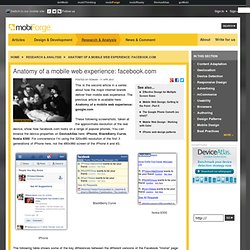
The previous article is available here: Anatomy of a mobile web experience: google.com These following screenshots, taken at the approximate resolution of the real device, show how facebook.com looks on a range of popular phones. You can browse the device properties on DeviceAtlas here: iPhone, BlackBerry Curve, Nokia 6300. For convenience I'm using the 320x480 resolution of the first 3 generations of iPhone here, not the 480x960 screen of the iPhone 4 and 4S. The following table shows some of the key differences between the different versions of the Facebook "Home" page served to different devices after logging into facebook.com. . * On capable devices Facebook use local storage to do some caching, so this figure isn't directly comparable to the others.
Analysis Facebook uses essentially no JavaScript at all for most lower end devices, save for a couple of onload() envents. Notes. ResponsiveSlides.js · Alternative themes. Pixel Perfect Responsive Design Testing Tool. The jQuery Mobile tutorial - Homepage. Screenshot of any website on mobile devices - Mobilito, check your website on mobile devices. TheAppBuilder. TheAppBuilder - interview with Matthew David. TheAppBuilder is a new online service that helps you create native Android, iOS, and Windows Phone applications (yes, all at once) in a matter of a few minutes.
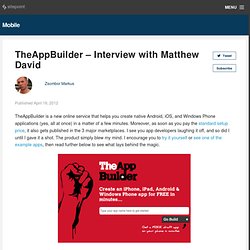
Moreover, as soon as you pay the standard setup price, it also gets published in the 3 major marketplaces. I see you app developers laughing it off, and so did I until I gave it a shot. The product simply blew my mind. I encourage you to try it yourself or see one of the example apps, then read further below to see what lays behind the magic. Media Query & Asset Downloading Results. A little while back, I mentioned I was doing some research for the book about how images are downloaded when media queries are involved.
To help with that, I wrote up some automated tests where Javascript could determine whether or not the image was requested and the results could be collected by Browserscope for review. I posted some initial findings, but I think I’ve got enough data now to be able to go into a bit more detail. First, any credit has to go to the awesome team at Cloud Four. Response JS: mobile-first progressive enhancement in HTML5. Recent. How to fit your website for the Apple iPad « x7 Labs. Important note, updated: Apple has released very limited information about the iPad at the Safari Dev Center.
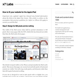
This article is written on the assumption that previous guidelines for Safari on iPhone OS apply to version 3.2 and the iPad. Step 0: Design for 980 pixels and do nothing The width of the iPad screen when held in portrait orientation is 768 pixels. Detect Orientation Change. Unless your mobile application allows for only portrait or only landscape views, there's a good chance you will need to adjust a few things.
Even if you've built your layouts in a fluid fashion, you may need to programmatically make some changes. There are a few strategies for knowing when pages have changed, so let's check out how we can detect orientation changes on mobile devices. orientationchange Event This method is what you would expect from a mobile API; a simple orientationchange event on the window: Mobile Navigation Design & Tutorial. One of the common challenges when designing responsive design for mobile is the navigation menu.
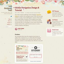
If the site has many sections or pages, it gets challenging to squeeze all the items into a small mobile resolution. The navigation most likely ends up running into multiple lines or the buttons stacking on top each other. So I'm going to review some of the design solution and provide a quick tutorial on how to create a mobile navigation with jQuery. View Demo Mobile Nav Problem The screenshots below show the navigation layout issues on mobile. <meta name="viewport"> - part2 - Jozef’s blog. * jsSizes for Curator * will calculate the zoom level, between width in DMS and the real one of the browser and set. Orientation and scale. Paul Irish, Divya Manian and Shi Chuan launched Mobile Boilerplate recently—a mobile companion site to HTML5 Boilerplate.
There’s some good stuff in there but I was a little surprised to see that the meta viewport element included values for minimum-scale=1.0, maximum-scale=1.0, user-scalable=no: Setting user-scalable=no is pretty much the same as setting minimum-scale=1.0, maximum-scale=1.0. In any case, I’m not keen on it. Like Roger, I don’t think we should take away the user’s right to pinch and zoom to make content larger.
Прокрустовы окна — Пепелсбей.net. Website Speed and Performance Optimization. Mobile Responsive Design Testing. Show your clients responsive design previews with ProtoFluid #js. Responsivepx - find that tricky breakpoint. Firefox Mobile Browser — Features. MobiReady - dotMobi compliance & mobileOK checker. Debugging CSS Media Queries - Johan Brook.
Frontender.com.ua. iPad Peek. Golden Grid System. GGS was my next step after Less Framework.
Instead of a fixed-width grid, it used a fully fluid-width one, without even a maximum width. The resources it was published with are still available on GitHub. The idea was to take a 18-column grid, use the outermost columns as margins, and use the remaining 16 to lay elements out. Инструменты, методы, шаблоны и платформы для разработки адаптивного дизайна сайтов. Раскрытие тайны реагирующего веб-дизайна. Адаптивная разметка. Создание резиновых разметок с помощью CSS хорошо зарекомендовало себя при ширине экрана от 800 до 1024 пикселей, но поскольку все более широкий круг устройств используется для доступа к веб, нам нужно более мощное и гибкое средство подстройки разметки под пользователя.

Полезные jQuery плагины для адаптивного дизайна. Количество людей, которые используют планшеты, смартфоны и любые другие мобильные устройства для доступа в интернет стремительно растет, а вместе с ним увеличивается и спрос на сайты, которые будут корректно отображаться на всех этих девайсах. [Lynda.com] Creating an Adaptive Web Site for Multiple Screens [2011, ENG. Blogs. The Great WebKit Comparison Table. Fix Button Borders in WebKit Mobile. Modernizr.
Адаптивный и мобильный дизайн с CSS3 Media Queries. Filamentgroup/Responsive-Images. Responsive web design. If you’ve been working in the web design field for the past couple of years you should know that designing a fixed interface for a widescreen computer is not enough.

Most of the clients you’ll be dealing with from now are going to request that their site is not only desktop-compliant but is also optimized for smartphones and tablets. This issue presents the necessity of working with different screen resolutions in order to guarantee that a website looks good in all sorts of devices. But if the devices’ production continues at the same speed that it has for the past couple of years, the amount of screen resolutions and formats that designers will have to deal with is going to become unbearable.
Using and customizing jQuery Mobile themes. Note: You can follow this tutorial with any version of Dreamweaver or a text editor.
In my earlier article, Getting started with jQuery Mobile, I provided an introduction to using the jQuery Mobile framework to build great web experiences for smartphones and tablets. Out of the box, the websites you build with jQuery Mobile look great. Buttons are glossy, gradients are smooth, and the overall interface is elegant. Depending on your design requirements, however, you may want to blend colors to match your company colors or brand, or highlight or mute buttons and tabs. In short, you may want control of the look and feel of your jQuery Mobile website.
jQuery Mobile uses cascading style sheets (CSS) to control the visual layout of content on the screen. Three Ways to Implement a Global Menu in jQuery Mobile. Navigation is the hardest thing to get right in any application.
Mobile only compounds the issue. jQuery Mobile doesn't (and shouldn't) have a pre-built global navigation structure. This leaves room for flexibly and creativity on the part of the designers, but also leaves some scratching their heads and wondering what to do. jQuery Mobile Best Practices - a one year retrospective. jQuery Mobile is very easy to use. For anyone who knows jQuery, it's also very easy to manipulate. But with great power comes great responsibility. The Goldilocks Approach to Responsive Web Design. Slide-in menu. Project info Last code update: 2010.05.28 – v0.1 beta 1Device compatibility: iPhone/Ipod touch >=2.0, Android >1.6, iPad.QR Code opens demo page. SwipeView. SwipeView is the super simple solution to endless seamlessly loopable carousels for the mobile browser. 5 Really Useful Responsive Web Design Patterns. How to build a website for the iphone with orientation detection.
Well, we did promise we'd get around to a tutorial eventually, so here you have it! The Engage Interactive school for all things internet proudly presents: How to build a website with orientation specific content especially for the iPhone! This tutorial will cover the basic setup and creation of a web page for the iPhone that will detect and change the content based on the phones orientation. Mobile Bookmarklets · h5bp/mobile-boilerplate Wiki.
Mobile Perf bookmarklet. Installation. Mobile HTML5 - compatibility tables for iPhone, Android, BlackBerry, Symbian, iPad and other mobile devices. Iphonemockup.lkmc. Share this Mockup with others by sharing the URL. Flow Slider jQuery Thumbnail Plugin. Swipe JS - a lightweight mobile web slider.