

A Complete Guide to Grid. Create Your Own @font-face Kits.
Responsive. Media Queries Are Not The Answer: Element Query Polyfill. Responsive Web design has transformed how websites are designed and built. It has inspired us to think beyond device classifications and to use media queries to adapt a layout to the browser’s viewport size. This, however, deviates from the hierarchical structure of CSS and characterizes elements relative to the viewport, instead of to their container. Media Queries Are Not The Answer: Element Query Polyfill. Parallax. HSLColorPicker. Apprendre les mises en page CSS. Créer une grille CSS responsive. Build more with less. CSS Front-end Frameworks with comparison - By usabli.ca.
Une vidéo d'arrière-plan sur toute la page en HTML et CSS. How to Create CSS3 Speech Bubbles Without Images. I remember my creating my first image-less speech bubble many years ago.
It required a long-winded JavaScript function to inject elements into the DOM, some horrendous CSS, looked fairly awful, and didn’t work well in IE5. CSS3 is starting to change our lives for the better. Vertical align anything with just 3 lines of CSS. With just 3 lines of CSS (excluding vendor prefixes) we can with the help of transform: translateY vertically center whatever we want, even if we don’t know its height.
The CSS property transform is usally used for rotating and scaling elements, but with its translateY function we can now vertically align elements. Usually this must be done with absolute positioning or setting line-heights, but these require you to either know the height of the element or only works on single-line text etc. So, to vertically align anything we write: That’s all you need. It is a similar technique to the absolute-position method, but with the upside that we don’t have to set any height on the element or position-property on the parent.
Hiding elements and CSS animations. Following the last article about CSS animations using Javascript, let's see how we can apply this to something closer to a real life situation than a bouncing ball.
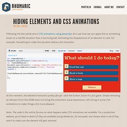
Animating the disapearance of an element in a list, for example. Something to make the situation below a bit smoother: At the moment, the element removal is pretty abrupt: click the button, boom it's just gone. Simply removing an element from the DOM does not bring the smoothest visual experience. Let's bring in some CSS animations to make things a bit more pleasant.
Note: The code in this article focuses on what happens when CSS animations are available. Making elements disapear in CSS If you think of hiding elements with CSS, display: none; is probably that first comes to your mind. The next option in mind would be visibility: hidden;, but it has the same "I-am-not-animatable" issue. opacity: to fade the element outtransform: to scale the element or translate it out of screen Get it out of the way The translation works well. 10 Packs d'icônes gratuites et de qualité à télécharger. Unfolding the Box Model: Exploring CSS 3D Transforms. Adaptive Backgrounds, un arrière-plan assorti avec jQuery. Adaptive Backgrounds est un plugin jQuery qui permet d’assortir le background de votre site avec les images que vous aurez préalablement définies : la technique consiste à extraire la couleur dominante de l’image et de l’appliquer sur l’arrière-plan de son élément parent.

CSS animations and Javascript. Usualy, to animate CSS properties with Javascript, you'd use a tweening library to progressively transition their values.
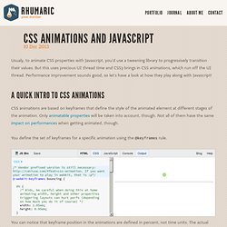
But this uses precious UI thread time and CSS3 brings in CSS animations, which run off the UI thread. Performance improvement sounds good, so let's have a look at how they play along with Javascript! A quick intro to CSS animations CSS animations are based on keyframes that define the style of the animated element at different stages of the animation. Only animatable properties will be taken into account, though. Rabbit by Beard Chicken.
A collection of best front-end frameworks with comparison. Design web : Est-ce la fin de Photoshop? Cinq constats et quatre approches alternatives. Percentage Loader, une ravissante barre de progression avec jQuery et HTML5. SASS. Le merdier du “stacking context” en CSS (aka “pourquoi mon z-index marche pas bordel de merde” ?) Public service announcement: time to update your CSS3. If you use experimental CSS on your sites, demos, articles or tools, there is a certain amount of maintenance required to keep on top of changes.
With a number of recent changes in the browser world, now is the time to revisit and update your code. Read on to find out what may need updating. Reorder your prefixes There is no specific order that you should place your prefixed properties. However, a commonly recommended method is to place them in alphabetical order, with the prefixless version last. Gérer les débordements de contenus grâce à CSS. CSS Flip Animation. You've all asked for it and now I've added it: Internet Explorer support!
Annoyingly enough, the change involves rotate the front and back elements instead of just the container. Skip to this section if you'd like the Internet Explorer code. IE10+ is supported; IE9 does not support CSS animations. CSS animations are a lot of fun; the beauty of them is that through many simple properties, you can create anything from an elegant fade in to a WTF-Pixar-would-be-proud effect. One CSS effect somewhere in between is the CSS flip effect, whereby there's content on both the front and back of a given container. Quick note: this is not the first tutorial about this effect, but I've found the others over-complicated. The HTML. Animated 3D Flipping Menu with CSS. CSSrefresh - automatically refresh CSS files. Create a Trendy Retro Photo Effect Purely with CSS. I’ve done plenty of retro photo effect tutorials in the past, but they’ve all been done using Photoshop.

After playing around with some cool new CSS3 features I managed to create a pretty decent looking retro style image effect using just CSS. With the help of CSS gradients and filters, let’s take a look at how a cool vintage photo effect can be created directly in the browser. This little technique uses a mix of CSS gradients and filters to combine various colour overlays to create that typical old school analogue photo effect. Currently CSS filters only work in Webkit browsers (Safari, Chrome), but it won’t be long until this fun little tip can be put into practice across all browsers.
Basic Ready-to-Use CSS Styles. This is a collection of some basic styles that can come in handy when creating your own style definitions.

Learn how to make some useful classes for simple styles and how to apply them to a variety of elements. View demo Download source. Make a stopwatch using CSS3 without images or javascript.
CSS3 Flexbox Layout module. Knacss. Bootstrap. LESS. Menu fixe avec un effet de slide en CSS3. Les transitions en CSS3.