
Beyond Infographics: 12 Ways to Visualize Data. Create infographics & online charts. D3.js - Data-Driven Documents. Download @HubSpot's Infographic Template. Easel.ly. Infographics & Data Visualizations. Online Charts Builder. Hohli Online Charts Builder New version: Try new version of Charts Builder, it based on new Google Charts API Load From Image URL: Chart Data can't equal to original, but very similar to it.

Only for images on chart.apis.google.com Chart Type: 3D Pie charts Lines Bar charts Pie charts For Pie Charts with labels choose 1000x300 or 800x375 size Venn diagrams Scatter plots Radar charts Chart Size: 320x240 Horizontal 1000x300 800x375 600x500 320x240 Vertical 300x1000 375x800 500x600 240x320 Square 546x546 400x400 300x300 200x200 Chart Ads: Data: Should be consists only positive numbers, use minus one (-1) for missing value, separated by coma, space or semi(,; ), e.g.: 23, 432, 456, 341 For Lines (pairs): Input data as x-axis and y-axis coordinates, e.g.: x1,y1, x2,y2, x3,y3. Online Diagram Software and Flowchart Software - Gliffy.
Interactive Graphic Organizer. Holt Interactive Graphic Organizers "Graphic organizers are tools that help your brain think.
" - Kylene Beers Graphic organizers are an illustration of your thoughts on paper. They can help you brainstorm, organize, and visualize your ideas. Click on a graphic organizer to download a PDF of it. Once you’ve downloaded an organizer, type in your comments and print it out. Each graphic organizer below includes Teaching Notes with lessons and tips on how to use graphic organizers in the classroom. Help with PDF Files Generating, Identifying, and Organizing Details. Interactive maps and visualizations. Make Your Own Infographic. Infographics are to data what storytelling is to an annual report: a more engaging way to help bring attention and understanding to your nonprofit’s cause.
Yesterday we looked at an interesting infographic that suggested a new way to view your volunteers. Today, let’s look at infographics in general – and resources to help your nonprofit get started on making your own. As Wikipedia explains, “Information graphics are visual devices intended to communicate complex information quickly and clearly”: Search results for 'infographic' Tour at GeoCommons. GeoCommons is the public community of GeoIQ users who are building an open repository of data and maps for the world.
The GeoIQ platform includes a large number of features that empower you to easily access, visualize and analyze your data. We've highlighted just a few of these features below. Tutorials. How to Make a State Grid Map in R Something of a cross between a reference table and a map, the state grid provides equal space to each state and a semblance of the country to quickly pick out individual states.
How to Make Animated Line Charts in R Sometimes it's useful to animate the multiple lines instead of showing them all at once. How to Make a Multi-line Step Chart in R For the times your data represents immediate changes in value. Ultimate Guide to Create/Design an Infographic. Visual editor. Alpha Pro: Experience the Next Big Step in Computational Knowledge. 5 Unbeatable Types of Infographic + Free Tools to Create Them. An infographic (information graphic) has been a very effective way to bait for links and social media votes for ages.

Like anything else, it can be done right or wrong (I am sure you have seen dozens of poorly implemented infographics by now and maybe a few really good ones). How to create a good one? The secret is in days (maybe months) of brainstorming. A cool concept doesn’t even have to be too very well-designed. All you need is a great idea and some time of putting it together. This post lists 5 unbeatable (when done right) types of infographics as well as free tools to help you put your ideas to life – enjoy! 1. As the periodic table hangs in thousands of classrooms all over the world, it has become a visual metaphor and serves now as a template for knowledge presentation in various niches and verticals.
Examples: Tools and resources: 2. Tools and resources: 3. 4. 5. Further reading: Ann Smarty is the blogger and community manager at Internet Marketing Ninjas. 10 Awesome Tools To Make Infographics. Advertisement Who can resist a colourful, thoughtful venn diagram anyway?

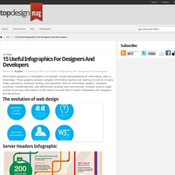
In terms of blogging success, infographics are far more likely to be shared than your average blog post. This means more eyeballs on your important information, more people rallying for your cause, more backlinks and more visits to your blog. In short, a quality infographic done well could be what your blog needs right now. Designing An Infographic. 15 Useful Infographics For Designers And Developers.
Writen by Bogdan / Comments Off on 15 Useful Infographics For Designers And Developers Information graphics or infographics are graphic visual representations of information, data or knowledge.
These graphics present complex information quickly and clearly,[1] such as in signs, maps, journalism, technical writing, and education. Over 100 Incredible Infographic Tools and Resources (Categorized) This post is #6 in DailyTekk’s famous Top 100 series which explores the best startups, gadgets, apps, websites and services in a given category.

Total items listed: 112. Time to compile: 8+ hours. Follow @DailyTekk on Twitter to make sure you don’t miss a week! Update: Be sure to check out our latest post on infographics: Infographics Are Everywhere – Here’s How to Make Yours Go Viral.