
Understand the Israeli - Palestinian Apartheid In 11 Images » ThrivalRoom. Free and Equal - Timeline Photos. 01mapa.jpg (2344×3356) 40 more maps that explain the world. Maps seemed to be everywhere in 2013, a trend I like to think we encouraged along with August's 40 maps that explain the world.
Maps can be a remarkably powerful tool for understanding the world and how it works, but they show only what you ask them to. You might consider this, then, a collection of maps meant to inspire your inner map nerd. I've searched far and wide for maps that can reveal and surprise and inform in ways that the daily headlines might not, with a careful eye for sourcing and detail. I've included a link for more information on just about every one. Enjoy. 1. Data source: Oak Ridge National Laboratory, World Bank.
Those dots represent people: the brighter the dot, the more people. 2. Click to enlarge. Human beings first left Africa about 60,000 years ago in a series of waves that peopled the globe. 3. (Wikimedia commons) The Mongol conquests are difficult to fathom. 4. Click to enlarge. This map shows the Spanish and Portuguese empires at their height. 5. This Comic Perfectly Explains What White Privilege Is. Facebook. ATD Quart Monde. Des radio-poubelles aux campagnes électorales, les idées fausses sur la pauvreté se répandent et se diffusent dans tous les milieux et s’ajoutent aux violences que subissent quotidiennement les personnes en situation de pauvreté.
Depuis plusieurs mois, des personnes en situation de pauvreté et des volontaires du mouvement ATD Quart Monde travaillent à créer ensemble des outils simples, clairs et efficaces pour mettre fin à ces idées fausses sur la pauvreté : quiz en ligne, fiches-argumentaires, animations vidéo, guide collaboratif, théâtre forum. Découvrez la campagne »En finir avec les idées fausses sur la pauvreté » : Testez vos idées sur la pauvreté en répondant à notre quizDécouvrez les affiches et fiches-argumentaires autour de vous et sur les réseaux sociauxContribuez à la diffusion au plus grand nombre en participant à la campagne de financement.Devenez partenaires de la campagne »En finir avec les idées fausses sur la pauvreté » Participez à notre campagne de financement en ligne !
9 Out Of 10 Americans Are Completely Wrong About This Mind-Blowing Fact. Facebook. 40 Maps That Will Help You Make Sense of the World. If you’re a visual learner like myself, then you know maps, charts and infographics can really help bring data and information to life. Maps can make a point resonate with readers and this collection aims to do just that. Hopefully some of these maps will surprise you and you’ll learn something new. A few are important to know, some interpret and display data in a beautiful or creative way, and a few may even make you chuckle or shake your head. If you enjoy this collection of maps, the Sifter highly recommends the r/MapPorn sub reddit.
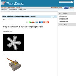
You should also check out ChartsBin.com. Simple animation to explain complex principles. 1, aircraft radial engine 2, oval Regulation 3, sewing machines 4, Malta Cross movement - second hand movement used to control the clock 5, auto change file mechanism 6, auto constant velocity universal joint 6.gif 7, gun ammunition loading system 8 rotary engine - an internal combustion engine, the heat rather than the piston movement into rotary movement # Via World Of Technology. 1, inline engine - it's cylinders lined up side by side 2, V-type engine - cylinder arranged at an angle of two plane 3, boxer engine - cylinder engine arranged in two planes relative.
Goodbye Animated GIFs, Say Hello to Cinemagraphs. Animated GIFs, that are a sequence of images on top of each other, as a miniature movie are always fun to watch.
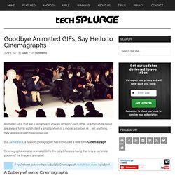
Be it a small portion of a movie, a cartoon or… err, anything, they’ve always been heavily popular. But Jamie Beck, a fashion photographer has introduced a new form: Cinemagraph. Cinemagraphs are also animated GIFs, the only difference being that only a particular portion of the image is animated. A Gallery of some Cinemagraphs Some more Cinemagraphs Thanks to Steve Marsel for sending in his works: Thanks to Amit for letting me know about it.
Infographics & Data Visualization. The State of Social Media. The Scale of the Universe 2. The Scale of the Universe 2. Infographic: 50 Unbelievable Facts About Earth.