
The Racial Dot Map: One Dot Per Person for the Entire U.S. Population Pyramids of the World from 1950 to 2100 - PopulationPyramid.net. UK Population Projections. Maps of Census 2011 data. World Population Clock: 7.5 Billion People (2017) World Population: Past, Present, and Future (move and expand the bar at the bottom of the chart to navigate through time) The chart above illustrates how world population has changed throughout history.
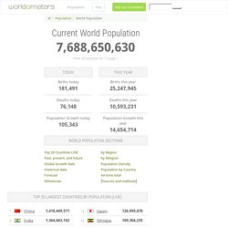
View the full tabulated data. At the dawn of agriculture, about 8000 B.C., the population of the world was approximately 5 million. Over the 8,000-year period up to 1 A.D. it grew to 200 million (some estimate 300 million or even 600, suggesting how imprecise population estimates of early historical periods can be), with a growth rate of under 0.05% per year. Population Clock. Migrations Map: Where are migrants coming from? Where have migrants left? 7 signs Japan has become a 'demographic time bomb' A Japanese soccer fan wipes her tears as Japan loses their 2014 World Cup soccer match against Colombia, at a public viewing event in Tokyo.Reuters/Issei Kato Japan is dealing with what economists call a "demographic time bomb.

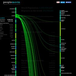
" Through a vicious cycle of low fertility and low consumer spending, the country's economy has gradually shrunk over the last 25 years. People are living longer, and they're heaping greater social-security costs onto younger generations who aren't having kids to replace them — thereby furthering the cycle. Here are some of the most visible signs in daily life that the time bomb is ticking. Adult diapers outsell baby diapers. Peoplemovin - A visualization of migration flows. World Population: 6,853,328,460 Migrants in the world: 215,738,321 Almost 216 million people, or 3.15% of the world population, live outside their countries.
Syria Regional Refugee Response - Regional Overview. Crossing the Mediterranean Sea by Boat. Mapping and Documenting Migratory Journeys and Experiences.

Global international migration flows. The Global Flow of People. International Organization for Migration. UNHCR - The UN Refugee Agency. OECD.org. The Age of Migration, Stephen Castles, Hein de Haas and Mark J. Miller - Palgrave Macmillan. Immigration and asylum. Women at work - Trends 2016: Map: Explore the gender labour gap around the world. Economist. 'I don't want any more sadness in my life' - comedy theatre about life in the Calais refugee camp. Iceland Invaders: Coping with the numbers. It’s been called the Game of Thrones effect.

This year, Iceland expects to host 2.4 million tourists, most searching for the landscapes of ice and fire that served as backdrops for the universally successful TV series. However, such record-breaking numbers are taking a toll on the island’s culture and protected landmarks. The one-child policy in China - Centre for Public Impact. Legitimacy Stakeholder Engagement Weak The main stakeholder behind this initiative was the central government, which was very concerned that uncontrolled growth in the population could threaten the country's ambitions for prosperity.

There is no evidence of consultations with stakeholders at the local or institutional level before this policy was implemented. Chart: From Pyramids to Skyscrapers. From pyramid to bell to high-rise building — that is how the age structure of the world’s population will have developed from 1950 to 2100, according to UN calculations, which is a good thing.

It means that we can say farewell to the pyramid. which to many still symbolizes the ideal age structure of a population: lots of industrious young folks and few dependent old people. First and foremost, however, the pyramid means that in every age group many millions of people die. To illustrate this, imagine you could climb the stairs of the perfectly shaped German population pyramid of 1910. World population day in numbers. Animated Map: The 20 Most Populous Cities in the World by 2100. In Africa Alone, 13 Cities Will Pass NYC in Size The Chart of the Week is a weekly Visual Capitalist feature on Fridays.
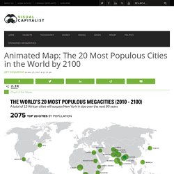
If you look at a modern map of the world’s most populous cities, you’ll notice that they are quite evenly distributed around the globe. Metropolises like Moscow, New York, Tokyo, Cairo, or Rio de Janeiro are spread apart with very different geographic and cultural settings, and practically every continent today can claim at least one of the world’s 20 most populous cities. Watch The Movements Of Every Refugee On Earth Since The Year 2000. In 2016, more refugees arrived in Uganda–including nearly half a million people from South Sudan alone–than crossed the Mediterranean Sea to Europe.
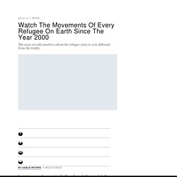
While the numbers in Africa are increasing, the situation isn’t new: As the world continues to focus on the European refugee crisis, an equally large crisis has been unfolding in Africa. A new visualization shows the flow of refugees around the world from 2000 to 2015, and makes the lesser-known story in Africa–and in places like Sri Lanka in 2006 or Colombia in 2007–as obvious as what has been happening more recently in Syria.
Each yellow dot represents 17 refugees leaving a country, and each red dot represents refugees arriving somewhere else. (The full version of the map, too large to display here, represents every single refugee in the world with a dot.) The lab began working on its Explorables project, a platform designed to help make sense of big data, four years ago. The Earth's population is going to reach 9.8 billion by 2050. In Brief According to the Population Reference Bureau's 2017 World Population Data Sheet, Earth will be home to 9.8 billion people by 2050.

This represents an increase of 31 percent in just 33 years, and it raises existing concerns about the threat of overpopulation. Billions and Billions The Population Reference Bureau has issued their 2017 World Population Data Sheet, and it asserts that the global population will reach 9.8 billion by 2050. Fact Sheet: Attaining the Demographic Dividend. (November 2012) Many countries in Asia and Latin America have experienced impressive economic growth over the last two decades, and researchers, economists, and demographers have attributed these gains in part to demographic changes that have facilitated growth. This demographic contribution to accelerating economic growth—the "demographic dividend"—is particularly misunderstood by leaders and decisionmakers in developing countries who, based on their large youth populations, are optimistic about the prospects for such a dividend.
This fact sheet aims to improve understanding of what investments are needed to attain the demographic dividend. More people live inside this circle than outside of it - and other demographic data you should know. As this circle created by Brilliant Maps shows, more people live inside this circle than outside of it. Circle centred on 106.6° East, 26.6° North, projected using GMT, created by BCMM - Brilliant Maps While the map looks surprising at first glance, it shouldn’t really once you consider it contains all or most of the world’s most populous countries: China, India, Indonesia (fourth), Pakistan (sixth), Bangladesh (seventh) and Japan (tenth). And according to the World Population Prospects 2017, a recently updated UN report, the world population will hit a staggering 9.8 billion by 2050. China (with currently 1.4 billion inhabitants) and India (with currently 1.3 billion inhabitants) will remain the two most populous countries, and Nigeria will overtake the United States to become the third-most populous country in the world.
4 maps that will change how you see migration in Europe. Did you know that Polish people represent the highest percentage of the foreign-born population in Norway? Or that the largest proportion of immigrants to the Republic of Ireland hail from the UK? These four maps, created by Jakub Marian, a Czech linguist, mathematician and artist, are based on a 2015 study by the United Nations on international migration. Scientists thought humans couldn't live past 115 - but now some say there could be no limit. Elderly South Korean women practice TaeKwonDo Chung Sung-Jun/Getty Images Jeanne Calment, the French woman who holds the record for the longest verified lifespan, died in 1997 at 122 years old.
Few people, of course, ever become supercentenarians — 110 years old or older — and even fewer hit 115. So few people have exceeded that age, in fact, that a group of researchers published an analysis in the journal Nature last year arguing that the human species' lifespan plateaus around 115. But a number of scientists are now rebutting that analysis with five separate commentaries published in Nature on June 28. These maps show you just how divided US cities are - even on education. This Is How Empty Canada Really Is (PHOTOS) Matt Hartzell's Blog: Maps: China's Internal Migration. I lived in China for six years, but it wasn’t until my last six months there that I stumbled upon one of the best-kept secrets on the Chinese internet, a question-and-answer web app called Zhihu.
On the surface, it’s a fundamentally simple concept, and not an original one either (it’s basically a Chinese language Quora, the popular English language Q&A app aimed at the intellectual crowd). Yet Zhihu is charting new ground, carving out what might be the most “civilized” niche in an otherwise unruly Chinese internet, a place where knowledge is prized, critical thinking and debate are welcomed, and free speech makes a solid stand. As a window in on the hopes, dreams, and concerns of contemporary intellectual Chinese youth, Zhihu is indispensable. When I started using Zhihu last September I thought I’d be asking more questions than answering them. The following essay of mine was originally published in China US Focus on June 3, 2015 Not so fast. 4 Maps Crucial to Understanding Europe's Population Shift - CityLab.
Mapping Europe's Demographic Shifts, 2006-2016 - CityLab. 5 charts that show how migration is changing the world’s cities. Fertility Rate. More precisely it is average number of children that would be born to a woman over her lifetime if 1) the woman were to experience the exact current age-specific fertility rates through her reproductive years and 2) the woman were to survive from birth through the end of her reproductive life (most institutions define this age bracket as 15-49 years).
A. Global trends in consumption - #IBGEOG19. Economist. Italy is older than ever as birthrate falls to all-time low. Nearly 23 percent of Italy's population is over 65. This disease kills half the people who get it, but you've probably never heard of it. Where are the UK's youngest and oldest city populations? Image copyright Alamy. Women Lose Out to Men Even Before They Graduate From College. Britons living in rest of EU are mainly working age, not over-65s.
Income Mobility Charts for Girls, Asian-Americans and Other Groups. Or Make Your Own. China, India grapple with the consequences of too many men, Asia News. With 250 babies born each minute, how many people can the Earth sustain? He was one of millions of Chinese seniors growing old alone. So he put himself up for adoption. JlWMlhMoc9Nt5vheJQzc3CR0976US3aAFdvHzgRO27U.
How refugees can actually create jobs for locals in growing cities – if given the chance. Subscribe to read. The US fertility rate just hit a historic low.