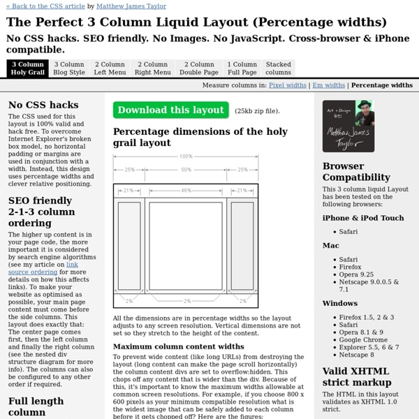
The Perfect 3 Column Liquid Layout: No CSS hacks. SEO friendly. iPhone compatible.
http://matthewjamestaylor.com/blog/perfect-3-column.htm
HTML5 Video
Introduction In modern browsers, adding a video to your page is as easy as adding an image. No longer do you need to deal with special plug-ins or require crazy markup, you can do it with a single element.
Top 10 Tutorials for Converting PSDs to HTML/CSS
Get the FlatPix UI Kit for only $7 - Learn More or Buy Now Many web designers start a new project by designing a mockup in Photoshop before actually coding the website. For a designer who is comfortable with Photoshop and with this process, less time can be used to create the end result.
Fix Your Site With the Right DOCTYPE!
You’ve done all the right stuff, but your site doesn’t look or work as it should in the latest browsers. Article Continues Below You’ve written valid XHTML and CSS. You’ve used the W3C standard Document Object Model (DOM) to manipulate dynamic page elements. Yet, in browsers designed to support these very standards, your site is failing. A faulty DOCTYPE is likely to blame.
The Best Social Media Icons All In One Place
464 shares 8 Free & Useful Minimal Icon Sets Icons are certainly a very important element of a design.
Create A Responsive Imagemap With SVG
While traditional imagemaps remain a very effective UI pattern for certain sites – especially those that need a visitor to enter a geographical location, or used in navigation that has a particularly strong visual theme – they bring with them two significant disadvantages that make them ill-suited for modern web development: Imagemap hotspots can take a long time to plot out, and are difficult to modify once created. Traditional imagemaps cannot be made responsive; while the image can be rescaled, the imagemap coordinates will not, meaning that hotspots will drift out of registration with the underlying image as the picture is resized. I’ve shown how to recreate simple imagemaps with SVG shapes, but that version did not incorporate bitmaps. As we’ll see, it’s entirely possible to integrate the two formats together.
50 Excellent Digital Photography Photoshop Tutorials
Advertisement Adobe Photoshop is the industry standard for digital-image editing and graphics creation. Photoshop’s versatility makes it a popular choice among Web designers, graphic designers, digital media artists, print designers, photographers and other professionals in design and image-editing. Whether you’re designing a business card or website or digitally enhancing an image, you can rest assured that Photoshop will give you the necessary tools to get the job done.
2 Column CSS Layout: Fixed Width And Centered
One of the more common css layout patterns you’ll come across is the fixed width 2 column layout. It’s relatively easy to code and understand, though it sometimes trips up developers new to css layouts. A few weeks ago I promised to offer boilerplate code for some common css layout patterns.
List of Really Useful Tools for CSS Developers
Regardless of size and scope of your project, CSS development process can take quite a lot of time. Even if you are an experienced CSS developer; having good set of tools at your disposal can drastically improve your productivity. W3Avenue has compiled a list of really useful CSS tools that will help you increase both your productivity and knowledge. We have categorized these tools under various categories to help you easily find the right tools for your needs. Layouts
Make SVG Responsive
Cet article est également disponible en français For an image format that features infinite scalability, SVG can be a surprisingly difficult format to make responsive: vector images do not adjust themselves to the size of the viewport by default. Make A Responsive SVG Image As an image, you can make a SVG vector illustration scale with the page content as you would any other: While this works in many cases, sometimes it isn’t enough, especially if you’re trying to embed the SVG illustration via an <object> tag or entering the code directly into the page.
Related:
