Brooding Cityscapes Painted with Oils by Jeremy Mann
San Francisco-based artist Jeremy Mann executes these sublime, moody cityscapes using oil paints. To create each work he relies on a wide range of techniques including surface staining, the use of solvents to wipe away paint, and the application of broad, gritty marks with an ink brayer. The resulting paintings are dark and atmospheric, urban streets seemingly drenched in rain and mystery. Mann’s work is in no way limited to cityscapes, he also paints the human figure, still lifes, and landscapes. He currently has work at John Pence Gallery and you can see many more of his cityscapes here.
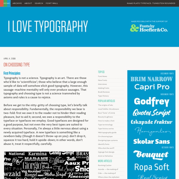
Great New Typography Design Inspiration - 51 Examples
The visual culture that surrounds you relies strongly on typography: movies, magazines, posters, packaging designs and websites. Designers treat this idea as a solid base for their whole work and are aware that typographic experience is as emotional as any pictorial masterpiece. What people, not only designers, should know is that type is not only movable, but it also has the power to move and that is really important when considering a typographic design because you’ll have more chances of sending a message than with a simple design that doesn’t focus on typography.
The 100 best free fonts
In this freshly updated free fonts for designers post, we bring you the world's best free fonts. We've filtered out the diamonds from the thousands of less perfectly designed free fonts available online, for you to use in your designs and illustrations. Get Adobe Creative Cloud now This list represents the 55 best free fonts we've found in eight categories. You can use the drop-down menu at the top of the page, or the boxout, right, to jump to the section you want. Don't forget, we have many other articles covering specialist font types including handwriting fonts, kids' fonts, cursive fonts, beautiful fonts, web fonts, professional fonts and more.
Stumblers Who Like Most Amazing Miniature Food Artworks by Shay Aaron
Shay Aaron is a brilliant artist from Israel who makes the most astonishing miniature food jewelry. These foodstuffs look so beautiful that we would desire to eat them. Actually, there’s a whole market out there for miniature food.
10 rules for Better Typography Design Design Article
One of the biggest things I have seen destroy a nice design is bad use of typography. A block of text should be inviting to read and not look like a chore. I'm going to provide a few principles and tips to help you avoid a lot of common typography mistakes. This isn't a comprehensive article on the art of typography, it's more of a "quick tips for better type design" kind of thing. I don't like to use the word "rules", because it makes people think they will go to jail for breaking them.
Mexout on Behance
Mexout is a fresh-mex eatery in Singapore. We imagine Mexout to be a young eccentric Mexican food expert, or "Mex'pert" as we've coined it, who i… Read More Mexout is a fresh-mex eatery in Singapore. We imagine Mexout to be a young eccentric Mexican food expert, or "Mex'pert" as we've coined it, who is living in his parents' basement.
How to Create 3D Type in Perspective in Illustrator CS6
In this tutorial you will learn to create 3D Typography using the Perspective Tool, Blends and some of the new features of Adobe Illustrator CS6. Step 1 Start by creating the text or shapes in 2D. This particular effect works best with bolder text with a wider surface area.
Stormtrooper, Donald Duck, and More
This is the latest (2013) sketchbook drawings of French illustrator Pez . His work is done with different grades of pencils, and it is amazing the three-dimensionality. See also: “ Drawings Come to Life ” and “ 3D Drawings .” Photos © Pez Via Behance Network
20 Historic Black and White Photos Colorized
One of the greatest facets of reddit are the thriving subreddits, niche communities of people who share a passion for a specific topic. One of the Sifter’s personal favourites is r/ColorizedHistory. The major contributors are a mix of professional and amateur colorizers that bring historic photos to life through color. All of them are highly skilled digital artists that use a combination of historical reference material and a natural eye for colour. When we see old photos in black and white, we sometimes forget that life back then was experienced in the same vibrant colours that surround us today. This gallery of talented artists helps us remember that :)
Drawing within Photography
Home » Drawing » Incredibly Creative Pencil Drawings vs Photography 465K Flares465K Flares × Today we are listing incredibly creative and amazing pencil drawings vs photography work of Ben Heine from Belgian, who is a painter, illustrator, portraitist, caricaturist and photographer.

Choosing the right font is crucial for your visual communication project. Here are some tips to help you decide which type of font is right for your project! by baileykretz Oct 1