
Gapminder: Unveiling the beauty of statistics for a fact based world view. - Gapminder.org. Knoema - Home. Statistiques mondiales écologiques. Développement Durable, Investissement Socialement Responsable (ISR) - Responsabilité Sociale de l'Entreprise (RSE) Ecobase 21 - L'encyclopédie du Développement Durable. Carbon map infographic: a new way to see the Earth move.
How can you map the world to show global data in an immediately clear way?
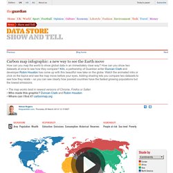
How can you show two datasets at once to see how they compare? Kiln, a partnership of Guardian writer Duncan Clark and developer Robin Houston has come up with this beautiful new take on the globe. Watch the animated intro or click on the topics and see the map move before your eyes. Adding shading lets you compare two datasets to see how they relate – so you can see clearly how poorest countries have the fastest growing populations but the lowest emissions • The map works best in newest versions of Chrome, Firefox or Safari• Who made this graphic?