
Graph Visualization for Neo4j: Tools, Methods and More. Graph Visualization for Neo4j Goals This article reviews the different tools available for visualizing graph-based data.
Prerequisites You should have familiarized yourself with Graph Databases and the Property Graph Model. Beginner Overview Screencast: The Neo4j Browser Presentation: SVG-Based Graph Interaction Library: Alchemy.js Open Source… Learn More → Developer Working with Data Goals This article reviews the different tools available for visualizing graph-based data. Prerequisites You should have familiarized yourself with Graph Databases and the Property Graph Model. Beginner Overview Graph visualisations are a powerful tool to convey the content of a graph. In all cases, the visualizer request JSON data for all or part of the graph data then dynamically creates an in-memory JavaScript visualization on the client side.
Product - Linkurious - Understand the connections in your data. Processing.org. JsPlumb 1.7.4 demo - animation (Vanilla) Angular gauge. Arbor.js. Auto-table-to-chart - AttC - Automatically convert a html table to Google Chart. Mindmapping, concept mapping in 3D. Thinkmap visualization software facilitates communication, learning, and discovery. Facts are sacred: the power of data - out now on Kindle and iBooks. We have a new ebook out for Kindle and it's about how we work with data at the Guardian - and how that data is changing the world around us. It's available now in the US, Canada and around the world - having been published in the UK just before Christmas.
What's in it? It's a combination of original writing and the best data coverage from the Datablog and Datastore. "Comment is free," wrote Guardian editor CP Scott in 1921, "but facts are sacred". Ninety years later, publishing those sacred facts has become a new type of journalism in itself: data journalism. It will be available on as an enhanced iBook soon too, complete with videos and graphics. • Buy it on Amazon.co.uk• Buy it on Amazon.com • Buy it on iBooks• Published as enhanced iBook soon You don't have to have a Kindle or an iPad - here's how you can read it on your PC or Mac. Contents include: Infographics old and new: top data visualisations, in pictures.
There is an infographic boom going on out there - with the internet flooded with data visualisations of the way we fight war, how we use Twitter, what music we like and how we use the, er, internet. But new as these are, there's a long tradition of telling stories using graphics. Guardian definitive atlas of UK government spending Information Graphics from Taschen, which includes work from the Guardian such as our public spending chart, tells the story of how information graphics came to rule our world. We've selected some of those from the past - to contrast with some key infographics from the past few years - albeit missing out hundreds of examples we could have chosen from the years inbetween. These are some of the images. Information Graphics from the Guardian bookstore at a discount price of £35.99 1858 Histoire Universelle Fold-out print depicting all of human history This Table of Universal History was published in Paris. 1926 Kahn Fritz Kahn 1940 Geis Geis 1940 2006 Esquire.
Gource - software version control visualization. ChronoZoom: A Timeline for Big History. Video from The 2012 R.
Lowry Dobson Memorial Lecture featuring Walter Alvarez, Big History and ChronoZoom now online! ChronoZoom 2 beta in HTML5 has arrived! Please visit www.ChronoZoomProject.org/ to try it now. ChronoZoom. Visualisation of Ontologies and Large Scale Graphs. For a whole number of reasons, I am currently looking into the visualisation of large-scale graphs and ontologies and to that end, I have made some notes concerning tools and concepts which might be useful for others.
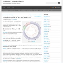
Here they are: Visualisation by Node-Link and Tree jOWL: jQuery Plugin for the navigation and visualisation of OWL ontologies and RDFS documents. Visualisations mainly as trees, navigation bars. OntoViz: Plugin into Protege…at the moment supports Protege 3.4 and doesn’t seem to work with Protege 4. IsaViz: Much the same as OntoViz really. NeOn Toolkit: The Neon toolkit also has some visualisation capability, but not independent of the editor. OntoTrack: OntoTrack is a graphical OWL editor and as such has visualisation capabilities. Cone Trees: Cone trees are three-dimensional extensions of 2D tree structures and have been designed to allow for a greater amount odf information to be visualised and navigated.
Gravity. Gravity - Personalizing the Internet. Datavisualization.ch Selected Tools.
d3.js. Graphics. Infographics. Information. Maps. Products. Samples.