
Information Architects – Web Trend Map 4. By Oliver Reichenstein The has been featured all across the web from TechCrunch to BoingBoing, and Gawker.
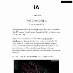
Now the latest version of our popular Web Trend Map is up for grabs. —The Web Trend Map plots the Internet’s leading names and domains onto the Tokyo Metro map. Domains and personalities are carefully selected through dialogue with map enthusiasts, and every domain is evaluated based on traffic, revenue, and character. La-carte-du-web.png (Image PNG, 6740x4768 pixels) Web Trend Map 4 by Information Architects Inc. Global-internet-map-2011-x.png (Image PNG, 2160x3000 pixels) - Redimensionnée (26.
Terence Kawaja Presentations Channel. The Internet map. PEER 1 Hosting Launches Map of the Internet App. Wednesday, March 6, 2013 - 04:00 While curiosity around the Internet has loomed since its inception, no one has been able to explain what the Internet physically looks like.

Today, I’m excited to share that we have officially launched our Map of the Internet app, which provides a stunning 3D visualization of the Internet and all of its autonomous systems worldwide, as well as how they are connected. In 2011, we took the first step in developing this visualization with the debut of our Map of the Internet infographic poster.
Driven by our continued passion for all things having to do with networking, we designed this app to further bring to life what the Internet looks like – and how the various autonomous components interact to connect the world. UPDATE: CNNMoney has posted a video review and demonstration of the app here. Users can view Internet service providers (ISPs), Internet exchange points, universities and other organizations through two view options – Globe and Network. Heeft-iemand-hyves-gezien.jpg (Image JPEG, 1000x2075 pixels) Map Of Online Communities: 2010 vs. 2007 (PICTURES) XKCD's Randall Munroe, who created a popular, just-for-fun, pseudo-scientific Map of Online Communities in 2007, has revamped his previous infographic.
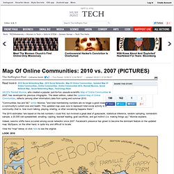
The latest edition, called the Updated Map of Online Communities, reflects (among other information) data from spring and summer 2010. "Communities rise and fall," writes Munroe, "and total membership numbers are no longer a good measure of a community's current size and health. This updated map uses size to represent total social activity in a community--that is, how much talking, playing, sharing, or other socializing happens there. " The 2010 estimates "are based on the bet numbers I could find, but involved a great deal of guesswork, statistical inference, random sampling, nonrandom sample, a 20,000 cell spreadsheet, emailing, cajoling, tea-leaf reading, goat sacrifices, and gut instinct (i.e. making things up)," Munroe explains.
Indeed, seismic shifts have occurred among social networks since 2007. Via XKCD. Find out where you are on the Cyberthreat map / Узнай, где сейчас кипит кибервойна. PageAccueil. Web ranks & stats. Internet World Stats - Usage and Population Statistics. Newsroom_UK_InternetOfThings_1024x1448.jpg (Image JPEG, 1024x1448 pixels) - Redimensionnée (55%) FI-WDD-interb34a-6b230.gif (Image GIF, 460x5145 pixels) The-map-is-the-territory. Many people will have heard of the infamous swastika made up of larches that revealed itself every autumn in a forest outside Berlin.
The trees, which turned yellow at the end of the year, stood out against the otherwise evergreen pine forest. Web Map (World Wide Web - Interactive Map) Web 2.0 Digitage 2012. We Have No Maps of The Web. We dream the internet to be a great public meeting place where all the world’s cultures interact and learn from one another, but it is far less than that.
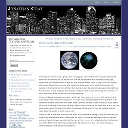
We are separated from ourselves by language, culture and the normal tendency to seek out only what we already know. In reality the net is cliquish and insular. We each live in our own little corner, only dimly aware of the world of information just outside. In this the internet is no different from normal human life, where most people still die within a few kilometers of their birthplace. Nonetheless, we all know that there is something else out there: we have maps of the world.
I have met people who have never seen a world map. Online, we are all that man. We can remedy this. First, language. Another kind of invisibility results from gaps in media coverage. Visualize your LinkedIn network. Internet Mapping Project. Internet Mapping Project. Atlas of Cyberspace - Full Content.
Atlas of the World Wide Web. The Web 2.0 Summit Points of Control Map. Social Media Landscape Redux. A new version of this landscape has been published here: Social Media Lanscape 2011.
Following last year’s first version of my Social Media Landscape, I am induced to publish a new version to sync with the market’s latest evolutions. And I a not the only one: The Conversation Prism v2.0. This new landscape is now spitted into four main usages (expressing, sharing, networking, playing) and is structured around social platforms which ambition is to cover each user’s needs.
The large size version is here : Social Media Landscape (redux). Four Main Usages The various tools and services displayed on this landscape are listed bellow. 1. Web2.0 schema-10.10-2010. Building A New Map And I Need Your Help: What Are The Key Categories of Data In Today's Network Economy? Many of you probably remember the “Points of Control” Web 2 Summit Map from last year, it was very well received.
Hundreds of thousands of folks came to check it out, and the average engagement time was north of six minutes per visitor. It was a really fun way to make the conference theme come to life, and given the work that went into its creation, we thought it’d be a shame to retire it simply because Web 2 has moved on to a new theme. As I posted last week, this year’s theme is “The Data Frame.” The french touch of Network Sciences.
The Opte Project. Here you will find static and dynamic 2D JPG/PNG images and 3D VRML maps of the Internet.
These maps are built off of our database using two different graphing engines: Large Graph Layout (LGL) by Alex Adai and Graphviz by Peter North at AT&T Labs Research. Each graphing engine produces wonderful displays, but they are only as good as the data and graphing language we provide. You can find our test images and some well produced full Internet maps below. Soon we will release the tools to create these maps on your own. How to view LGL data: You can view these maps with LGL View the LGL Java viwer (it requires JRE >= 1.4.1).
Connection-map.png (Image PNG, 4096x4096 pixels) - Redimensionnée (19%) Sites de musique et d'humour.
ATT_Labs_InternetMap_0730_10.pdf. Carte-forums - Powered by Google Docs. Cartoblog2.1. Map of the Internet. Wednesday, March 2, 2011 - 12:00 UPDATE: See and download our new Map of the Internet App released March 6th, 2013.
Click here. How many hours have you used the Internet today or in an average week? Do you even remember the first time you surfed the Interweb? It wasn’t that long ago when some of us didn’t even know what the Internet was. The_internet_2160x3240.jpg (Image JPEG, 2160x3240 pixels) - Redimensionnée (24. Mapa Visual de la Web 2.0. Network Mapping. So why would I want to create a network map?
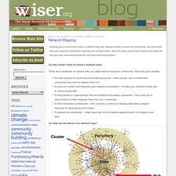
There are a multitude of reasons why you might want to map your community. Here are just a sample: To build a sense of community and shared purpose – when people ‘see’ a networked community they tend to believe more in itTo discover hidden sub-networks and network connections – to help your members know who to communicate withTo find people or organizations that are isolated and weakly connected – this could be an opportunity to better integrate them into your communityTo find information bottlenecks – this could be a chance to develop alternative ‘people’ channels for sharing key informationTo assess the community – initial maps can form a baseline against which to compare over time So what are the basics of a network map? Source: The Monitor Institute First let’s get some terminology out of the way. Une carte conceptuelle du web social. Web 2 Map: The Data Layer – Visualizing the Big Players in the Internet Economy.
As I wrote last month, I’m working with a team of folks to redesign the Web 2 Points of Control map along the lines of this year’s theme: “The Data Frame.” In the past few weeks I’ve been talking to scores of interesting people, including CEOs of data-driven start ups (TrialPay and Corda, for example), academics in the public dataspace, policy folks, and VCs. Along the way I’ve solidified my thinking about how best to visualize the “data layer” we’ll be adding to the map, and I wanted to bounce it off all of you.
So here, in my best narrative voice, is what I’m thinking.