
Munterbund.de. Graphical visualization of text similarities in essays in a book. Amaztype. Concept Maps. NetLogo Home Page. NetLogo is a multi-agent programmable modeling environment.
It is used by tens of thousands of students, teachers and researchers worldwide. It also powers HubNet participatory simulations. It is authored by Uri Wilensky and developed at the CCL. Diseño de sistemas interactivos centrados en el usuario - Toni Granollers i Saltiveri, Jesús Lorés Vidal, José Juan Cañas Delgado. Well-formed.eigenfactor.org : Visualizing information flow in science. Well-formed data.
News. I recently started playing with shaders in three.js and I wanted to share some of what I’ve discovered so far.
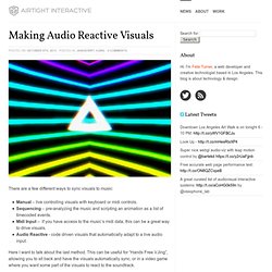
Shaders are the ‘secret sauce’ of modern graphics programming and understanding them gives you a lot of extra graphical fire-power. For me the big obstacle to learning shaders was the lack of documentation or simple examples, so hopefully this post will be useful to others starting out. This post will focus on using pixel shaders to add post-processing effects to Three.js scenes. This post assumes you already know the basics of using Three.js. What is a Shader? A Shader is a piece of code that runs directly on the GPU. The big conceptual shift when considering shaders is that they run in parallel. There are 2 main types of shaders – vertex shaders and pixel shaders. Vertex Shaders generate or modify 3D geometry by manipulating its vertices. Graphviz - Graph Visualization Software. Snake Oil? The scientific evidence for health supplements. See the data: bit.ly/snakeoilsupps.

See the static versionSee the old flash version Check the evidence for so-called Superfoods visualized. Note: You might see multiple bubbles for certain supplements. These is because some supps affect a range of conditions, but the evidence quality varies from condition to condition. For example, there’s strong evidence that garlic can lower blood pressure. This visualisation generates itself from this Google Doc. As ever, we welcome your thoughts, crits, comments, corrections, compliments, tweaks, new evidence, missing supps, and general feedback. » Purchase: Amazon US or Barnes & Noble | UK or Waterstones » Download: Apple iBook | Kindle (UK & US) » See inside For more graphics, visualisations and data-journalism: David McCandless: The beauty of data visualization. Gapminder: Unveiling the beauty of statistics for a fact based world view. - Gapminder.org.
Navigator. Quintura - visual search engine. Quintura - visual search engine Quintura - visual search engine for hotels ⚫ London hotels ⚫ Manchester hotels ⚫ Liverpool hotels ⚫ Bournemouth hotels ⚫ Cambridge hotels ⚫ Blackpool hotels ⚫ Cardiff hotels.
WikiMindMap. Spezify. Graphs Infographics. Thinkmap Visual Thesaurus - An online thesaurus and dictionary of over 145,000 words that you explore using an interactive map. 50 Great Examples of Data Visualization. Wrapping your brain around data online can be challenging, especially when dealing with huge volumes of information.

And trying to find related content can also be difficult, depending on what data you’re looking for. But data visualizations can make all of that much easier, allowing you to see the concepts that you’re learning about in a more interesting, and often more useful manner. Below are 50 of the best data visualizations and tools for creating your own visualizations out there, covering everything from Digg activity to network connectivity to what’s currently happening on Twitter. Music, Movies and Other Media Narratives 2.0 visualizes music. Liveplasma is a music and movie visualization app that aims to help you discover other musicians or movies you might enjoy.
Tuneglue is another music visualization service. MusicMap is similar to TuneGlue in its interface, but seems slightly more intuitive. Digg, Twitter, Delicious, and Flickr Internet Visualizations. Mapping Science - Places & Spaces: Mapping Science. Liveplasma. Data Visualization, Design and Information Munging // Martin Krzywinski / Genome Sciences Center. Schemaball is a flexible schema visualizer for SQL databases.
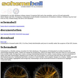
The purpose of Schemaball is to help visualize the relationships between tables. Tables are related by foreign keys, which are fields which store the value of a record field from another table. Foreign keys create a lookup relationship between two tables. Large schemas can have hundreds of tables and table relationships. Keeping track of them call can be tedious, error-prone and slow down the schema development process. Figure | A MySQL schema of our sequencing LIMS database. Schemaball produces images called schema balls. Schemaball is free software, licensed under GPL. I am not longer actively working on Schemaball. Schemaball was published in SysAdmin Magazine (Krzywinski, M. Ensembl balls! A visual exploration on mapping complex networks. Information aesthetics - Data Visualization & Information Design. Infoscopio. Big ideas worth pursuing. Shutterstock: Royalty-Free Subscription Stock Photography & Vector Art.
Flickr Related Tag Browser. Data Visualization, Infographics, and Statistics. Revista.