

Wwwhere. Responsive CSS Patterns without Media Queries. Let me start by saying that despite the title, this article is not about doing away with media queries or media query bashing in any way.
Media queries are incredibly useful and I use them all the time for all sorts of things. However, they don’t solve all our responsive design problems. It’s often desirable to effect changes to an arrangement of elements based on the dimensions of their container, rather than the viewport. To solve this problem, the concept of element queries was born. However, element queries aren’t really a thing yet, and Mat Marquis has demonstrated some problems with the concept and reformulated them as container queries. Hopefully they will be one day, but in the meantime, I’ve presented here a few tricks and techniques you can use to address some of the problems container queries will one day solve.
A color accessibility tool for designers and developers. Flexbox Cheatsheet Cheatsheet. While I am no stranger to the magic of Flexbox, I find that I am not using it very often just yet.
As a result I end up pausing and referring back to this post at CSS-Tricks whenever an opportunity to utilize its powers presents itself. I set out to create a quick visual to summarize Flexbox when I run into these moments of pause in the future. HTML Reference - A free guide to all HTML elements and attributes. HTML Reference - A free guide to all HTML elements and attributes. #NewInElementor: Revision History. Switch Between Previous Design Versions - Elementor. As Elementor has grown in popularity in the last few months, we started getting requests for more advanced features, meant to provide the web designer a better and more efficient workflow.
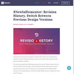
One recurring request has finally been answered on today's feature release, which is the first release for the new year. The new Revision History feature logs a revision every time you press save. This allows you to go back and forth between earlier versions of your page design, so your entire page design process is backed up, every step of the way. This is a super-useful feature, that will save you time, as well as ensure your work is never lost. How Does it Work? Imagine you are designing a homepage for a client, and you find out that the section you deleted half an hour ago was actually the best fit for the page. Clippy — CSS clip-path maker.
Avocode - PSD and Sketch to iOS and Android. Get Started with Debugging JavaScript in Chrome DevTools This tutorial teaches you the basic workflow for debugging any JavaScript issue in DevTools.
Read on, or watch the video version of this tutorial, below. Step 1: Reproduce the bug Finding a series of actions that consistently reproduces a bug is always the first step to debugging. Click Open Demo. Webdesign.tutsplus. Powerful set of key features : User Testing. Formsite - Online Form Builder. Create HTML Forms & Surveys. Inspect—Pixel-perfect design handoffs for your team. Website Downloader. Newsletters spam test by mail-tester.com. Mitya - Bring your ideas to life. Monitory. Surveillance de vos sites et serveurs. Monitority est un outil de veille automatique qui va vous permettre de mettre sous surveillance votre ou vos sites Internet.

Comment être prévenu si quelque chose ne va pas sur votre site ou sur votre blog ? C’est le cauchemar de tout éditeur ou rédacteur de site. Un site « down » trop longtemps et ce sont des revenus perdus, des lecteurs déçus, une image écornée. Si personne n’est à l’abri d’une mésaventure de ce genre, la vitesse d’intervention est primordiale. Monitority va vous aider en mettant votre ou vos sites sous surveillance. Plusieurs services de veille de ce type existent sur le web. Monitority permet de monitorer des domaines, des urls et des adresses Ip. La mise en place de cette veille technique est on ne peut plus simple. Tout cela fonctionne très bien et Monitority vous permet de surveiller autant d’urls que vous voudrez. 15 Must-have Chrome extensions for web designers and front end developer. CSS - Shack. Gagnez du temps au démarrage de votre projet Javascript avec Mega Boilerplate.
Plus les applications web avancent, plus les stacks les composant sont imposants.

Structured Data Testing Tool. Keyword Density Tool. Optimize Images - PageSpeed Insights. This rule triggers when PageSpeed Insights detects that the images on the page can be optimized to reduce their filesize without significantly impacting their visual quality.
Overview Images often account for most of the downloaded bytes on a page. As a result, optimizing images can often yield some of the largest byte savings and performance improvements: the fewer bytes the browser has to download, the less competition there is for the client's bandwidth and the faster the browser can download and render content on the screen. Recommendations Finding the optimal format and optimization strategy for your image assets requires careful analysis across many dimensions: type of data being encoded, image format capabilities, quality settings, resolution, and more. PageSpeed Insights. Les bonnes pratiques de la qualité Web - Opquast Check-lists. CSSCO. Bootstrap 4: A Visual Guide to What’s New – WDstack – Medium. The Bootstrap Grid Has Changed Looking back at Bootstrap 3, the 4 grid tiers (‘xs’, ’sm’, ‘md’ and ‘lg’ breakpoints) worked looked like this..
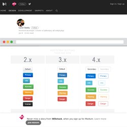
As you can see in Bootstrap 3, the smallest breakpoint has a wide range of devices less than 768px in width. Compresser des Images JPG en ligne. TwentyTwenty — WordPress Plugins.