
Hygiene ratings: an interactive map of UK food outlets. Air Pollution in Asia: Real-time Air Quality Index Visual Map. Environmental disease. Every death on every road in Great Britain 1999-2010. Britain has one of the best records in the world for road casualties.
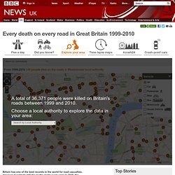
However, hundreds still die on the roads every year. In 2010, the police recorded 1,850 deaths, 22,660 people seriously injured and 184,138 who received light injuries. About the map: Using official data recorded by police in Great Britain between 1999 and 2010, we have plotted every road collision in which someone died. In all, 36,371 fatalities are marked on this interactive map. You will also find partial data for Northern Ireland, for 2004-2009.
How the data is gathered: Detailed information about each crash is recorded by the police at the scene. Missing data: As with any large collection of data, there will be errors and omissions. Here are answers to some of your frequently asked questions are here.. Europe's Deadliest Driving Countries. Calendar Visualization of Fatal Car Crashes. How Dangerous Is Your Street? Find Out With New Traffic Fatality Maps (video. ITO World maps traffic fatalities so you can see when and where accidents happen.
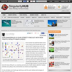
Ever wonder how safe that street corner is you cross or turn at every day on your way to work? It seems busy, sure, but you’ve never actually seen an accident, much less anyone killed. You might’ve suspected, assuming you’d heard of it, that the information was available in the Fatality Analysis Reporting System (FARS) put out by the US National Highway Traffic Safety Administration but don’t have the time to sift through all their complicated data tables. Well UK-based transport data mavens ITO World has just done the heavy lifting for us, compiling vast amounts of traffic fatality data from multiple websites and putting it into a format that’s as intuitive as Google Maps. It’s the old tables and charts age catching up with the web interface technologies of today. Right now ITO World has created maps for the US and the UK, and are currently working on a map for Canada.
Graphic: South East England water levels and drought mapped. UKradon. Welcome to Eye On Earth. Mapping a Lifetime of Health Risks - Technology. Waking up in the hospital after a heart attack, Bill Davenhall, a health-care manager with the geographic information systems software developer Esri, wondered whether the disease that nearly took his life might have been predicted by the pollution he’d been exposed to since birth.
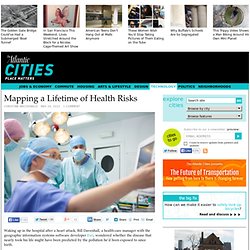
He put his GIS skills to work, mapping his proximity to coal mining pollution growing up in Scranton, Pennsylvania. Then, he added the Midwestern industrial emissions and Los Angeles smog he breathed regularly in later years. When he cross-referenced those pollutants to their known health risks and mortality data, a connection to his heart troubles emerged. Since then, he has traveled the globe speaking to audiences and advising governments on geo-medicine, an emerging field that uses GIS mapping to correlate environmental conditions to health risks like heart attacks and cancer.
Geo-medicine can zoom in on a patient’s life to create a geographically enhanced medical history. Some doctors are skeptical. HEIMTSA > Home. Integrated Environmental Health Impact Assessment Tool. Health Impact Assessment Toolbox - contacts.