
Ilha Formosa on Behance - Nightly. We Feel Fine / by Jonathan Harris and Sep Kamvar - Nightly. Pavel Risenberg - Nightly. Noosphere - Wikipedia, the free encyclopedia - Nightly. Pavel Risenberg - Nightly. Visualize This: The FlowingData Guide to Design, Visualization, and Statistics. How To Create Outstanding Modern Infographics. The Anatomy Of An Infographic: 5 Steps To Create A Powerful Visual. Information is very powerful but for the most bit it is bland and unimaginative.

Celebrating Excellence in Data Visualization and Information Design - Nightly. Web Tools - Information Is Beautiful Awards - Nightly. Infographic Inspiration on Vimeo - Nightly. Graphing every idea in history. Beer versus church mapped. Map of the Internet. Ruslan Enikeev created a searchable Internet map of links and bubbles, showing over 350,000 sites and two million links from 196 countries.
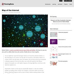
Similar sites are closer together. As one might have expected, the largest clusters are formed by national websites, i.e. sites belonging to one country. For the sake of convenience, all websites relative to a certain country carry the same color. For instance, the red zone at the top corresponds to Russian segment of the net, the yellow one on the left stands for the Chinese segment, the purple one on the right is Japanese, the large light-blue central one is the American segment, etc.Importantly, clusters on the map are semantically charged, i.e. they join websites together according to their content.
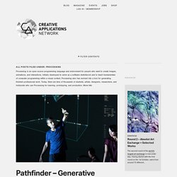
Paintings as pie charts. OpenProcessing - Share your sketches! - Nightly. CreativeApplications.Net - Nightly. Created by Princemio in collaboration with onformative, the Pathfinder project was created with aim to contribute to the creative processes of choreographic development.
RC4 in London researches computational design methodologies for large-scale 3D printing with industrial robots, taking logistical, structural and material constraints as design opportunities to generate non-representational architectural spaces with extreme information density. Created by LUSTlab in collaboration with The Mobile City, Binnen de Lijnen is part of an ongoing research project called Public Space – Public Matter from Trancity.
Over 100 children took part in colouring the playground which visualised the spatial organization of Schilderswijk’s social life. Series of works exploring the subject of drawing images in the space around the earth using latitude, longitude and altitude as a coordinate system. Every once in a while a project comes along that will change how we think, discuss and produce digital art. City Symphonies - Mark McKeague - Nightly. City Symphonies Can the city become a symphony?
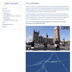
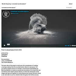
Electric cars are increasingly using synthesised sounds in order to mimic the recognisable noise of the internal combustion engine. I explore an alternative in which the sound that the cars generate changes according to its relationship to other road users and the environment. A traffic simulation is used to power the movement of vehicles through different sections of road networks in London. From a street level perspective the motions of traffic combine the sounds to create soundscapes that are unique to the place and time. We Are Chopchop / » “unnamed soundsculpture” - Nightly. Project by Daniel Franke & Cedric Kiefer produced by:onformativeChopChop Documentation: vimeo.com/38505448 Text: Sandra Moskova The basic idea of the project is built upon the consideration of creating a moving sculpture from the recorded motion data of a real person.
Studio Sketchpad - Processing on Etherpad - Nightly. Infographic: The Digital Promise. When Art Meets Science, You'll Get The Picture. Hide caption Student scientist Araw Akram discovered that fruit flies that eat nonorganic produce have lower reproduction rates than insects that eat organic food. Manuel Guzman/Intel Hide captionRaghav Tripathi showed for the first time that two proteins in brains combine to cause neuronal death and progression of Alzheimer's disease. Brett Yasko /Intel Hide caption Angie Pamela Marin-Acuna, Melina Jimenez-Porras and Maylin Patricia Valverde-Torres created a new software system for transferring patient information from ambulances to hospitals to minimize human error and provide better care. Thomas Ng/Intel Hide caption Teenagers' brains are still maturing. Erendira Citlalli Diaz de Leon developed a new software tool she used to measure the activity of brain areas separately, to track development of key regions.
Hide captionContaminated water is still a major cause of childhood death worldwide. Science and Health Infographics From The New York Times. September 1, 2010 | Updated On Monday we kicked off “infographics week” on the blog.
Yesterday we ran down some of the best infographics on NYTimes.com for teaching social studies, current events, politics, history and economics. Tomorrow we’ll provide a list for language arts and fine arts. Here, now, are Times infographics for teaching various topics in health and science. Many of them not only render complex information easy to understand, but are also lovely and elegant. Who ever said that art and science were opposites? Make Your Own Infographic. Infographics are to data what storytelling is to an annual report: a more engaging way to help bring attention and understanding to your nonprofit’s cause.
Yesterday we looked at an interesting infographic that suggested a new way to view your volunteers. Today, let’s look at infographics in general – and resources to help your nonprofit get started on making your own. As Wikipedia explains, “Information graphics are visual devices intended to communicate complex information quickly and clearly”: Information graphics or infographics are visual representations of information, data or knowledge.
These graphics are used where complex information needs to be explained quickly and clearly, such as in signs, maps, journalism, technical writing, and education. ... 10 Awesome Free Tools To Make Infographics. Advertisement Who can resist a colourful, thoughtful venn diagram anyway?

In terms of blogging success, infographics are far more likely to be shared than your average blog post. XMind: Professional & Powerful Mind Mapping Software - Nightly. TIZIANO Map 030410-copy.jpeg (JPEG Image, 3195 × 1945 pixels) - Scaled (39%) - Nightly. Gallery - Nightly. The "Gallery" section is new to our website.
We hope to build a strong VUE community of users and thinkers. We need your help in creating a stimulating gallery area, showcasing your uses of VUE. Let us know about your maps and stories, and we will post them on this page. Featured Maps Patrick Szucs explains the use as a Tool for the Construction of Narrative. Eva Gladek of Except Integrated Systainability uses VUE to create system maps, read more about how they use VUE here. Tufts University Open Educational Resources (OER) Tufts University has been a leader in the Open Educational Resources (OER) movement, particularly in the health sciences.
Features - Nightly. Enhanced Pathways and Presentation Tools VUE’s unique pathways tool now supports the construction of interactive presentations.
The pathways tool allows the presenter and audience to focus in on specific content while at the same time maintaining a sense of its overall context within a VUE map. VUE authors may also navigate their pathways in a linear or non-linear fashion, allowing for “just-in-time teaching” and more in-depth exploration of a topic. Creating Pathways (Video running time: 48 sec.) Gallery - Nightly. Introduction I am an extremely visual person; the proposition or axiom that thought cannot exist without language is a proposition that is absurd. Visual Understanding Environment (VUE), a program that I have yet to discover the full potential of, has proven, for me, a useful tool in the translation of abstract non-symbolic concepts into symbolic, objective form; as importantly, it has proven useful in taming the nonlinear beast of thought by corralling it into the linear format of the written word.
Conveying thought through writing is largely a task of organizing things linearly that have a non-linear nature; this organization creates the need for a narrative to be formed (this is true for both fiction and non-fiction), a narrative that usually is only one of many possible narratives. Click for full image Nodes. Visual Understanding Environment - Nightly. yEd - Graph Editor - Nightly. yEd is a powerful desktop application that can be used to quickly and effectively generate high-quality diagrams. Create diagrams manually, or import your external data for analysis. Our automatic layout algorithms arrange even large data sets with just the press of a button. yEd is freely available and runs on all major platforms: Windows, Unix/Linux, and Mac OS X. The latest release is version 3.12.2 Key Features. Gephi, an open source graph visualization and manipulation software - Nightly.
Dex - Nightly. Data Explorer, or Dex is a tool for exploring data. Dex is a JavaFX application which aims to provide a general purpose framework for data visualization. The basics are easy to learn, however Dex offers advanced capabilities in the form of SQL and groovy transformations. Dex integrates many excellent visualization frameworks into one consistent GUI package. This is an early release, so you are likely to find functional gaps for your particular problem space. Dex - Nightly.