
Oh, shit, git! CSS flexbox with order animation. Date : 13th May 2016 For all modern browsers but animation of order only supported by Firefox This demo is too wide for your mobile screen.Please view on a tablet or PC.
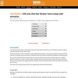
Information I am not sure if this menu is of any real use, but it does demonstrate the use of 'flexbox' layout for menus and the animation of the 'order' style. At the moment the 'order' animation is only supported by Firefox, so if you are using this browser and you click the '6. You can then click the same top level item to close the sub menu and return the top level to its original position in the list, or you can click another top level item to close the current open sub menu and return the current top level to its origianl position and then move the selected item to the top of the list and open its sub menu. Can't wait for the 'grid' layout style to be supported by all the latest browsers. Copyright Because of all the time and effort spent in producing this demonstration I would ask that you respect my copyright. Pure CSS icons. Set Up Persistence with DevTools Workspaces. CSS Flags. Interactive 3D Mall Map. Family.scss.
Inspiration for Custom Select Elements. GitHub - cubiq/iscroll: Smooth scrolling for the web. Git Community Book. Sliding Panels Template in CSS and jQuery. A simple portfolio template, with project preview images that slide out to reveal the selected project.
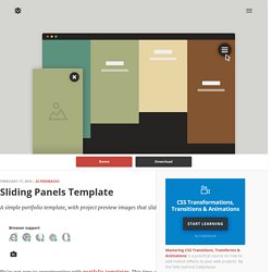
Browser support ie Chrome Firefox Safari Opera 9+ We’re not new to experimenting with portfolio templates. This time, we’ve been playing around with the idea of moving blocks of content as a way to transition from the main/gallery page to the project page. All panels move along the y-axis (x-axis on smaller devices), and the movement is triggered by whether the user wants to learn more about a project, or wants to access the navigation. Images: unsplash.com Creating the structure The HTML structure is composed of two unordered lists, the ul.cd-projects-previews for the project preview images and the ul.cd-projects for the project details, and a nav.cd-primary-nav wrapping the main navigation. Adding style On small devices, each project preview <li> has width equal to the viewport width and height equal to one-fourth of the viewport height (4 projects in our demo). Zell Liew's blog about web design and development.
I talked about using rem and em for responsive typography and for building modular components in two blog posts previously.
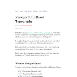
In both posts, comments about viewport based units inevitably comes into the picture. I resisted working with viewport units for a while, believing that using them would be a pain in the ass because of the calculations involved. Last week, I finally overcame the resistance and took a stab at exploring viewport units and how to use them in responsive typography.
Material Slider Dots. Documentation. Documentation Reference Reference Manual The official and comprehensive man pages that are included in the Git package itself.
Quick reference guides: GitHub Cheat Sheet | Visual Git Cheat Sheet Book Pro Git. Localfont.com - Download fonts from googlefonts. SVG Icons - Ready to use SVG Icons for the web. Blueprint: Multi-Level Menu. A simple multi-level menu with delayed item animations and an optional breadcrumb navigation and back button.

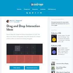
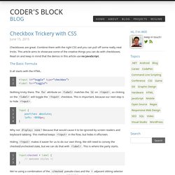
View demo Download source Today’s Blueprint is a simple menu with multiple levels. The idea is to animate each menu item once a level is changed. The animation starts with the item clicked and the delays are propagated through the neighbors. The animation delays follow the same logic for the incoming items of the new level of the multi-level menu. Drag and Drop Interaction Ideas. Some ideas for drag and drop interactions in a UI.
The idea is to show a droppable area that stands for certain actions after an element is being dragged. View demo Download source Sometimes we wonder how to pack all those possible actions into a UI. From buttons to drop-downs to menus—there are certainly many possibilities. Pixel Map Generator. Get the code. Coder's Block Blog / Checkbox Trickery with CSS. Checkboxes are great.
Combine them with the right CSS and you can pull off some really neat tricks. This article aims to showcase some of the creative things you can do with checkboxes. Read on and keep in mind that the demos in this article use no JavaScript. The Basic Formula It all starts with the HTML. Nothing tricky there. Inspiration for Text Styles and Hover Effects. Stampede Blog - Responsive Bootstrap Push Menu Tutorial. Getting bored with the current responsive Bootstrap menu?
Or you simply don't want to use Bootstrap 3 dropdown menu on mobile because the menu is just too tall? CSS3 Border-Image Explained. One of the more powerful new CSS properties, border-image is also one of the best supported, with the exception of (all together now) IE10 and earlier.
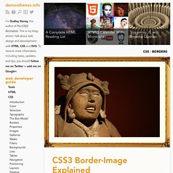
It is, unfortunately, also one of the most obtuse and difficult to understand. The explanation of how border-image works is perhaps best illustrated graphically. Audio canvas analyser spectrum 360 degree. Quantity Queries for CSS. Don’t you just hate documentaries that don’t deliver?
They have enticing names like In Search of the Giant Squid, and tease you with shots of murky underwater shapes and excited scientists pointing far out to sea. You settle down to watch, eyes narrowed with suspicion, thinking, “I better see some squid or I’m writing an angry letter to the network.” Article Continues Below Sure enough, 90 minutes of interviews with bored-looking fishermen later, the presenter is forced to conclude, “No… no, we didn’t find any big squids. MixItUp. Hover Effect Ideas. Bootstrap 3 Examples - Tutorial Republic. Inspiration for Custom Select Elements. Pick your color. Text Input Effects. Hover.css - A collection of CSS3 powered hover effects. All Hover.css effects make use of a single element (with the help of some pseudo-elements where necessary), are self contained so you can easily copy and paste them, and come in CSS, Sass, and LESS flavours. Many effects use CSS3 features such as transitions, transforms and animations.
Old browsers that don't support these features may need some extra attention to be certain a fallback hover effect is still in place. Licenses Hover.css is made available under a free personal/open source or paid commercial licenses depending on your requirements. To compare licenses please visit the Ian Lunn Design Limited Store and purchase a commercial license. Tab Styles Inspiration. Previous Demo Back to the Codrops Article Re-created from Vintage Productions Technique from Slanted tabs with CSS 3D transforms by Lea Verou If you enjoyed this demo you might also like: Arrow Navigation Styles.
Hands On: 3D Transforms. Font Awesome, the iconic font designed for Bootstrap. 200 Best Image Slider jQuery Plugins. David DeSandro. Bootstrap Navbar - Bootply. Little Boxes Menu with jQuery. Image-rendering - CSS. This is an experimental technologyBecause this technology's specification has not stabilized, check the compatibility table for usage in various browsers. Also note that the syntax and behavior of an experimental technology is subject to change in future versions of browsers as the specification changes.
SummaryEdit The image-rendering CSS property provides a hint to the browser about the algorithm it should use to scale images. It applies to the element itself as well as any images supplied in other properties for the element. CSS transitions, CSS transforms and CSS animation. Browser Support for CSS transitions How to use transitions If you haven't used transitions before, here's a brief introduction.
On the element you want to have animate, add the following CSS: There is a lot of duplication due to vendor prefixes - until the specification if finalised, this will persist. Stylie. A graphical CSS animation tool. Project Parfait (Beta) - PSD CSS Extraction, Measurements and Image Optimization Service for the Web. Collective. CoolCarousels - Showcasing 66 cool jQuery carousel examples. Target a specific device. PrefixMyCSS - Prefix your CSS3 code. Instantly!
Responsive jQuery Slider. 24 ways: web design and development articles and tutorials for advent. Récupéré: Thumbnail Grid with Expanding Preview. CSS3 Tools and Snippets. WebPlatform.org — Your Web, documented. 17,.67,.83,.67) ✿ cubic-bezier.com. 318 useful twitter bootstrap resources #1 Web Design and Web Development Agency based in Palma de Mallorca, Baleares, Spain - MA-NO Web Design and Development.
Display BOOTSTRAP-MAXLENGTH Uses badges to display the maximum length of the field where the user is inserting text. This plugin uses the HTML5 attribute "maxlength" to work. WATABLE a pretty decent jQuery table plugin. Lea Verou, "More CSS Secrets: Another 10 things you may not know about CSS" at W3Conf 2013. Web-design, jQuery, design and more. CRO Consultant Expert Web Analytics et Optimisation Taux Conversion. Il faut l’avouer sur le web, en général on est assez impatient. On n’aime pas attendre qu’une page se charge, chercher l’accès à un contenu, comprendre pourquoi la validation d’un formulaire ne se fait pas.
La décision de cliquer sur tel ou tel lien est prise très rapidement. C’est pourquoi nous avons besoin de simplicité dans la conception d’un site Web, car la complexité est source de confusion et de mauvaises décisions. Nous pourrions schématiser l’expérience utilisateur à un réservoir de « bonne volonté » qui se viderait proportionnellement aux efforts cognitifs fournis jusqu’à une certaine limite de l’acceptable et du « clickout ». « La réserve de bonne volonté » de Steve Krug :1 – Les visiteurs arrivent sur le site avec un réservoir plus ou moins plein de bonne volonté. 2 – Chaque effort cognitif fourni fait baisser le niveau du réservoir.La capacité du réservoir est propre à chaque utilisateur. Interface Builder for Web Apps - Divshot. Height equals width with pure CSS. Description If you have an image with a certain aspect ratio you can easily keep the proportion with the "auto" value.
Loading Effects for Grid Items with CSS Animations. Transitions & Animations - An Advanced Guide to HTML. PNG that works. Once you sprite your images, the next step is to compress them as much as possible. CSS triangle generator. Stock.xchng - the leading free stock photography site. Compresseur, minimiseur et optimiseur de code CSS. 56 Pure CSS Effects Javascript Alternatives Including Demos. Cascading Style Sheet (CSS) is a document format which provides a set of style rules which can then be incorporated in an XHTML or HTML document. It is a means to separate web content from formatting and presentation information. Lorempixel - placeholder images for every case.
Fontello - icon fonts generator. Presentation tool based on the power of CSS3 transforms and transitions in modern browsers. The CSS Ninja - All things CSS, JavaScript & HTML. jQuery Migrate. CSS3 Drop Shadows Generator - Application. Nifty Modal Window Effects. A set of experimental modal window appearance effects with CSS transitions and animations. Twitter Bootstrap Button Generator. Application Cache: Douchebag. Beveled corners & negative border-radius with CSS3 gradients. Bootstrap Form Builder. Media Query Snippets - list of media queries. Codrops. Un aperçu de Scrum pour néophyte … LayoutIt! - Interface Builder for Bootstrap.
Bootstrap. JavaScript Libraries Catalog. Scottjehl/picturefill. MixItUp - A CSS3 and JQuery Filter & Sort Plugin. Twitter Bootstrap Button Generator. Bootstrap Form Builder. 80 Awesome Twitter Bootstrap Templates To Get You Started. Viljamis/ResponsiveSlides.js. Experiments with cascading style sheets. Alsacréations : Actualités et tutoriels HTML, HTML5, CSS, CSS3, standards du web. Tools - Tabifier (HTML and CSS code beautifier) - Arantius.com.
CSS-Tricks. QuirksBlog. Tag "JavaScript" on Smashing Coding. Stack Overflow. Thumbnail Grid with Expanding Preview. 50 Useful Fresh CSS3 and jQuery Tutorials. The Toolbox: a directory of the best time-saving apps and tools.