
The 36 best tools for data visualization. It's often said that data is the new world currency, and the web is the exchange bureau through which it's traded.
As consumers, we're positively swimming in data; it's everywhere from labels on food packaging design to World Health Organisation reports. As a result, for the designer it's becoming increasingly difficult to present data in a way that stands out from the mass of competing data streams. Get Adobe Creative Cloud One of the best ways to get your message across is to use a visualization to quickly draw attention to the key messages, and by presenting data visually it's also possible to uncover surprising patterns and observations that wouldn't be apparent from looking at stats alone.
And nowadays, there's plenty of free graphic design software to help you do just that. As author, data journalist and information designer David McCandless said in his TED talk: "By visualizing information, we turn it into a landscape that you can explore with your eyes, a sort of information map. The top 20 data visualisation tools. A Carefully Selected List of Recommended Tools on Datavisualization. When I meet with people and talk about our work, I get asked a lot what technology we use to create interactive and dynamic data visualizations.
At Interactive Things, we have a set of preferred libraries, applications and services that we use regularly in our work. We will select the most fitting tool for the job depending on the requirements of the project. Sometimes a really simple tool is all you need to create something meaningful. On other occasions, a more multifaceted repertoire is needed. But how does one choose the right thing to use? That’s why we have put together a selection of tools that we use the most and that we enjoy working with. Let me answer the most likely questions right away: No, not everything find its’ way into this list, so you might not find your personal favorite. Gource - software version control visualization. Gource is a software version control visualization tool.
See more of Gource in action on the Videos page. Introduction Software projects are displayed by Gource as an animated tree with the root directory of the project at its centre. Directories appear as branches with files as leaves. Submissions. Uskudnik/GraphGL - GitHub. Shutterstock.github.com/rickshaw/ Graphing Toolkit Rickshaw provides the elements you need to create interactive graphs: renderers, legends, hovers, range selectors, etc.
You put the pieces together. See Demo → Built on d3.js It's all based on d3 underneath, so graphs are drawn with standard SVG and styled with CSS. Open Source Rickshaw is free and open source, available under the MIT license. Getting Started Here's a minimal but complete working example. Area Graphs Lines. Datavisualization. Simple Business Analytics. Skip to main content Visual analytics for everyone Easy to use, easy to love.
Start your free trial Full-version trial. No credit card required. Fast AnalyticsConnect and visualize data in minutesEase of UseAnyone can analyze data with intuitive drag & dropShare in SecondsPublish a dashboard with a few clicks to share it live on the web and on mobile devicesBig Data, Any DataFrom spreadsheets to databases to Hadoop to cloud services, explore any dataSmart DashboardsCombine multiple views of data for richer insightUpdate AutomaticallyGet the freshest data with a live connection to your data or get automatic updates on a schedule Try Tableau For Free Product Video Click to watch Create rich analyses and share your insights with colleagues in seconds. Watch the Video Close I was able to download Tableau, install it, create something within 30 minutes and my boss was blown away. Gephi, an open source graph visualization and manipulation software.
7 Essential Books on Data Visualization & Computational Art. By Maria Popova What 12 million human emotions have to do with civilian air traffic and the order of the universe.
I’ve spent the past week being consistently blown away at the EyeO Festival of data visualization and computational arts, organized by my friend Jer Thorp, New York Times data artist in residence, and Dave Schroeder of Flashbelt fame. While showcasing their mind-blowing, eye-blasting work, the festival’s all-star speakers have been recommending their favorite books on the subject matter, so I’ve compiled the top recommendations for your illuminating pleasure. Enjoy. Processing, the open-source programming language and integrated development environment invented by Casey Reas and Ben Fry in 2001, is easily the most fundamental framework underpinning the majority of today’s advanced data visualization projects. Visual Complexity: Mapping Patterns for the Information Age.
By Maria Popova What the basis of Buddhism has to do with Jack Kerouac, poverty in Italy and Alice in Wonderland.
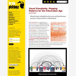
Data visualization is a running theme of visual literacy here, and Manuel Lima has been one of its biggest advocates since 2005 when, shortly after graduating from the Parson School of Design, he launched VisualComplexity — an ambitious portal for the visualization of complex networks across a multitude of disciplines, from biology to history to the social web. This month marks the highly anticipated release of Visual Complexity: Mapping Patterns of Information — a rigorously researched, beautifully designed, thoughtfully curated anthology of the world’s most compelling work at the intersection of these two relatively nascent yet increasingly powerful techno-cultural phenomena, network science and information visualization.