
The vertical-align Property. The vertical-align property controls the vertical positioning of elements within their parent.
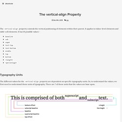
It applies to inline-level elements and table-cell elements. It has 10 possible values - baselinesubsupertext-toptext-bottommiddletopbottom<length><percentage> Typography Units The different values for the vertical-align property are dependent on specific typography units. The Values The vertical-align property vertically aligns an inline or table-cell element according to these units of typography.
Baseline The baseline value, for inline elements, aligns the current element’s baseline to the parent element’s baseline. For table-cell elements, the value aligns the current cell’s content with the baseline of all other baseline-aligned cells in the same row. Sub The sub value, for inline elements, aligns the current element’s baseline to the parent element’s subscript baseline. For table-cell elements, the value produces the same result as baseline. The "Blur Up" Technique for Loading Background Images. The following is a guest post by Emil Björklund.
Filter effects in CSS have been around for a while, and together with things like blend modes, they bring new possibilities for recreating and manipulating stuff in the browser that we previously had to do in Photoshop. Here, Emil explores a performance technique using one of the more forgotten filter effects – the filter function – as well as recreating it with SVG. This all starts with a post from the Facebook engineering team on how they load cover photo previews in their native apps. The problem they faced is that these "cover photos" are large and often take a while to load, leaving the user with a less-than-ideal experience when the background suddenly changes from a solid color to an image. Intrinsic Placeholders with the Picture Element. Picture + Intrinsic ratios = My new bestfwend.
The leaner/faster your site is, the more noticeable/painful image loading becomes, especially with hero images. Layout getting recalculated when each image arrives results in a spastic hurk-jerk page reflow. Absolute Horizontal And Vertical Centering In CSS. We’ve all seen margin: 0 auto; for horizontal centering, but margin: auto; has refused to work for vertical centering… until now!
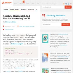
But actually (spoiler alert!) Absolute centering only requires a declared height*1 and these styles: Flexbox’s Best-Kept Secret. Let’s get flexible!
Of course if you read the spec, you’ll see that auto margins are referenced right in the middle: Spec Reference: 8.1. Aligning with auto margins. If you apply auto margins to a flex item, that item will automatically extend its specified margin to occupy the extra space in the flex container, depending on the direction in which the auto-margin is applied. For example, a <div> with the style margin-left: auto would be pushed all the way to the right of the flex container, with the left-side margin taking up any extra space between the left edge of the element and its previous sibling. If you don’t specify a direction, simply applying margin: auto, a flex item would evenly distribute any extra space on either side of the itself equally.
The magic of using auto margins in conjunction with Flexbox comes from allowing you to override the default alignment specified by justify-content on an individual flex item. DocumentCSS - DocumentCSS. Naming Things ◆ 24 ways. Gridlex - Just a Flexbox Grid System. Creating an Animated Menu Indicator with CSS Selectors. The following article is by James Nowland, a front end developer for Headjam, a creative agency in Newcastle, Australia.
James has created a fairly simple little effect here, but one that you might think would require a little JavaScript. Instead, it uses some clever selector usage. In this article, I'll cover creative ways of using sibling selectors and pseudo elements to make a CSS-only menu indicator that would normally be achieved using JavaScript. Here is what we will be making: We'll break this down into three steps: Basic structure and stylingBuilding the indicatorMaking the indicator move We'll also be leveraging SCSS throughout this example to take advantage of the variables and functions Sass offers that make things much easier to maintain in the long-run. Step 1: Basic structure and styling First off, let's set up the HTML for the menu using a basic unordered list structure.
Nothing too fancy so far. Defining the variables. Stretchy Navigation in CSS and jQuery. A rounded navigation trigger that stretches on click/tap to reveal the navigation items.
Browser support ie Chrome Firefox Safari Opera 9+ While surfing some Dribbble shots, we came across this nice shopping list concept by Hila Peleg, which inspired today’s resource. We decided to apply a similar idea to a stretching navigation, and create 3 different user cases where this snippet would be useful: 1) fixed navigation, 2) add content button and 3) edit content button. Icons: Nucleoapp.com Creating the structure. Background Image Shapes. The following is a guest post by Joe Markevicius.
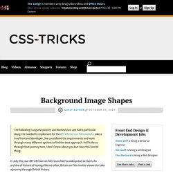
Joe had a particular design he needed to implement for the BFI's Britain on Film website. Like a true front end developer, Joe considered the requirements and went through many different options to find the best approach. He'll take us through that journey here. I don't know about you but I love this kind of thing. In July this year BFI's Britain on Film launched to widespread acclaim.
Motion UI. Motion UI is a Sass library for quickly creating CSS transitions and animations.
We originally bundled this code with Foundation for Apps, but we've souped it up, made it its own library, and open sourced it ahead of the launch of Foundation for Sites 6. Getting Started. CSSGram. What is This?
For more background on CSS Image Effects, you can check out my blog series here, or watch my video from CSS Conf EU, which gives a baseline on blend modes and filters. Simply put, CSSgram is a library for editing your images with Instagram-like filters directly in CSS. What we're doing here is adding filters to the images as well as applying color and/or gradient overlays via various blending techniques to mimic these effects. This means less manual image processing and more fun filter effects on the web!
CSS Glossary. Comments in CSS are signified by a forward-slash and asterisk.
Example Definition Properties are defined within selectors by defining a property and a value. Effects for Card Stacks. Using Quantity Queries to write content-aware CSS - tomango. The dawn of HTML5 and CSS3 provided a wave of new technologies promising to change the way we build web applications. Web developer reactions to most features were similar, an initial buzz of excitement while we pondered the possibilities brought forth by these shiny new techniques followed by a crushing sense of disappointment when we realised just how long it would be before we could start using them.
Some crest-of-the-wave developers renounced any form of support to older browsers and pressed on with the new features. However, many developers did not have the option to blindly assume that all users ran the latest cutting edge browser, if we were to do that, we’d segregate a significant portion of our users. For this reason, it’s usually a game of patience when it comes to using new frontend features in the wild.
Chart.css - A Simple CSS Chart System. Stop Printing Ugly WordPress Pages With This Easy Fix. As a WordPress designer, you fret and worry about how your pages and your posts look – on the screen. That’s what it’s all about, right? You look at that new travel-story website you just finished, and it looks great in all the current web browsers. It’s fabulous. The client loves you. A week later, you’re sitting at your computer when the client calls and says, “Hey, our customers are trying to print stuff off that new website you made for us, and everything is a mess – you have to fix that – now!!!”
Then you (for the first time ever) choose your browser’s print command, your printer starts whirring and clacking, and by the time you slide over to your printer it’s already printed out three sheets of paper when it should have just been one sheet. Reverse Text Color Based on Background Color Automatically in CSS. Over the weekend I noticed an interesting design for a progress meter in a videogame. The % complete was listed in text in the middle of the bar and didn't move. But that text was the same color as the background of the bar that was filling up from left to right. It seemed like the background was going to make the text invisible once they overlapped, but instead, the text color reversed to be white instead anywhere it overlapped with the background.
Image Grid Effects. Stand by me. Diamond grid layout with Sass. Since I started my career on the web, I’ve been building websites that follow standard grid layouts. It got to a point where I was telling an intern at my company that developers think in rectangles. I mean, there’s nothing wrong with rectangular layouts. They’re like your mom’s Volvo, steady and reliable. But sometimes, it’s fun to try something different. Modernizr Documentation. News. After what appears an eternity to us and the wider development community we are ecstatic to announce the release of Modernizr 3.0!
This is a massive release and from our last release almost 2.5 years have passed - an unacceptable timeline. Modernizr: the feature detection library for HTML5/CSS3. CSS Image Effects #1: Vintage Washout. Typebase.css: Customizable typography stylesheet. SUIT CSS: style tools for UI components. Elephants, The Three Code Ilities, & Two Months With CSS Modules. “Move fast and break things” is what they said. Over at Lystable we are definitely moving fast.
In only two months we have gone from having nothing but a feature list and early designs to having two beautiful, component-sharing, fully functional apps built and shipping to companies such as Google, Twitter & Apple. The Three Ilities While moving fast feels great (and is, of course, great) it can very easily (and more often than not) come back to haunt you if you do not approach it correctly. Watch: Creating High Resolution Background Images with CSS. 5 Ways to think about CSS Flexbox. Rather than hash out all the flexbox properties and values, I thought I'd share a few ways to think about flexbox, and how it differs from other layout conventions like floats.
Here are five, higher-level thoughts which have helped wrap my head around flexbox. (Note: I'll refer to flex containers as parents, and flex items as children.) 1. The parent is the commander of positioning the children. Flexbox Cheatsheet Cheatsheet. While I am no stranger to the magic of Flexbox, I find that I am not using it very often just yet. How alignment and hyphenation improve your text's impact. Using alignment and hyphenation properly can make your text look better, especially on a small screen. Justified text (when your text goes all the way to the right margin on each line) will result in empty spaces in the middle of lines.
Changing to left alignment gets rid of the spaces, but leaves a ragged right margin. 9 Creative CSS Form Designs From Codepen. Making and Breaking the Web With CSS Gradients. Le petit flexbox illustré chez Vincent Valentin. Nantes, le 7 septembre 2015. Quick Tip: The Simplest Way To Center Elements Vertically And Horizontally. Danny Markov.
The future of layout with CSS: Grid Layouts. Word Wrapping Woes. Learning FlexboxSarah Parmenter - User Interface Designer.Sarah Parmenter - User Interface Designer. Score Quick Style Wins with These CSS Animation Tools for WordPress. 8 Responsive CSS Grid Systems For Your Web Designs. Bootstrap Hover Image Gallery. CSS Superpowers. Panique/php-sass. CSS element() function. Creating Responsive Shapes With Clip-Path And Breaking Out Of The Box. Clippy — CSS clip-path maker. Glen Maddern: Internet Pro. Adding Social Media Icons to WordPress With CSS Sprites. Designing Hover Styles and the Future of the Technique. Laying Out A Flexible Future For Web Design With Flexbox – Smashing Magazine.
How Floating Works. Showing and Hiding Content With Pure CSS3. Inspiration pour les intégrateurs #48 : Des titres originaux. CodePen - Front End Developer Playground & Code Editor in the Browser. Understanding Reference Boxes for CSS Shapes. Constructing CSS Quantity Queries On The Fly — Smashing Magazine. Quantity Ordering With CSS. Advanced CSS filters.
CSS vs. SVG: Graphical Text Effects : Adobe Dreamweaver Team Blog. Designing Flexible Pie Charts With CSS and SVG — Smashing Magazine. 12 Little-Known CSS Facts. Off canvas menu. Page Scroll Effects. A Look at Some CSS Methodologies. The Debate Around "Do We Even Need CSS Anymore?" CSS3 2D Transforms. Score Quick Style Wins with These CSS Animation Tools for WordPress. 25 ressources CSS et plugins Javascript pour vos interfaces. Selectors. CSShake: CSS classes to move your DOM. Programme #css-day-2015. Tips for Writing Modular CSS Matt Lambert. Home - A to Z CSS.
CSS-Only Responsive Layout with Smooth Transitions. CSS Sprites: What They Are, Why They're Cool, and How To Use Them. SpritePad - Create and edit css sprites. Useful Collection Of Free CSS Libraries & Resources. Inspiration for Text Styles and Hover Effects. CSS Dig. How to make a carousel using only HTML and CSS (no JavaScript required!)
CSS Margin. Simple Icon Hover Effects with CSS Transitions and Animations. Apprendre les mises en page CSS. Comment centrer verticalement sur tous les navigateurs. 8 CSS Tools for CSS Phobics - The Hive. Sass pour les web designers par Dan Cederholm. CSS Filters. Pure CSS Slide Up and Slide Down. VH and VW units can cause issues on iOS devices. To overcome this, create media queries that target the width, height, and orientation of iOS devices. Une taille de police en fonction de la largeur d’écran - CSS / CSS3. How to Center in CSS. CSS3 Awesome Link Effects.
Can I use... Support tables for HTML5, CSS3, etc. Focal Point: Intelligent Cropping of Responsive Images. Retina Display Media Query. Content Folding. CSS3 box-sizing property. Shade.