
30 Tools to Create Your Own Infographics. Infographics are one of the best ways to present data without making your audience yawn with boredom.
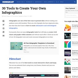
There are a lot of people who have impressive data, but what they don’t know is how to create informative and well-designed infographics. Fortunately, there are many infographic tools that will help you create vivid charts and graphs within minutes and without much effort. Check out our list of over 40 infographic tools and create awesome infographics in no time. 40 Free Infographic Templates to Download 40 Free Infographic Templates to Download Infographics are extremely popular these days. Piktochart Piktochart has one of the best tools to create interactive charts and maps. Canva Canva offers handy tools for designers, including an infographic tool. Submit and Showcase Creative Infographics. Créer des infographies.
20+ Tools to Create Your Own Infographics. A picture is worth a thousand words – based on this, infographics would carry hundreds of thousands of words, yet if you let a reader choose between a full-length 1000-word article and an infographic that needs a few scroll-downs, they’d probably prefer absorbing information straight from the infographic. What’s not to like? Colored charts and illustrations deliver connections better than tables and figures and as users spend time looking back and forth the full infographic, they stay on the site longer. Plus, readers who like what they see are more likely to share visual guides more than articles. While not everyone can make infographics from scratch, there are tools available on the Web that will help you create your very own infographics. In this article, we’re listing more than 20 such options to help you get your messages across to your readers, visually. Read Also: The Infographic Revolution: Where Do We Go From Here?
Free Icons - IllustIcon. Data Visualization & Storytelling. Python practice, practice, practice. Data visualisation and Infographics tools. TimeViz Browser. Imrich, P.; Mueller, K.; Imre, D.; Zelenyuk, D.
& Zhu, W.: Interactive Poster: 3D ThemeRiver. Poster Compendium of IEEE Symposium on Information Visualization (InfoVis), IEEE Computer Society, 2003. Imrich, P.; Mueller, K.; Imre, D.; Zelenyuk, D. & Zhu, W. (2003), © 2003 IEEE. Used with permission. Image courtesy of Ben Fry, MIT Media Laboratory, Aesthetics + Computation Group, © 1999-2005. Anemone by Fry, B. (2000) is a technique related to the visualization of structured information.
Pantheon - Visualizations. Pixteller ★ Snappa. Create Interactive Online Presentations & free Infographic software. HTML5 Animations, download & Publish. Visual Learning Center. Infographics & Presentations. The 25 Best Data Visualizations of 2018. Making information beautiful is an art form. Here at Visme, we are huge fans of what data artists are constantly creating. From data journalism to data art and data science in between. Last year, we published a roundup of the best data visualizations of 2018 and you loved it. For that reason, we are back with another installment of our favorite data viz of 2019. We hope you like the examples we have chosen.
Please understand that the images we include here are only a glance at what the projects really offer. Visual information. Infographics. UX Designers: Here are the 56 Best Websites To Learn Something New. 24 Data Viz Sites to Improve Your Next Data Design Project. The Data Visualisation Catalogue. Resources: The Data Visualisation Catalogue. Collection of data visualizations to get inspired and finding the right type.
D3.js - Data-Driven Documents. Chart Porn. HistoryShots InfoArt. History of Film and Movies by HistoryShots InfoArt. Webcomic, page 196. 14 October. 2014 Language trees for the language lovers!
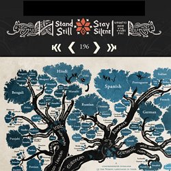
I've gathered pretty much all the data for this from ethnologue.com, which is an awesome well of information about language families. And if anyone finds some important language missing let me know! (Naturally most tiny languages didn't make it on the graph, aww. There's literally hundreds of them in the Indo-European family alone and I could only fit so many on this page, so most sub-1 mil. speaker languages that don't have official status somewhere got the cut.) Well, it's the end of this set of info pages and we'll return to the company of our brave explorers next. On another subject: I'm going to reopen the aRTD book store either this weekend or next week (one of the reasons why I'm going to Finland).
See you all on Thursday, I should be in Finland by then! 14 October. 2014 Language trees for the language lovers! Well, it's the end of this set of info pages and we'll return to the company of our brave explorers next. Data Visualization and Infographics Resources. A visual exploration on mapping complex networks.
Gallery · d3/d3 Wiki. Wiki ▸ Gallery Welcome to the D3 gallery!
More examples are available for forking on Observable; see D3’s profile and the visualization collection. Please share your work on Observable, or tweet us a link! Visual Index Basic Charts Techniques, Interaction & Animation Maps Statistics Examples Collections The New York Times visualizations Jerome Cukier Jason Davies Jim Vallandingham Institute for Health Metrics and Evaluation Peter Cook.
Visual data analysis. Infographics.