
A Single Div. CSS,JavaScript Tutorials. A Simple CSS Tooltip. CSS Grid Changes EVERYTHING - Amazing Presentation. The CSS genius of Bali Balo – freeCodeCamp. Free JavaScript / CSS / CSS3 - CSS Script.
Perfect Icons - A social icon creation tool. CSS Animations. Write Better Media Queries with Sass. Let's face facts: media queries can be a pain.
They're difficult to write and they tend to get duplicated a lot. Sass includes a few helpful features that make media queries easier to work with. This article will show you these tricks and how you can use them to simplify your stylesheets. The Basics Let's take a look at a simple example. Here, we've set the font size of paragraphs to 16 pixels. Right away, you should be struck by how much code is required to do something as simple as responsive typography.
Media queries are hardcoded in the code and copied where they're needed. Shortening Things Up Sass allows variables to be interpolated. Now, we can use the $tablet and $desktop media queries anywhere in our project without duplicating code. Mixins to the Rescue The code above works, but it's a bit difficult to read. Multi-Level Drop Down Menu with Pure CSS3 - Minimal Transparent Menu. Useful :nth-child Recipes. Share this: Ship custom analytics today with Keen.io.
I get a little giddy when I come across perfect uses for :nth-child or :nth-of-type (read about the difference). The better you understand them, the more css nerdgasms you get to have! In these simple "recipes" (really: expressions) I'll arbitrarily use a flat list of list items and randomly chosen numbers.
But it should be fairly obvious how to alter them to get similar selections. #Select Only the Fifth Element. Different Tricks on How to Make Bootstrap Columns All the Same Height. Bootstrap 3 (and now Bootstrap 4) are amazing CSS frameworks that can make the lives of developers of any skill-level easier.
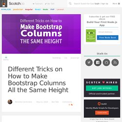
When I was more of a beginner and I first started using Bootstrap, I used every feature of it possible and used to hack it to get things to work the way I wanted. Now, with more experience, I mostly just use their reset and grid system. I now rarely alter any of its core functionality. Bootstrap's grid system is fantastic and near perfect in my opinion.
You can read about it here. . # Equal Columns? I've made a demo CodePen to illustrate the issue when content in columns are different lengths and how it messes with design. Padding of 25px is added to the top and bottom of all Bootstrap stuffA subtle border wraps all .colsVarious backgrounds are used to see how things stack on each other and how this all works. The 30 CSS Selectors You Must Memorize. Sub-Menu Aligned Middle. Animation. Share this: Ship custom analytics today with Keen.io.
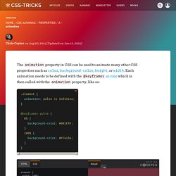
The animation property in CSS can be used to animate many other CSS properties such as color, background-color, height, or width. Each animation needs to be defined with the @keyframes at-rule which is then called with the animation property, like so: See the Pen A simple animation by CSS-Tricks (@css-tricks) on CodePen. Each @keyframes at-rule defines what should happen at specific moments during the animation. Is it possible to transition text-alignment using CSS3 only?
CSS Reference - A free visual guide to the most popular CSS properties. CSS3 transition on click using pure CSS. Edit fiddle. Using media queries. Media queries are useful when you want to apply CSS styles depending on a device's general type (such as print vs. screen), specific characteristics (such as the width of the browser viewport), or environment (such as ambient light conditions).
With the huge variety of internet-connected devices available today, media queries are a vital tool for building websites and apps that are robust enough to work on whatever hardware your users have. Media types describe the general category of a given device. Although websites are commonly designed with screens in mind, you may want to create styles that target special devices such as printers or audio-based screenreaders.
For example, this CSS targets printers: @media print { ... } You can also target multiple devices. @media screen, print { ... } 10 principles for smooth web animations. There are dozens of ways to achieve animations on the web.
For example, the filmstrip is an approach has been around since before the internet, with slightly different hand-drawn frame being swapped out many times a second to create the illusion of motion. Twitter recently used this simple approach for their new heart animation, flipping through a sprite of frames. This effect could’ve been done with a ton of tiny elements individually animating, or perhaps as an SVG, but that would be unnecessarily complex and probably not be as smooth.
Inspiration for Button Styles and Effects. A collection of fresh button styles and effects for your inspiration.
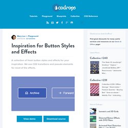
We use CSS transitions and pseudo-elements for most of the effects. View demo Download source Today we’d like to share some fresh button styles and effects with you. The current “button trend” is quite exciting since there are a variety of design details in use which allow for a great diversity of styles. There are lots of thin lines but also bold typography and vice versa. In order to keep things overseeable, we’ve chosen to trigger any effect on hover. Please note that some of the techniques used are only supported in modern browsers. Css - Remove white space below image. Css - Remove white space below image.