
712130main_8246931247_e60f3c09fb_o. La messagerie de Google. Geteach.com. The Best Geography Sites For Beginning & Intermediate English Language Learners. As I mentioned earlier this week, because of an unexpected substantial increase in our student enrollment and the resulting scheduling challenges, I volunteered to convert one period of my Beginning and Intermediate English Language Learner class into a Geography class.

I think Geography is a great tool for language acquisition. I have a more expansive The Best Websites For Learning & Teaching Geographylist, but I thought readers might find it useful to see the sites I plan to primarily use in this class. Lesson Plan Library - Google Earth for Educators. Minecraft Overviewer. 40 maps that explain the world - The Washington Post. By Max Fisher By Max Fisher August 12, 2013 Maps can be a remarkably powerful tool for understanding the world and how it works, but they show only what you ask them to.
So when we saw a post sweeping the Web titled "40 maps they didn't teach you in school," one of which happens to be a WorldViews original, I thought we might be able to contribute our own collection. Some of these are pretty nerdy, but I think they're no less fascinating and easily understandable. A majority are original to this blog, with others from a variety of sources. I've included a link for further reading on close to every one. 27 Pictures That Will Change The Way You Look At The World. 17 Maps That Will Change How You See the World. 40 Maps That Will Help You Make Sense of the World. If you’re a visual learner like myself, then you know maps, charts and infographics can really help bring data and information to life. Maps can make a point resonate with readers and this collection aims to do just that. Hopefully some of these maps will surprise you and you’ll learn something new.
A few are important to know, some interpret and display data in a beautiful or creative way, and a few may even make you chuckle or shake your head. If you enjoy this collection of maps, the Sifter highly recommends the r/MapPorn sub reddit. You should also check out ChartsBin.com. 1. 2. 3. 4. Pangea was a supercontinent that existed during the late Paleozoic and early Mesozoic eras, forming about 300 million years ago. 800px-Gall–Peters_projection_SW.jpg (JPEG Image, 800 × 511 pixels) Alpha Examples: Places & Geography. World Countries (Countries Of The World) The Global Religious Landscape. Worldwide, more than eight-in-ten people identify with a religious group.
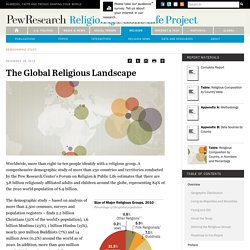
A comprehensive demographic study of more than 230 countries and territories conducted by the Pew Research Center’s Forum on Religion & Public Life estimates that there are 5.8 billion religiously affiliated adults and children around the globe, representing 84% of the 2010 world population of 6.9 billion. The demographic study – based on analysis of more than 2,500 censuses, surveys and population registers – finds 2.2 billion Christians (32% of the world’s population), 1.6 billion Muslims (23%), 1 billion Hindus (15%), nearly 500 million Buddhists (7%) and 14 million Jews (0.2%) around the world as of 2010. In addition, more than 400 million people (6%) practice various folk or traditional religions, including African traditional religions, Chinese folk religions, Native American religions and Australian aboriginal religions. Geographic Distribution. Fo0324_religion1500.gif (GIF Image, 1500 × 2613 pixels) - Scaled (38%)
AP Human Geography Models Project - Introduction To Geography. What If The World Were 100 People? Here’s a fresh take on a complex set of data.

What if you took all the statistics about everyone in the world and boiled it all down into one question: what if the world was just 100 people? What if you took the billions and billions of people on Earth and made it so only 100 people could represent them? You’d get some super-simplified but interesting stats, that’s for sure. For example, there would be (obviously) 50 men and 50 women.
But most of those men and women would live in Asia. It’s quite fascinating, to be honest. 50 would be female 50 would be male. World Wonders Project - Street View - Google Maps. Geographyawarenessweek.wordpress.com. Lifelines. Cultural Institute. DigGeog. Twitter map finally reveals exactly where Manchester United fans live. Their interactive results map highlights the historical east/west split between fans in Manchester, but also shows that United – despite perceptions – do not have huge waves of support in London and the south east.
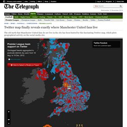
The grey areas show relative few United fans live in London The map also draws an interesting picture of Liverpool's vast support in Wales and Northern Ireland, a he small pocket of Arsenal fans among a vast area of Tottenham's dominance north of London and, whisper it, the masses of support Norwich in Ipswich postcodes. For information about how the data was sourced, and how the map was created, visit the Oxford Institute site here. OverlapMaps - Instantly compare any two places on Earth!
GeoBee Challenge Game, Geographic Bee Practice, Geography Trivia.