
Comparison « Data Visualization. I got this question often: which is the best Data Visualization product?

Lets compare some DV platforms such as Spotfire, Qlikview, Tableau Software and the Microsoft BI platform (PowerPivot, Excel 2010, SQL Server with its VertiPaq, SSAS, SSRS and SSIS). 2 key factors for tool selection are which makes it easy to comprehend the data,price-performance Because modern datasets are huge (or growing very fast!) , they are usually best comprehended using Data Visualization (DV) with an ability to interact with data through visual drill-down capabilities and dashboards. There is NO a single best visualization product. We also suggest for you to take a look on other comparisons: Altheon comparing Qlikview, Tableau and Omniscope and others (please ping me if you will find good comparison of DV tools).
Looking 4 data visualization: Software. . IBM, depuis le mois de Mars, dispose d'une nouvelle solution de Business Intelligence: Cognos Insight. Cette solution se positionne principalement sur le marché de la data visualization, IBM espère concurrencer le succès des solutions QlikView, Tableau Software avec la sortie de Cognos Insight . . Pour découvrir Cognos Insight, je vous propose un guest post rédigé par un expert d'IBM: Christoph Papenfuss performance-ideas.com Christoph Papenfuss has been working in the area of Business Analytics and Performance Management for over 14 years. Here is his thoughts on the new IBM BI tool : Cognos Insight. ' On March 7th, IBM officially released the highly anticipated personal analytics tool Cognos Insight. Rapid time to analysis Cognos Insight is a desktop tool. Analysis and visualization Analyzing and exploring data is really easy.
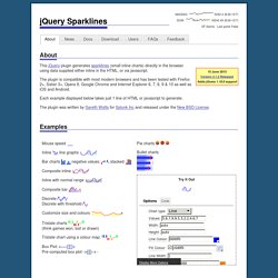
There are a lot of different tools users can choose for the analysis: traffic-lighting, calculations and interactive filtering (so-called Explore Points). Browsing visualizations. Better Know a Visualization: Small Multiples. jQuery Sparklines. News 15 June 2013 - Version 2.1.2 Relased This release adds support for jQuery 1.10.0 and other bug fixes and minor improvements.

See the full changelog for details of all changes. 26 January 2013 - Version 2.1.1 Relased This release adds support for jQuery 1.9.0 along with a couple of other bug fixes. If you're using a version of jQuery later than 1.8, be extra sure you're not rendering your page in quirks mode to avoid breaking tooltips for IE users. See jQuery's notes on quirks compatiblity for more info.
See the full changelog for details of all changes. 15 October 2012 - Version 2.1 Released This release is primarily a bug-fix release, but also adds support for Internet Explorer 10. See the full changelog for details of all changes. 29 April 2012 - Version 2.0 Released This release represents a significant code update. Customizable mouseover tooltips and interaction including highlighting of moused-over values.
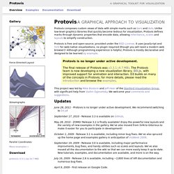
There's a few non-code updates as well: Smoothie Charts. Examples. Journal of Computational and Graphical Statistics, Vol. 5, No. 2 (Jun., 1996), pp. 123-155. Protovis. Protovis composes custom views of data with simple marks such as bars and dots.

Unlike low-level graphics libraries that quickly become tedious for visualization, Protovis defines marks through dynamic properties that encode data, allowing inheritance, scales and layouts to simplify construction. Protovis is free and open-source, provided under the BSD License. It uses JavaScript and SVG for web-native visualizations; no plugin required (though you will need a modern web browser)! Although programming experience is helpful, Protovis is mostly declarative and designed to be learned by example.
Protovis is no longer under active development.The final release of Protovis was v3.3.1 (4.7 MB). This project was led by Mike Bostock and Jeff Heer of the Stanford Visualization Group, with significant help from Vadim Ogievetsky. Updates June 28, 2011 - Protovis is no longer under active development. September 17, 2010 - Release 3.3 is available on GitHub. May 28, 2010 - ZOMG! Getting Started. Mr.doob's blog. I think it was in 2004 when I started investigating, learning the maths and testing all this stuff of projecting 3d points into a 2d plane...

Two years later, in 2006, I had a torus knot with flat shading with a light and a camera. Then Papervision3D came into the scene and I got distracted ;) GGobi data visualization system. Examples. This example demonstrates loading of CSV data, which is then quantized into a diverging color scale. The values are visualized as colored cells per day. Days are arranged into columns by week, then grouped by month and years. Chord diagrams show directed relationships among a group of entities.
This example also demonstrates simple interactivity by using mouseover filtering. Choropleth maps visualize geographic distributions using a color encoding. This diagram shows the distribution of age groups in the United States over the last 150 years. Unlike choropleth maps, cartograms encode data using area rather than color, resulting in distorted geographic boundaries. This simple force-directed graph shows character co-occurence in Les Misérables . A treemap recursively subdivides area into rectangles; the area of any node in the tree corresponds to its value. A sunburst is similar to the treemap, except it uses a radial layout. Gephi, an open source graph visualization and manipulation software.