Luk Ka Lai
Dream Maker
Guest Post: The Future of Data Visualization. Data is everywhere - and readily accessible The open data movement is finally beginning to have some real impact.
Governments are beginning to open up and give people access to the data they have rights to. Fast Thinking and Slow Thinking Visualisation. Last week I attended the Association of American Geographers Annual Conference and heard a talk by Robert Groves, Director of the US Census Bureau.
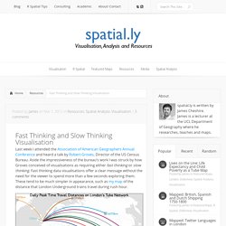
Aside the impressiveness of the bureau’s work I was struck by how Groves conceived of visualisations as requiring either fast thinking or slow thinking. Fast thinking data visualisations offer a clear message without the need for the viewer to spend more than a few seconds exploring them. These tend to be much simpler in appearance, such as my map of the distance that London Underground trains travel during rush hour.
The explicit message of this map is that surprisingly large distances are covered across the network and that the Central Line rolling stock travels furthest. How Much Data Do You Really Need? One of the many things Malofiej 20 made me wonder about is how we present data and what we expect from such a presentation.
Very often, we essentially narrate the process of discovery, but is that really the best way? And how much data do we need to show when making a point? Just because we start out with lots of data does not mean we really need to show it all. So here is a simple experiment. The Explanatory Power of Data Points. As newspaper graphics go, scatterplots are a fairly advanced technique.
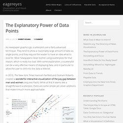
They tend to show a reasonably large amount of data as single points, and they require the reader to have an idea what to look for. Most newspapers never bother using scatterplots for that reason, which is really too bad. List of Influences: Nigel Holmes. Few people have influenced the face of information graphics like Nigel Holmes.

I am honored to not only present his very extensive and detailed list of influences here, but also do so on the occasion of his upcoming 70th birthday on June 15, 2012. Nigel Holmes has recently been the subject of discussions in information visualization because of the role and potential benefit of chart junk. His work has been very influential, and no doubt controversial, because of his unique style and the breadth of his experiments. He is best known for the 16 years he spent at Time Magazine, first as a designer, later as Graphics Director. Using Data Visualization to Find Insights in Data. 10 Things You Can Learn From the New York Times’ Data Visualizations. The Malofiej 20 awards, known as the Pulitzers of the infographics world, recognize the finest infographics published across the globe.
This year, more than 1,500 print and online submissions competed for the prestigious awards. National Geographic Magazine, which won best print map and two gold awards, and Internet Group do Brasil iG (gold) were notable achievements. However, as in previous years, the portfolio of graphics from the New York Times dominated the event, winning six gold medals (four print, two online), the best online map and both the ‘Best in Show’ awards for print and online submissions. Ending the Infographic Plague - Megan McArdle. A History Of Dishonest Fox Charts. Fox News was forced to address yet another dishonest chart last week, which it aired to paint a misleading picture of President Obama's handling of the economy.
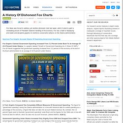
Fox has a habit of displaying error-laden and deceptive graphics to reinforce conservative attacks on the Obama administration. Spurious Fox Graphic Accused Obama Of Exploding Government Spending Fox Graphic Claimed Government Spending Increased From 3.2 Percent Under Bush To An Average Of 23.8 Percent Under Obama. In a graphic labeled "Growth of Government Spending (As A Share Of GDP)," Fox & Friends suggested that government spending increased from 3.2 percent of the economy at the end of the Bush administration to an average of 23.8 percent under Obama.
[Fox News, Fox & Friends, 9/26/12, via Media Matters] In Fact, Graphic Compared Two Completely Different Measures Of Government Spending. Government Spending Under Obama Increased Only Slightly Since 2008 And Dropped Since 2009. [Media Matters, 9/26/12] [Media Matters, 7/31/12] Interaction Design for Data Visualizations. Interactive data visualizations are an exciting way to engage and inform large audiences.
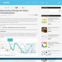
They enable users to focus on interesting parts and details, to customize the content and even the graphical form, and to explore large amounts of data. At their best, they facilitate a playful experience that is way more engaging than static infographics or videos. Here are several ideas and concepts of interaction design for data visualizations, using 11 examples from the web. 1. The Science of Information Visualization: A Sketch. According to Carl Mitcham’s book Thinking through Technology: The Path between Engineering and Philosophy (University of Chicago Press, 1994), engineering is making things based on scientific principles – as opposed to the intuitive making that defines a craft.
Information visualization (InfoVis) is practiced like a craft today, based mostly on practical examples, but not on theoretical basics. Here is a sketch of not only InfoVis as an engineering field, but InfoVis as a science. We could model the science of InfoVis after physics, a well-established science. If we assume that we already have the engineering part, then there’s also theoretical physics, experimental physics, and computational physics. The Three Types of Chart Junk. A recent posting on Dmitry Fadeyev’s design blog got me thinking about decoration and chart junk again.
Fadeyev talks about the Victorian obsession with ornamentation, but he could equally be talking about the way charts and infographics are often decorated. A short excursion to the 1850s might help shed some light on the issue of chart junk. Article: The 8 hats of data visualisation design. Last week I posted a slideshare version of my slides from a recent pair of presentation events in Chicago.
The title of this talk was “The 8 hats of data visualisation”. In this article I want to follow up these slides with a written accompaniment to contextualise and explain what I was presenting, as slides alone don’t really manage to achieve this effectively. Ever since I discovered data visualisation I have been intrigued by the many different subject areas and disciplines that contribute to its unique mix of art and science.
How to Become a Data Visualization Expert: A Recipe. In my previous post last week I complained about the state of infovis blogging, arguing that there is not enough freely available quality material around for novices who want to learn, despite new websites and little business pop up every day. Especially, there is not much guidance for people who want to become visualization experts. So I thought, what if one is attracted by visualization and wants to start? Is there anything on the web that helps taking at least the first few steps? So, I came up with the idea of writing a very small initial guide (recipe) to help people take these first steps. (Of course, I know there’s never one single right path.
My recipe is simple: Billion Dollar Graphics: Updated Graphic Cheat Sheet. How to choose the right chart (corrected) A friend recently asked me, “how do you choose the right chart?” I thought about it, and essentially sent her a list of the sites that I have bookmarked, along with a few comments. This is by no means an exhaustive list, and it’s meant more for a layperson, but here’s the list, nonetheless. If you have more suggestions, I’d love to hear them. This Chart Is a Lonely Hunter: The Narrative Eros of the Infographic. Quartz. Inspiration, Technique, Great Design. A podcast on data visualization with Enrico Bertini and Moritz Stefaner. Visual Encoding. Michael Dubakov, TargetProcess Founder September, 2012.
Data Visualization for Human Perception. The Functional Art: An Introduction to Information Graphics and Visualization. Knight Center for Journalism in the Americas: Login to the site. Visualising Data.
Gallery of Data Visualization - Introducton. INFOGRAPHIC TUTORIAL. Interaction-Design.org. New York Times Infographics and data visualizations. John Grimwade Information Graphics. Infographics & Data Visualization. Safari Books Online - Home. Things We Forget. HKU Libraries. Zynga - THe VIrtual World Business. D3.js - Data-Driven Documents. More d3.js fun - how to create d3.js force diagrams from Excel with no coding. Tutorial: Introduction to D3.
Check out the final result here! D3 is a brand new visualization framework created by Mike Bostock. Tutorials. First steps in data visualisation using d3.js. Piktochart- Infographic & Presentation Tool. Infographics & Data Visualization. Graphical Bios. Stunning. Simple. Many Eyes. Free Data Visualization Software. Interactive maps and visualizations. Bringing Infographics And Visualization to the Mainstream: Not Just the Tools, but the Ideas. Create Infographics.