
Windows 10 Icon Font Is Broken, and We Fixed It! Windows 10 released the icon font recently.
It’s called Segoe UI Symbol and is recommended to the developers of the Windows apps. We can’t recommend it though, because icons have different visual weights, adding visual noise to your apps. La più grande raccolta di strumenti e tecniche per il design. Quick Start Guide to UX Design. Customer journey mapping. A customer journey map is a way to describe all the experiences a customer has with your organisation and the emotional responses they provoke – from their first impression of your building, to speaking to staff or receiving a service.
In government, the process of providing a service or ‘product’ is often complex, with multiple interactions taking place over long timeframes with little by way of tangible outputs. Customer journey mapping is a particularly useful tool to help identify the customer’s interaction with your organisation, their thought processes and reactions to you, which can reveal opportunities for improvement and innovation in the customer’s experience. Customer journey mapping can help to identify how the customer is treated during each contact and how the customer feels towards your organisation at the end of the experience. Sample Cognitive Walkthrough. Task-Centered User Interface Design : 4. Evaluating the Design Without Users. Throughout this book we've emphasized the importance of bringing users into the interface design process.
However, as a designer you'll also need to evaluate the evolving design when no users are present. Users' time is almost never a free or unlimited resource. Most users have their own work to do, and they're able to devote only limited time to your project. Usability Body of Knowledge. Heuristic Evaluation. AZofConversion. Usability 101: Introduction to Usability. User Experience Design Process [INFOGRAPHIC] - Centerline Digital. Dark Patterns - User Interfaces Designed to Trick People. Main Guidelines and Ethical Considerations (User Experience and Experience Design) - Video 3. Fastcodesign. After the success of Warby Parker and Everlane, companies have been cropping up across all industries with business models that cut out the middleman to offer designer-quality wares at reasonable prices.
A Design Mystery: Why are People at This Store Consistently Misusing This Product? Here's one of those bread-and-butter design problems that alerts you to the importance of context.
It's simple enough to design a coffee dispenser in a studio, where you've worked out people's average heights and eyelines and calculated how they'll interact with the device. Then it goes out into the real world, where unforeseen human behavior leads to unintended consequences. Technology for all the right reasons. Can Color-Blind Users See Your Site? As of December 2011, this topic has been archived.
As a result, it is no longer actively maintained. For more information, see Archived Content. For information, recommendations, and guidance regarding the current version of Internet Explorer, see Internet Explorer Developer Center. Robert Hess Microsoft Corporation October 9, 2000 Contents. Colour for the colour blind. With colour being used for communication so much in day to day life, let alone if your a graphic designer, colour blindness must post regular challenges for those affected by the condition.
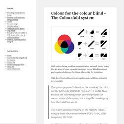
With the ColourAdd system, recognizing and utilizing colour is now possible. The system proposed is based on the search of the color, not the light color RGB Ð (R, red; G, green and B, blue), because the colorblind person does not possess the correct vision of the colors, nor a tangible knowledge of how their addition works.The system proposed is based on the pigment colour, using as basis the primary colours: BLUE (cyan), RED (magenta), YELLOW. In addition to primary and secondary colours, symbols for white and black allow users to expand their colour range into the dozens, as well as using shades of grey and specialty symbols for gold and silver. Tips for Designing for Colorblind Users. It’s estimated that about 8% of males and 0.5% of females are born colorblind.
That may seem like a low number but if you’re designing for a large audience, having a site that’s unusable for eight out of every hundred males is definitely less than desirable. Fortunately, you can fairly easily make sure that your site is colorblind friendly by always keeping in mind the information below. We’ll take a look at what colorblindness really means and how you can tweak your designs based on a few simple principles. I’d like to start by saying that even though I am by no means an opthamologist, most of the men in my family are colorblind and any examples given below have been run by bonafide colorblind men. If you’re a colorblind person, your description of the examples below might be slightly or even considerably different as no two set of colorblind eyes will quite be the same. The Science. Google Design. Material Interaction. Gestalt Principles Applied in Design. By Michael Tuck Web designers, like other artists and craftsmen, impose structure on the environment.
We enforce order and beauty on the formless void that is our blank computer screen. We do it in different ways — creating an organized layout first, writing text and content first, or even basing a design concept on an image, a color palette, or something that visually trips your trigger, whether it’s a sunset or a Song Dynasty painting. Wherever you gain your inspiration, it’s often not just the particular element that sparks your artistic impulse; it’s the totality of the element and its surroundings. Grasping that totality concept — both the individual element and the whole in which it exists are important both separately and together — is essential to understanding how gestaltism influences our design choices. We’ll cover 6 principles related to gestalt, in the context of design, and they are: ProximitySimilarityPrägnanz (Figure-Ground)Symmetry"Common Fate"Closure Source: Dr.
Mr. Webdesign · Webentwicklung.
User Experience for the Web (WebUX) The 10 User Experience Principles à la WordPress. 17 Skeuomorphs That Show Retro Is Always In. In 1889, H.
Applying Fitts' Law To Mobile Interface Design. Fitts’ Law is an essential principle of Human-Computer Interaction theory that was formulated almost 60 years ago. It’s critical to UX design for the desktop and laptop, but with interaction techniques being vastly different on mobile devices can we still use it the same way? Principi base di Interaction Design. What Is User Experience Design? Overview, Tools And Resources – Smashing Magazine.
Websites and Web applications have become progressively more complex as our industry’s technologies and methodologies advance. What used to be a one-way static medium has evolved into a very rich and interactive experience. But regardless of how much has changed in the production process, a website’s success still hinges on just one thing: how users perceive it. “Does this website give me value? Is it easy to use? Is it pleasant to use?” When You Shouldn’t Use Fitts’s Law To Measure User Experience. The key statement of Fitts’s Law is that the time required to move a pointing device to a target is a function of the distance to the target and its size. In layman’s terms: the closer and larger a target, the faster it is to click on that target. This is easy to understand, not too difficult to implement and it doesn’t seem to make much sense to contradict such a simple and obvious statement.
However, before you start applying Fitts’s Law on every single pixel you can find, consider a few problems that might arise for you as an interaction designer. Fitts’s Rule Number 1: Create Larger Targets. UX Mastery - We help UX professionals get started and get better.UX Mastery What the #$%@ is UX Design? Introduction - Material design - Google design guidelines. Sketch 3: la grafica su Mac cambia direzione. Innovativa, snella, potente e ambiziosa: queste le parole chiave per descrivere Sketch, l’applicazione sviluppata da Bohemian Coding per Mac che, arrivata da poco alla versione 3, sta velocemente prendendo piede tra i designer come alternativa ai più celebri software Adobe. What The Heck Is Responsive Web Design? Responsive websites respond to their environment Adaptive (Multiple Fixed Width Layouts) or Responsive (Multiple Fluid Grid Layouts) Recommended Approach Go All In On Responsive Make pages that look great at any size.
Making and Breaking UX Best Practices. Imagine a website with a beautiful, enticing, full-screen image, where a transparent button leads to pages of well constructed, adaptive content. The navigation functions perfectly across devices, switching from a horizontal to a mobile menu at just the right times.
Unfortunately a large portion of the potential audience lives in Africa, and won’t have the bandwidth to use it. Does that mean our best practices failed us? No—it means that an experience is made up of more than the sum of its parts. A good user experience, like a measurable ROI, doesn’t typically happen by accident. Best practices in User Experience provide the framework for a repeatable process, a way for us to deliver the value of user experience in a reasonable amount of time, without making the mistakes of those who followed in our past.
But while following best practices sets the foundation for implementing good UX, we must avoid letting the best practice substitute for doing the work. Interaction Design Patterns. Welcome to Method of Action. Startups, This Is How Design Works – by Wells Riley. Complete Beginner's Guide to Interaction Design. Interaction design has its origins in web and graphic design, but has grown into a realm of its own. Far from merely working with text and pictures, interaction designers are now responsible for creating every element on the screen that a user might swipe, click, tap, or type: in short, the interactions of an experience. Newsletter Sign Up Original UX articles Curated Resources. 6-interview-questions-you-must-ask-if-you-want-to-hire-the-best-people.
Guide de l’innovation centrée-usager. Ce guide - ou plutôt cette "boussole" - propose aux innovateurs quelques clefs de lecture et pistes méthodologiques pour innover aux contacts des usagers. Il est issu de plusieurs années d’observation de projets d’expérimentation par l’usage dans le cadre du programme PACA Labs. Un travail coordonné par Fabien Labarthe et Renaud Francou. UI and Capability. 6 principles for designing trustworthy learning experiences. User Experience Project: The User Experience Wheel. UX 101: What is User Experience? [INFOGRAPHIC] GoodUI.