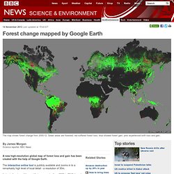

WWII Europe .gif. Forest change mapped by Google Earth. By James Morgan Science reporter, BBC News A new high-resolution global map of forest loss and gain has been created with the help of Google Earth.

The interactive online tool is publicly available and zooms in to a remarkably high level of local detail - a resolution of 30m. It charts the story of the world's tree canopies from 2000 to 2012, based on 650,000 satellite images by Landsat 7. In that time, the Earth lost a combined "forest" the size of Mongolia, enough trees to cover the UK six times.
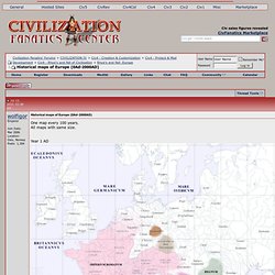
Continue reading the main story. Historical maps of Europe (0Ad-2000AD) One map every 100 years.

All maps with same size. Year 1 AD. Nilo-Saharan.png (400×438) World War II in Europe: Every Day. Pangea modern geopolitical borders. French Worst Case Scenario: What if the Central Powers had won WW1? [650×461] Earth Night Life [4000 x 2000] [OC] 1900big.jpg (1203×960) Frontiere_francaise_985_1947.gif (931×859) 2oDLGIi.jpg (3244×1581)
QVmjk7e.jpg (1914×1070) File:Egypt 2010 population density1.png. Kv6ZV.png (1600×969) Idz4O.jpg (1977×1604) Map of Facebook. Inca-expansion.png (1730×3200) Regions-dec2009-web.jpg (776×397) Constantine's Roman Empire. DS921.jpg (1337×714) TreatyOfSevres_(corrected).PNG (1024×738) Tb1Ul.jpg (2000×1347) IBq7X.jpeg (1024×722) Wind Map.
An invisible, ancient source of energy surrounds us—energy that powered the first explorations of the world, and that may be a key to the future.

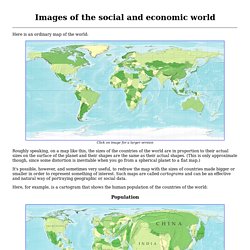
This map shows you the delicate tracery of wind flowing over the US. The wind map is a personal art project, not associated with any company. We've done our best to make this as accurate as possible, but can't make any guarantees about the correctness of the data or our software. Please do not use the map or its data to fly a plane, sail a boat, or fight wildfires :-) If the map is missing or seems slow, we recommend the latest Chrome browser. Surface wind data comes from the National Digital Forecast Database. If you're looking for a weather map, or just want more detail on the weather today, see these more traditional maps of temperature and wind. Map of the World Drawn Entirely Using Facebook Connections. Map Porn, for interesting maps. Images of the social and economic world. Here is an ordinary map of the world: Click on image for a larger version Roughly speaking, on a map like this, the sizes of the countries of the world are in proportion to their actual sizes on the surface of the planet and their shapes are the same as their actual shapes.

(This is only approximate though, since some distortion is inevitable when you go from a spherical planet to a flat map.) It's possible, however, and sometimes very useful, to redraw the map with the sizes of countries made bigger or smaller in order to represent something of interest. Such maps are called cartograms and can be an effective and natural way of portraying geographic or social data. Here, for example, is a cartogram that shows the human population of the countries of the world: Population Notice also how the lines of latitude and longitude have become distorted by the growing and shrinking countries. Gross domestic product Now here are a few more cartograms. Child mortality People living with HIV/AIDS. Holocaust Europe. MiHs7.jpg (1330×1177) Path of Homo Sapien. World History Maps by Thomas Lessman. Historical Maps. Home page Down to: 6th to 15th Centuries | 16th and 19th Centuries | 1901 to World War Two | 1946 to 21st Century The Ancient World ... index of places Aegean Region, to 300 BCE Aegean Region, 185 BCE Africa, 2500 to 1500 BCE Africa to 500 CE African Language Families Alexander in the East (334 to 323 BCE) Ashoka, Empire of (269 to 232 BCE) Athenian Empire (431 BCE) China, Korea and Japan (1st to 5th century CE) China's Warring States (245 to 235 BCE) Cyrus II, Empire of (559 to 530 BCE) Delian League, 431 BCE Egyptian and Hittite Empires, 1279 BCE Europe Fertile Crescent, 9000-4500 BCE.

File:Civilizations map.png. Animated Historical Maps. The first Christian communities (1st century) This map is part of a series of 17 animated maps showing History of Christianity. 4 are currently available online Independence for India and Pakistan Clement Attlee, the Labour Prime Minister who replaced Winston Churchill in July 1945, soon realised that independence for India was inevitable, but disagreements among the Indian politicians made the negotiations very difficult.
Iberian Linguistic Map. Daily chart Olympics: The global games. Famous Historical Voyages.