
Ie CSS. A photograph gallery tutorial. Creating an Photograph Gallery using CSS only Introduction One of the many uses for personal and professional web site is to display a gallery of photographs that show off your skills with a camera.
Until now these galleries have been produced using javascript, PHP or CGI. However there is now another way. Multiple Backgrounds with CSS3. Home / CSS3 Previews / Multiple Backgrounds with CSS3 CSS3 allows web designers to specify multiple background images for box elements, using nothing more than a simple comma-separated list.
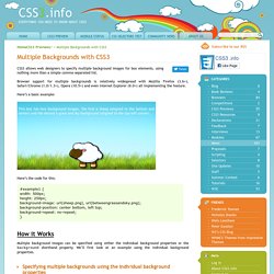
Browser support for multiple backgrounds is relatively widespread with Mozilla Firefox (3.6+), Safari/Chrome (1.0/1.3+), Opera (10.5+) and even Internet Explorer (9.0+) all implementing the feature. Here’s a basic example: This box has two background images, the first a sheep (aligned to the bottom and center) and the second a grass and sky background (aligned to the top-left corner). Here’s the code for this: How it Works Multiple background images can be specified using either the individual background properties or the background shorthand property.
Specifying multiple backgrounds using the individual background properties. Responsive Design with CSS3 Media Queries. Screen resolution nowsaday ranges from 320px (iPhone) to 2560px (large monitor) or even higher.
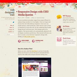
Users no longer just browse the web with desktop computers. Users now use mobile phones, small notebooks, tablet devices such as iPad or Playbook to access the web. So the traditional fixed width design doesn't work any more. Web design needs to be adaptive. The layout needs to be automatically adjusted to fit all display resolution and devices. View Demo Responsive Design Download Demo ZIP.
Box-shadow, one of CSS3′s best new features. Home / CSS3 Previews / Box-shadow, one of CSS3’s best new features The box-shadow property allows designers to easily implement multiple drop shadows (outer or inner) on box elements, specifying values for color, size, blur and offset.
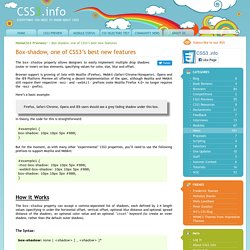
Browser support is growing of late with Mozilla (Firefox), Webkit (Safari/Chrome/Konqueror), Opera and the IE9 Platform Preview all offering a decent implementation of the spec, although Mozilla and Webkit still require their respective -moz- and -webkit- prefixes (note Mozilla Firefox 4.0+ no longer requires the -moz- prefix). Here’s a basic example: Firefox, Safari/Chrome, Opera and IE9 users should see a grey fading shadow under this box. In theory, the code for this is straightforward: Basic Link Rollover as CSS Sprite. Left & Right Halves Layout. Load More Sidebar Content When There Is Room.
One classic layout conundrum is how much stuff to put in a sidebar. Ideally the height of the main content area and the sidebar are about the same, to avoid either area having a large blank area which can be strange looking and a waste of good web real estate. Go light on sidebar content and short content pages may be just about right but long content pages have a lot of unused sidebar space. Go heavy on sidebar content and those long content pages are looking good but short content pages are pushed down awkwardly far. One solution is to pick some kind of happy medium and just roll with it. Another is to get technical and dynamically load the appropriate amount of sidebar content to fit the space available.
Testing Heights We literally need to measure the height of content here, so that's JavaScript territory. First we'll "cache" those elements so we don't need to select them more than once. var mainContent = $("#main-content"), aside = $("aside"); var height = mainContent.outerHeight(); Code Snippets. Textarea Tricks. Oh, <textarea>'s.
How many quirks you posses. Here is a collection of nine things you might want to do related to textareas. Enjoy. 1. Image as textarea background, disappears when text is entered. Creating a Nice Textarea. A textarea is an element on a webpage that you can type into.
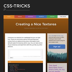
These are commonly used as commenting areas, contact forms or address entry areas. All browsers have defaults styles for textareas which vary. You can take control of your textareas and style them with CSS, just like any other element: In this case, the textarea with the id of "styled" has its width and height explicity set, a border and padding applied, default font set, and a background image applied.
Textareas also support some other features to help you control their aesthetic behavior. <textarea name="styled-textarea" id="styled" onfocus="this.value=''; setbg('#e5fff3');" onblur="setbg('white')">Enter your comment here... Less Framework 4. I called Less Framework "a CSS grid system for designing adaptive websites".
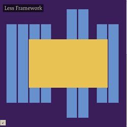
It was basically a fixed-width grid that adapted to a couple of then popular screen widths by shedding some of its columns. It also had matching typographic presets to go with it, built with a modular scale based on the golden ratio. The resources it was originally published with are still available on GitHub. Frameless. Troy Mcilvena. Nice and Free CSS Templates. Learn CSS Positioning in Ten Steps: position static relative absolute float. 1. position:static The default positioning for all elements is position:static, which means the element is not positioned and occurs where it normally would in the document.
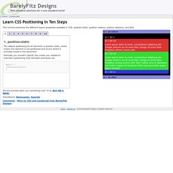
Normally you wouldn't specify this unless you needed to override a positioning that had been previously set. 2. position:relative If you specify position:relative, then you can use top or bottom, and left or right to move the element relative to where it would normally occur in the document. Let's move div-1 down 20 pixels, and to the left 40 pixels: 20+ Resources and Tutorials for Creative Forms using CSS. CSS has hugely improved forms.
Where once you had very rudimentary forms that looked plain and unstyled, CSS lets you style your form however you want and beautiful forms. Even a simple contact form can look slick and increase readability and user-friendliness – which means more visitors will fill it out, and you’ll get better results based on that action. Like with any web design, there’s no need for you to reinvent the wheel – use these CSS form templates and tools to speed up your CSS form creation. With the proper understanding of each element (radio buttons, checkboxes, text areas..), a little CSS know-how, some patience, and some creativity, you can create truly beautiful forms.
Beautiful Forms - Design, Style, & make it work with PHP & Ajax. Mar 09 2009 Forms needs a solid visual structure, a profound hierarchy of form elements (Fields and Labels), powerful techniques and Functionality (AJAX) to make the form look and work creatively.
There is a great bunch of creative, outstanding and individually designed from scratch forms. Thanks to AJAX, we can provide real-time feedback to our users using server-side validation scripts and eliminate the need for redundant validation functions and processing data. Today we wanted to share with you some great steps to get the perfect form: we will go through designing and usability you need to keep in mind, styling your form, spicing it up with some nice javascript effects, validating user’s input and finally getting it to work using PHP and Ajax. 1.
Créer des coins arrondis en CSS et sans images. Vouloir créer facilement des blocs aux coins arrondis est un rêve de webdesigner aussi vieux que le Web lui-même. Traditionnellement, depuis les débuts du web, on réalisait ceci à l'aide de plusieurs éléments <div> imbriqués (ou autres), ou à l'aide d'un tableau à 9 cellules : la cellule du centre accueillait le contenu, tandis que les autres recevaient des images ou des images de fond étirables afin de dessiner les quatre coins et les bordures.
DD_roundies: Code-only rounded HTML boxes. 2011/4/8: It is high time I update the documentation here. This plugin got as far as supporting IE8 Release Candidate 1. That was a while ago. Things have changed. I spent some time away from the project before IE8 final was released. Pressed Button State With CSS. NOTE: I’ve covered button link styling using CSS3 in a more recent post which you can read here. The following post is an older method using images. There is certain anchor state in CSS that I don’t see used very often — actually, it’s something I haven’t really used myself, but something which I now realize can be very useful.
I’m talking about the “active” anchor state. The active anchor state is the state an anchor (a link) is in when you click on it. The moment you click on a link, it becomes active. Styling Button Links With CSS3. A fair while back I wrote a post on pressed button states using CSS, which was a tutorial on how to implement a pressed down button effect on custom styled links. In that post I used images to achieve the visual effect. Now that we have good CSS3 support, that method is really out of date. In this post I’ll show you how to achieve the same effect using CSS3, as well as how I’d go about styling the rest of the button. A CSS Sticky Footer. A CSS Sticky Footer that just works We've all tried to use a CSS Sticky Footer one time or another, but they never seem to come out right, do they? Well, the days of a hard to understand CSS Sticky Footer are thankfully over.
With just a few simple CSS classes with minimal extra HTML markup, I've fashioned a CSS Sticky Footer that even beginners can get a handle on. It's been tested in IE 5 and up, Chrome, Firefox, Safari and Opera. Semi Web Safe Fonts to Spice Up Your Web Designs. We all know of the usual web safe fonts, you know, Arial, Verdana, Georgia, Times New Roman etc? They’ve been around for years and have become the standard for web typography, but there’s a bunch of fonts out there that are just waiting to be put to use in web design.
Semi web safe fonts is a term I’m using to refer to those fonts that aren’t usually found on multiple operating systems as standard, but are often bundled with common software applications such as Office or the Adobe Creative Suite. 16 Gorgeous Web Safe Fonts To Use With CSS. Snook.ca: Tips, Tricks and Bookmarks on Web Development. Killer Collection of CSS Resets. Update! Check out CSSresetr for an easy way to test and download the best reset styles for your next design. Using CSS to style semantically meaningful (X)HTML markup is an important key to modern web design practices. In a perfect world, every browser would interpret and apply all CSS rules in exactly the same way.
26 Essential CSS Submit Button Enhancements.