
Impresión de folletos. The Ezine Directory. “IDEAS PARA TENER IDEAS” de Agustín Medina. Seths Blog. We still teach a lot of myths in the intro to economics course, myths that spill over to conventional wisdom.
Human beings make rational decisions in our considered long-term best interest. Actually, behavioral economics shows us that people almost never do this. Our decision-making systems are unpredictable, buggy and often wrong.
25 Cool and Creative MacBook Stickers. As much as I hate Apple and their often overpriced hardware, I do admit that their products look beautiful and can be used just like jewelry to make you look better.
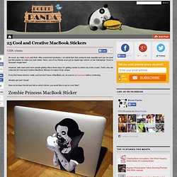
Heck, one of my friends even put an Apple logo sticker on her Dell laptop! *insert a facepalm image here* However, with more and more people getting Macs these days it’s getting harder to stand out of the crowd. That’s why we collected 25 Cool and Creative MacBook Stickers to make it truly unique. If you find these stickers really cool but don’t have a MacBook yet, be sure to get one here before continuing.
Already got one? Now scroll down the list and tell us which sticker you would like to put on your Mac? Perfect Summer Bangle. Here's a fun tutorial on how to make a message bangle that's one-of-a-kind, done in the sun, waterproof and weatherproof.

Even after several trips to the beach, it won't fade or wash off! Essentially, it's the Perfect Summer Bangle. Used in this tutorial: Inkodye Red. Glowing jar project – varázslat a lakásban (EN/HU) Tumblr_l6y89sozbz1qa3fgno1_500_large.jpg (550×550) This to That (Glue Advice) COTTONMONSTER.COM. Crafty Nest.
Diseño « Aula Geek. Aprende a contar desde 0 a 255 en binario.
Boredpanda / Pinterest. Welcome. HACK HiSPANO - Seguridad Informática y Nuevas Tecnologías - Ezine. 960 Grid, un framework para CSS /// Jepser Bernardino. Grid 960 es un framework de css que facilita la maquetación a un estándar de 960px.
En este tutorial vamos a crear un página utilizando este framework. Para empezar, ¿Qué es 960 Grid? 960 Grid es un framework de CSS que nos facilita la vida en un mil por ciento (si lo sabemos utilizar). Grid System — Demo. NewWebPick.com Free, Magazine, E-magazine, Connection, Designer, Art, Animation, Digital Art, Graphic, Graphic Artist, Flash, Print, Illustration, Advertising, CG, Film-making, Interior, Architectural, Wraper, Photography.
Eco-Beautiful Weddings - The E-Magazine & Blog for Eco-Friendly and Green Weddings. A volar on the Behance Network. Pump Up line Inc - With more than 15 years of experience, we manufacture and distribute promotional products. Tutoriales para el diseñador gráfico, enseñanza para diseñadores gráficos. El diseñador es el profesional que lleva adelante cualquier desarrollo de diseño.
En términos generales, el diseñador se ocupa de ingeniería de procesos industriales como la creación de una nueva silla, la decoración de una casa, etc. y de marketing, publicidad y comunicación como la creación de un Logo corporativo, el packaging de un producto, etc. Los diseñadores trabajan con el siguiente ordenamiento de tareas. Petición: es el momento en que una persona (cliente) se pone en contacto con él para desarrollar un proyecto de cualquier índole.
En este paso el diseñador recibe las ideas del cliente y repropone si lo cree conveniente. CANALTUTORIALES. 26 Beautiful Free Retro Fonts. 22 Greyscale Brochure Design Inspiration. The Dieline: The World's #1 Package Design Website - Finding Inspiration in Uncommon Sources: 12 Places to Look. Advertisement Inspiration can be a fickle thing.
Most designers, when lacking ideas, turn to design galleries to find ideas. But there are a few problems with that approach. The most obvious is that when taking inspiration from similar mediums, there’s a fine line between “inspired by” and “copied”. To some extent, looking at established website designs can also be somewhat limiting, especially if you’re looking for a fresh solution to a problem.
There are so many things designers could be turning to for inspiration outside of design galleries. Fashion The world of fashion has a long and varied artistic history. Taking inspiration from both modern and historical fashion can be a great way to infuse something new and fresh in your website designs. Look at the overall scale of an outfit and mimic it.Color schemes are one of the easiest areas to adapt.Look at the lines of a garment and emulate them in your designs.Fabric textures and patterns are another easy-to-mimic area.
Photography Travel. 12 sitios donde buscar inspiración para diseñadores. 26 Professional Photoshop Retouching Tutorials. Adobe Photoshop is the go-to tool for digital artists when it comes to professionally retouching images.
Enhancing and retouching photos in Photoshop is an effective way to "work with what you’ve got". There are many tips, tricks, and techniques for improving things like skin tone and imperfections, and enhancing the photo subject’s features. 45 Tutoriales de Photoshop para practicar. Yo soy de la creencia de que Photoshop es un poco como el deporte, tienes que entrenar y practicar a menudo para estar en un estado de forma correcto para rendir a un buen nivel.
En esta entrada quedan 45 fantásticos tutoriales para entrenar con Photoshop y aprender nuevas técnicas que posteriormente podéis aplicar en vuestros trabajos tanto personales como profesionales. Hay un poco de todo, desde tutoriales de efectos especiales hasta de creación de objetos. A practicar se ha dicho. Fuente | Designm.ag Create a Powerful Human Disintegration Effect in Photoshop Create a Futuristic Bicycle Icon in Photoshop. Ilustraciones para inspirarse I. Quisiera hacer una pequeña lista de ilustradores de distintas zonas del mundo que pueden servirnos de inspiración.

45 Latest Photo Manipulation Tutorials for Photoshop. When we talk about image editing or photo enhancement, Adobe Photoshop is the first thing that comes to our minds. The software itself is hard to learn and harder to master though. Thanks to the many tutorials available though, even novices can learn the tricky techniques used by the pros fairly easily.
Selecting the best tutorials from a pool containing tens of thousands is very difficult. That is were we come in. To make things a bit more easier for you, we’ve compiled an collection of 45 of the latest photo manipulation tutorials. Here they are: 16 procesos diferentes para diseñar logotipos. Psicología del color. Para un diseñador es imprescindible tener unas bases sobre los efectos que crea el color en el público, es muy distinto aplicar un colorido u otro en un mismo diseño, indirectamente una tonalidad nos hace llegar un mensaje determinado ya sea porque se ha establecido así socialmente o porque psicológicamente estamos predispuestos a recibir una sensación determinada. También existe diferencia entre utilizar gamas de colores cálidos o sus opuestos, los colores fríos.
Amarillo: Representa la calidez y la felicidad, y es altamente estimulante, se suele asociar con el lado intelectual. Hay que utilizarlo para crear un efecto alegre y feliz. Rojo: Es un color de fuerza, estimulante y muy dinámico. Se asocia con el optimismo y el liderazgo. Naranja: Es energético y a la vez agradable. Colour Combination Makes a Better Impact in Logo Designing. It’s undeniable. Branding is the life blood of any business. Even for small businesses, you’ve gotta build brand identity, or be ready for your company to go belly up. A big part of many company’s brand identity is the logo. It’s like the face of your company. You need one that’s good looking and instantly recognizable. How Colour Combination Makes a Better Impact in Logo Designing.
40 Logotipos que usan el espacio negativo. 30 Effective Business Cards that Grab Attention. Business cards are probably the smallest, most handy, cheapest, yet most effective contact-building tool. Sadly, not all business cards are the same. There are those that stand out and there are those that do not even stand a chance. Coming up with effective business cards will give you a better chance at securing any job or getting more clients to use your products or services. How do you make business cards effective? Honestly, there is no exact science on how to do so, but here are a few samples that could help you out.
After designing your business cards, let the experts at DigitalRoom.com take care of you. Leah Oripaypay - Who's written 6 posts on the DigitalRoom.com Blog. 30 Tarjetas de visita para impresionar a los clientes. Diseñar una tarjeta de visita no es complicado, pero hacer una con la que los clientes se acuerden de nosotros por los detalles es algo mucho más complejo y que cuesta lograr, pero vamos a dar un paso adelante con esta recopilación. Se trata de treinta tarjetas de visita diseñadas desde el buen gusto, desde la inspiración y desde la imaginación más espectacular. El resultado es fantástico, admirable. Ver Recopilación | DigitalRoom También te puede interesar. 15 tarjetas de presentación creativas e imaginativas. Folletos con un diseño sencillo. Este sitio pertenece y esta operado por: Source Logistic AS ("Optimalprint" "nosotros", “nos” o "nuestro (s)" ),