
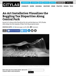
SITU Studio Art Project Shows the Gulf of Inequity in New York Property Tax Assessments. New York City calculates property taxes for condos and co-ops using a byzantine formula mandated by the state.
URBAN LENS. Apple animation - Designed by Apple - Intention (2013) Every Day of My Life. Apps.
Big Picture: Google Visualization Research. A Visual Introduction to Machine Learning. DESIGN — Stefanie Posavec. MultiTracking Agents. Where Bars Outnumber Grocery Stores. Back in 2008, the Floatingsheep group collected data about the number of bars across the United States, and they compared those counts against the number of grocery stores.
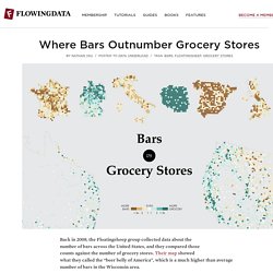
Their map showed what they called the “beer belly of America”, which is a much higher than average number of bars in the Wisconsin area. I came back to the map recently, and three questions came to mind: The original map only showed a binary comparison. That is, areas were either colored as more bars or more grocery stores. Connectography: Mapping the Future of Global Civilization: Parag Khanna: 9780812988550: Amazon.com: Books. Connectivity Atlas. Film Color Analysis. Wind prediction and potential power. As we use up current energy resources, it grows more important to look to alternative energy sources.
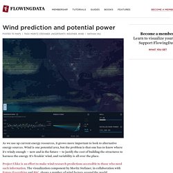
Wind is one potential area, but the problem is that one has to know where it's windy enough — now and in the future — to justify the cost of building the structures to harness the energy. It's freakin' wind, and variability is all over the place. Wikipedia Celebrates Its 15th Birthday With 15 Data Visualizations of the Site. Today is Wikipedia’s 15th birthday, and to honor the occasion, the team there has compiled a list of its favorite Wikipedia-related data visualization projects.
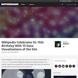
The projects range from the pragmatic to the simply elegant, but they’re all impressive, considering the massive amount of data being used. A screenshot from “Listen to Wikipedia.” One particularly beautiful effort is “Listen to Wikipedia,” which renders edits being made in real-time both visually and socially, and the effect makes surprisingly relaxing ambient music. Intelligent Life magazine. We are all familiar with maps of the globe, as though seen from space, unfolded onto a flat page with America on the left and China on the right.
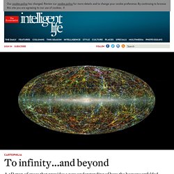
This map, with its glowing web of blobs and veins like so many city lights at night, shows space seen from Earth similarly unfolded. But unlike those two-dimensional maps, this one allows us to see in three dimensions: up and down, left and right, and then out through the universe. It’s a map of galaxies, bundled into clusters and superclusters. The haze running through the middle is our own galaxy, the Milky Way. At the top is a bright density of blue—the Coma Cluster, which contains 1,000 galaxies. Machine-Learning Algorithm Calculates Fair Distance for a Race Between Usain Bolt and Long-Distance Runner Mo Farah.
It’s obviously unfair to compare the performance of sprinters and long-distance runners.
Data Science – Short lesson on cluster analysis. Introduction In clustering you let data to be grouped according to their similarity.
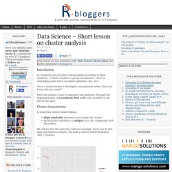
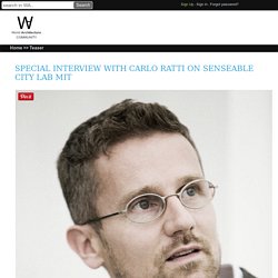
A cluster model is a group of segments -clusters- containing cases (such as clients, patients, cars, etc.). Once a cluster model is developed, one question arises: How can I describe my model? Here we present a way to approach this question, through the implementation of Coordinate Plot in R (code available at the end of the post) Cluster characteristics. Special Interview with Carlo Ratti on Senseable City Lab MIT. Photography © Lars Krüger Carlo Ratti really makes cool things in MIT Senseable Laboratory to experience the ''real-time'' city with a new approach by using new datas,electronics,codes and softwares.Carlo Ratti is an architect and engineer by training, Carlo Ratti practices in Italy and teaches at the Massachusetts Institute of Technology, where he directs the Senseable City Lab.
He graduated from the Politecnico di Torino and the École Nationale des Ponts et Chaussées in Paris, and later earned his MPhil and PhD at the University of Cambridge, UK.Carlo holds several patents and has co-authored over 250 publications. Senseable City Lab. Over the past decade digital technologies have begun to blanket our cities, forming the backbone of a large, intelligent infrastructure.

Broadband fiber-optic and wireless telecommunications grids are supporting mobile phones, smartphones and tablets that are increasingly affordable. At the same time, open databases—especially from the government—that people can study and contribute to are revealing all kinds of information, whilst public kiosks and displays are helping both the literate and illiterate gain access to it. Add to this a relentlessly growing network of sensors and digital-control technologies, all tied together by cheap, powerful computers, and our cities are quickly becoming “computers in open air.”
As a direct consequence of the their operation, these systems, networks, and devices generate vast quantities of data that are increasingly becoming available in real time. Divvy Data Challenge 2015 voting: Most Beautiful. Divvy Data Challenge 2015 voting: Most Beautiful. MIT Senseable City Lab. Soy español, ¿qué quieres que te infografíe? Por Borja Ventura ( @borjaventura ) ecciones de economía básica: cuando un producto tiene mucha demanda y poca oferta, el precio sube; cuando la demanda de ese producto no está donde se produce, se exporta; cuando un territorio produce y exporta de forma frecuente, se convierte en potencia.
Ahora cambiad «producto» por infografía y tendréis un retrato de España. Tenemos una enorme cantera de grandes infografistas que no encuentran acomodo en el sector mediático español, pero por los que andan locos por cazarlos más allá de nuestras fronteras. ¿Qué pasa entonces? Que hay muchos de nuestros infografistas copando puestazos en medios de comunicación internacionales y haciendo de España una referencia en el sector. Como ves, no hacen falta ni dos tardes para saber algo de economía. «Menos McLuhan y más cartografía, Adobe, Java Script y CSS en las aulas». Alberto Lucas López «Menos McLuhan y más cartografía, Adobe, Java Script y CSS en las aulas» (Samuel Granados)
Map your moves. Data This map distills more than 4000 moves from over 1700 people, collected in an informal survey by WNYC, a New York based public radio station. For generating the geo–coordinates from the entered ZIP codes, I used the free bulk geocoder at gpsvisualizer.com. I did not check every single data row in detail, so a few of the moves might be misrepresented. A decade of news articles from Hungary visualized. Ebullition is an animated visualization of articles from origo.hu, a major Hungarian news website. The video runs through the history of the site from December 1998 to October 2010, each frame representing a single day.
Whenever a place in Hungary is name-checked a map of the country dynamically swells according to the number of items about that location. Every event is accompanied by a sound effect, creating a constant drone-like musical backdrop. The result is an ever-changing organic map, permanently bulging from the flow of stories from Budapest, throbbing with less frequent bulletins from other parts of the country. An animated map of global wind, weather, and ocean conditions. MIT SENSEable City Lab.
An Interactive Visualization of NYC Street Trees. About We were curious to see what were some of the common and not so common trees planted in the five boroughs of New York City. While this visualizes trees which we personally love as an essential element of any urban city, we see this as an experiment or model to visualize other datasets in an additive/subtractive format. This visualization allows one to quickly see distribution. Best of the visualisation web... July 2014 - Visualising Data. At the end of each month I pull together a collection of links to some of the most relevant, interesting or thought-provoking web content I’ve come across during the previous month. Here’s the latest collection from July 2014. Visualisations/Infographics Includes static and interactive visualisation examples, infographics and galleries/collections of relevant imagery. The O-C-R | New project for the July issue of Popular Science "a 4-page, 3,460-word visualization which tells the story of NASA’s history in the agency’s own words".
Este experimento audiovisual visualiza la ciencia del sonido. Amazing Resonance Experiment! Receptive Environments. New York City taxi trips. Web Maturity. Infographics: What is it for and why use it. 7 Data Visualization Companies You Might Not Know. Datavisualization.ch Selected Tools. The Data Visualisation Catalogue. Centro de Innovación BBVA. Información para Innovar y de Innovación.
Etiquetas de este contenido: historia Facebook Datos Infografía BBVA Innovación TR35 MIT Infografía página web Innovación Google glass Política Financiación 3D Infografía impresión Cloud Computing Infografía.
PERIODISMO DE DATOS. Earth at Night 2012. Account Options Sign in Earth at Night 2012. 8 types of infographics: which one is right for you? Relation browser. This radial browser was designed to display complex concept network structures in a snappy and intuitive manner. It can be used to visualize conceptual structures, social networks, or anything else that can be expressed in nodes and links. CIA world factbook demo This demo displays the relations of countries, continents, languages and oceans found in the CIA world factbook database. Click the center node for detail information or click adjacent nodes to put them in the center. The arrows on the top left can be used to navigate your click history. Open source You can download a preliminary Open Source version of the software here: Relation browser source code Note that the code is already a couple of years old, so it is programmed in Actionscript 1.
STATIC MAPS/GRAPHICS. MOTION GRAPHICS. PLATAFORMAS. PROJECTS. TOOLS. GENTE. Visualización.