

Beginner’s Guide to Responsive Web Design. Whether you’re a beginner or a seasoned web professional, creating responsive designs can be confusing at first, mostly because of the radical change in thinking that’s required.
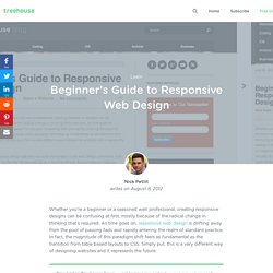
As time goes on, responsive web design is drifting away from the pool of passing fads and rapidly entering the realm of standard practice. In fact, the magnitude of this paradigm shift feels as fundamental as the transition from table based layouts to CSS. Simply put, this is a very different way of designing websites and it represents the future. Free trial on Treehouse: Do you want to learn more about responsive web design? Try a free trial on Treehouse. Responsive Web Design. The English architect Christopher Wren once quipped that his chosen field “aims for Eternity,” and there’s something appealing about that formula: Unlike the web, which often feels like aiming for next week, architecture is a discipline very much defined by its permanence.
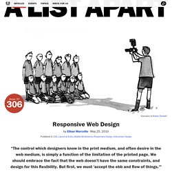
Article Continues Below A building’s foundation defines its footprint, which defines its frame, which shapes the facade. Each phase of the architectural process is more immutable, more unchanging than the last. Creative decisions quite literally shape a physical space, defining the way in which people move through its confines for decades or even centuries. Working on the web, however, is a wholly different matter. But the landscape is shifting, perhaps more quickly than we might like. In recent years, I’ve been meeting with more companies that request “an iPhone website” as part of their project. A flexible foundation#section1. The Many Faces of ‘Mobile First’ We see the phrase ‘mobile first’ everywhere.
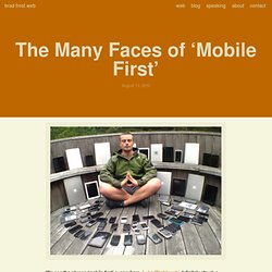
Luke Wroblewski definitely struck a nerve when he coined the phrase a few years ago and created an important battle cry as we head into this multi-screen future. Luke’s definition of mobile first consists of three core components: The growth of mobile is a huge opportunity to reach more people than everThe constraints of the mobile medium force us to focus on what really mattersThe capabilities of mobile create opportunities to innovate However, sometimes terms evolve beyond their initial definitions and become a catch-all for a general notion or idea (I’ve recently been talking about this with regards to responsive web design).
This genericization has certainly happened to ‘mobile first’ and as a result we’re seeing it used in myriad different ways. Culture The mobile-first population primarily (or only) accesses the digital world through their mobile devices. Designer’s guide to first Responsive Website. Over the last few months, we have worked with many designers to help them with Frontend Development and one thing that has actually become a default standard is “Responsive Web Design”.
The simplest definition people often give is: “Its a website that works across desktops, tablets and mobile phones“. But it hardly explains what it really means and how it works, thats the reasons often Developers end up requesting 3 PSDs for different layouts when the design is not made to be responsive. Responsive Web Design: What It Is and How To Use It. Advertisement Almost every new client these days wants a mobile version of their website.
It’s practically essential after all: one design for the BlackBerry, another for the iPhone, the iPad, netbook, Kindle — and all screen resolutions must be compatible, too. Guidelines for Responsive Website Design. This article includes several guidelines for creating websites that scale for different screen sizes and form factors.

During QA TechWeek 2014, David Walker, Principle Technologist for QA, has presented guidelines for creating a Responsive Website Design during the session Going Responsive with Foundation. Walker mentioned several ways of creating websites for mobile applications starting from an existing one for the desktop: Native App – one for each mobile OS, Embedded HTML5 – using PhoneGap or similar, Filtering at the server – separate websites for the desktop and mobile devices with redirection between the two.
After the pros and cons for each of these methods, Walker introduced Responsive Website Design (RWD) which involves creating a single website whose layout, format and content is adjusted on the fly for the device it is displayed on using HTML5, JavaScript and CSS. To be able to create a responsive design, Walker suggested following a number of guidelines: Responsive Web Design: What It Is and How To Use It. Responsive Web Design Best Practices. With the extreme rate at which the mobile web is increasing, it´s essential for you and your website be ready to accept customers who are coming to visit you from different devices and screen sizes.

Here responsive design can help you, however, you should follow some best practices. First of all, the browsing experience has to be the same for all the users: the website’s appearance should change without function losses for all the devices’ users and the quality of this experience doesn’t have to depend on whether it is desktop or smartphone/ tablet access. Responsive in Mind Understand that there always are layouts which are good for responsive design and which are not: there are designs that convert to the range of new sizes better than others because of their layout.
Use simple mechanisms for core elements, HTML5 guidelines and doctype, and a simple overall core layout. Breakpoints.