
Getting started. Bootstrap is downloadable in two forms, within which you'll find the following directories and files, logically grouping common resources and providing both compiled and minified variations. jQuery required Please note that all JavaScript plugins require jQuery to be included, as shown in the starter template. Consult our bower.json to see which versions of jQuery are supported. CSS. Get the lowdown on the key pieces of Bootstrap's infrastructure, including our approach to better, faster, stronger web development.
HTML5 doctype Bootstrap makes use of certain HTML elements and CSS properties that require the use of the HTML5 doctype. Include it at the beginning of all your projects. <! Doctype html><html lang="en"> ... Mobile first With Bootstrap 2, we added optional mobile friendly styles for key aspects of the framework. To ensure proper rendering and touch zooming, add the viewport meta tag to your <head>. You can disable zooming capabilities on mobile devices by adding user-scalable=no to the viewport meta tag. Bootstrap sets basic global display, typography, and link styles. Set background-color: #fff; on the body Use the @font-family-base, @font-size-base, and @line-height-base attributes as our typographic base Set the global link color via @link-color and apply link underlines only on :hover.
Bootstrap 3: the new grid system, for starters - Born, Growing Up. Heads up!
2013-08-20 · Updated to Bootstrap 3.0.0 stable. 2013-08-15 · Updated to reflect the changes in Bootstrap 3.0.0-rc.2. 2013-08-12 · It seems that the grid system is now being actively refactored with frequent changes. I’m closely watching the situation evolving, and will update this post when things settle down a bit. All in all, the core concepts remain the same. Baby steps It’s super easy to put together a basic page with Bootstrap. <! This is it. HTML5: achieved declaring a <! Take a look at the page in a browser, and you’ll see a lonely — but stylish — Hello, world!.
Heads up! If you can’t or don’t want to serve your pages locally, then please change every protocol relative URL in the sources to its more classic variant, or your browser may not be able to find those resources. Experience Design at Hello Erik. IMPORTANT NOTE: Bootstrap 4 will be out soon, and it will be moving to Sass for its CSS instead of Less.
Most of the principles of this article will still apply – but I will do my best to quickly either rewrite the post for Sass, or just update this post for both. I do not expect huge changes to how the grid HTML classes are applied. Read more here: After over 9-months of work, Bootstrap 3 is here. It introduces a new way of thinking on how the responsive grid works, when it is best applied, and how the styled elements within the breakpoints work as well.
Bootstrap 3 Grid Tutorial - Cyberdesign Craft. This is a tutorial on the new Bootstrap 3 grid system!
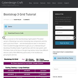
This latest version of Bootstrap has some interesting new components and the grid is just one of them - and the best place to start. In the demo I have included the page elements to give you an understanding of Bootstrap 3′s default styles. To get familiar with the new system, we’ll first take a look at the key on the grid map below, notice how different devices scale a little differently; particularly in the smallest (xs) grouping for phones. Bootstrap 3 Grid System Fig .1 As you can see the new grid is very straight forward.
The New Bootstrap Grid is based on four new column size classes, starting with the smallest sized devices: .col-xs-#(number-of-columns): Phone.col-sm-#(number-of-columns): Tablet.col-md-#(number-of-columns): Laptop/Desktop.col-lg-#(number-of-columns): Large Desktop Follow this link for an example of each class and to discover how they operate at differ sizes, simply re-size your browser. <! Example of All Classes. Understanding the Bootstrap 3 Grid System. With the 3rd version of the great Bootstrap out for about 4 and a half months now, people have had their time to play around with it, learn the changes, find new features, and build amazing things. # The Difference The most interesting change for me was the difference in the grid system.

Bootstrap 2 catered to two different browser sizes (desktop and then mobile). With Bootstrap 3, you now build with mobile in mind first, and the grid system lets you create different grid systems based on browser size. Bootstrap 2 The grid you create works on desktops and then stacks on top of each other when browser size is below 767px. Bootstrap 3 The new Bootstrap grid system applies to mobile first. For example, let’s say you want a site that has: 1 column on extra small devices2 columns on small AND medium devices4 columns on large devices.