

Flexbox Tutorial. Flexbox Froggy - A game for learning CSS flexbox. GitHub - imjustd/flexbox-playground: Mini project demonstrating how CSS3 Flexbox Layout works. CSS3 Flexible Box. CSS flex property. A Complete Guide to Flexbox. Background The Flexbox Layout (Flexible Box) module (a W3C Candidate Recommendation as of October 2017) aims at providing a more efficient way to lay out, align and distribute space among items in a container, even when their size is unknown and/or dynamic (thus the word “flex”). The main idea behind the flex layout is to give the container the ability to alter its items’ width/height (and order) to best fill the available space (mostly to accommodate to all kind of display devices and screen sizes).
A flex container expands items to fill available free space or shrinks them to prevent overflow. Most importantly, the flexbox layout is direction-agnostic as opposed to the regular layouts (block which is vertically-based and inline which is horizontally-based). While those work well for pages, they lack flexibility (no pun intended) to support large or complex applications (especially when it comes to orientation changing, resizing, stretching, shrinking, etc.).
Basics & Terminology. Flexbox · Bootstrap. Flexbox support has finally come to Bootstrap.
Opt-in to the new CSS layout styles with the flick of a variable or the swap of a stylesheet. Contents What’s included Flexbox support is available for a number of Bootstrap’s components: The entire grid system (mixins and predefined classes), which switch from floats to display: flex;. Vendor prefixes are provided in our compiled CSS with Autoprefixer via Grunt. Flexbox: CSS Flexible Box Layout. Do you remember when tables were the only layout method for a website?
At least until people realized that it’s a semantic nightmare to misuse something that’s actually reserved to display tabular data for the structure of an internet site. So a new “tool” needed to be found and soon floats and absolute positioning were discovered as a “proper” replacement. Just like tables, of course, the true purpose of these two methods wasn’t to give websites a shape. But nevertheless, here we are, over a decade later, and there’s still no reasonable solution for this “problem” – at least one that works a across a wide range of browsers. But the chances are good that Flexbox (or “Flexible Box Layout Module” as the W3C likes to call it) is the next big thing. But be warned: there’s also an older version of Flexbox from 2009, which has pretty decent support, but was dismissed by the W3C late 2011 in favor of a more catchy syntax. The advantages Let’s flex The order of things Unnatural placement. Flexbox demo. Flexbox: CSS Flexible Box Layout. Flexbox Bar Navigation Demo.
Someone wrote in to me asking how to create a simple bar navigation with icons.
This is a pretty simple layout thing that could be accomplished loads of different ways. List items as inline-block probably makes the most sense in general. But I've been enjoying tinkering with flexbox, so I decided to toss it together with that, and it made for a pretty educational example I think. Here it is: See the Pen Bar Navigation with Flexbox and SVG icons by Chris Coyier (@chriscoyier) on CodePen. Flexbox makes it easy to align the items however you want: Flexbox makes it easy to allow the menu items to take up as much space as they need, without specifying any exact numbers: But if you want to apply exact numbers, you can: Flex items can wrap and the properties can change with media queries: Flex items are easy to align how you want, even vertically, even with centering: In the demo, feel free to turn on the outlines to see how the boxes align themselves.
Solved by Flexbox — Cleaner, hack-free CSS. All of the code samples on this site show how to solve a particular design problem with Flexbox.
They show just the code that's needed to make the demos work in a spec-compliant browser. Some browsers do not fully comply with the latest version of the spec, so sadly, a few workarounds were necessary. Workarounds for non-compliant browsers are not shown in the code samples, but if you're curious about those implementation details, you can check out the source files. Each demo links to its source, and all browser-specific workarounds are well-documented, so don't be afraid to take a look. The vendor prefixing and translating of current flex properties to their legacy equivalents is all handled by autoprefixer. CSS3 Flexible Box. CSS/Eigenschaften/Größenangaben/Flexbox – SELFHTML-Wiki. Flexbox ist eine sehr moderne und einfache Möglichkeit, responsive und flexible Layouts zu erstellen, ohne feste Größenangaben und weitere CSS-Einstellungen wie position, float oder clear nutzen zu müssen.
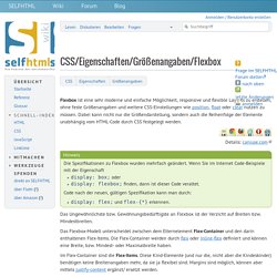
Dabei kann nicht nur die Größendarstellung, sondern auch die Reihenfolge der Elemente unabhängig vom HTML-Code durch CSS festgelegt werden. Details: caniuse.com Hinweis Die Spezifikationen zu Flexbox wurden mehrfach geändert. Wenn Sie im Internet Code-Beispiele mit der Eigenschaft display: box; oder display: flexbox; finden, dann ist dieser Code veraltet. Code nach der neuen, gültigen Spezifikation kann man durch: display: flex; und flex-{*} erkennen. Das Ungewöhnlichste bzw. A Complete Guide to Flexbox. Learn Flexbox Through Examples. CSS: Flexbox Essentials.