
Grid. A Complete Guide to CSS Media Queries. Flexbox. CSS Tricks. w3 Schools. Selectors. Scaled/Proportional Content with CSS and JavaScript. Flex Tut easy. Code Snippets. Hover effects. Passende Farben. Radio Buttons. Media query and transition. Tipps & Tricks. Nice Google-Fonts. Generatoren. 1200+ Best jQuery : Website Design Awards Gallery 2014 - 2013. 200+ CSS Image Hover Effects with Text Animation Example.
Home - Scalable and Modular Architecture for CSS. BEM — Block Element Modifier. On smaller brochure sites, how you organize your styles isn’t usually a big concern.
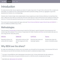
You get in there, write some CSS, or maybe even some SASS. You compile it all into a single stylesheet with SASS’s production settings, and then you aggregate it to get all the stylesheets from modules into a nice tidy package. However, when it comes to larger, more complex projects, how you organize your code is the key to efficiency in at least these three ways: it affects how long it takes you to write code, how much of that code you’ll have to write and how much loading your browser will have to do. This becomes especially important when you’re working with teams of themers, and when high performance is essential. This is also true for long-term projects with legacy code (read "How to Scale and Maintain Legacy CSS with Sass and SMACSS" — some nice SMACSS and BEM mixing in there). Methodologies Separating container and content with CSS “objects” Structured class names and meaningful hyphens Atomic Block.
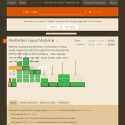
Codrop Animations. Minifyer. Tailwind. A Visual Guide to “em” and “rem” Units. Bezier curves. Video Courses. Can I use... Support tables for HTML5, CSS3, etc. About "Can I use" provides up-to-date browser support tables for support of front-end web technologies on desktop and mobile web browsers.
The site was built and is maintained by Alexis Deveria, with occasional updates provided by the web development community. The design used as of 2014 was largely created by Lennart Schoors. May I use your data in my presentation/article/site, etc? Yes, the support data on this site is free to use under the CC BY 4.0 license. Is there a way to see the support data in colors other than red/green?
Yes, you can enable accessible colors from this link or from the option under Settings. Do you have the data available in a raw format? Yes, the raw support data is available on GitHub and is updated regularly. Could you add feature X to the site? Adding features takes quite some time and there are many requests for additions. If you've done the research yourself already, you can also submit a feature on GitHub.
Which features do you choose to add to this list?
Sass. Responsive Design. Animation. Tuts. CSS Guru — Hello Laravel. Introduction of BEM — Hello Laravel. What is BEM ?
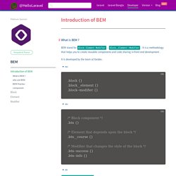
BEM stand for Block Element Modifier , Block__Element--Modifier . It is a methodology that helps you to create reusable components and code sharing in front-end development . It is developed by the team at Yandex . ex: ex .block__element--modifier this is proper pattern of bem . why use BEM It’s easy for new team members to read the markup and CSS, and understand its behaviorAdding more developers increases team productivityConsistent naming reduces the possibility of class name collisions and side effectsCSS is independent of markupCSS is highly reusable BEM Practise : CSS Guru — Hello Laravel. CDNs.
CSS. Color palettes - webdesign. Generate font pairings in one click. Other Frameworks. Flex. Grid. Responsive images. CSS Color Names.