
A Primer on the Different Types of Browser Storage. In back-end development, storage is a common part of the job.
Application data is stored in databases, files in object storage, transient data in caches… there are seemingly endless possibilities for storing any sort of data. But data storage isn’t limited only to the back end. The front end (the browser) is equipped with many options to store data as well. We can boost our application performance, save user preferences, keep the application state across multiple sessions, or even different computers, by utilizing this storage. In this article, we will go through the different possibilities to store data in the browser. The localStorage API localStorage is one of the most popular storage options in the browser and the go-to for many developers.
Surprisingly, the Google Chrome team doesn’t recommend using this option as it blocks the main thread and is not accessible to web workers and service workers. Fluid Images in a Variable Proportion Layout. Creating fluid images when they stand alone in a layout is easy enough nowadays.
However, with more sophisticated interfaces we often have to place images inside responsive elements, like this card: For now, let’s say this image is not semantic content, but only decoration. That’s a good use for background-image. And because in this context the image contains an object, we can’t allow any parts to be cropped out when it’s responsive, so we’d pick background-size: contain. Here’s where it starts to get tricky: on mobile devices, this card shifts direction and becomes vertical, with the image on top. But as we test for smaller screens, because of the contain property, this is what we get: That’s not very nice. At this point, our next attempt might be familiar to you: placing the image inline, instead the background. On desktop, this works fine: It’s not bad on mobile either: Clippy — CSS clip-path maker.
1-Line Layouts. New in Chrome: CSS Overview. Here’s a fancy new experimental feature in Chrome!
Now, we can get an overview of the CSS used on a site, from how many colors there are to the number of unused declarations… even down to the total number of defined media queries. Again, this is an experimental feature. Not only does that mean it’s still in progress, but it means you’ll have to enable it to start using it in DevTools. Open up DevTools (Command+Option+I on Mac; Control+Shift+I on Windows)Head over to DevTool Settings (? Or Function+F1 on Mac; ? And, oh hey, look at that! Notice that the report is broken out into a number of sections, including Colors, Font info, Unused declarations and Media queries.
This is pretty nifty though, huh? Learn Box Alignment. Display Styled Directory Contents. Rollout: Powerful Feature Flag Management Servers can be configured to show the contents of a directory that doesn't have an index file to render.
The result is usually less than visually spectacular: We can take control of this ourselves by replicating this functionality with PHP. Make an index file (.index.php, starting with the dot, really) which reads the files in the directory and outputs them into a tableMake an .htaccess file that serves that file as the indexHave the index file load in CSS and other resources that are also prefixed with a dot (hidden) The following PHP reads the directory of files and displays a styled table of their name, file type, and file size. The resources loaded in that index file are the top-in table sorter script sortable.js and a .style.css file.
View Demo Download Files REMEMBER: The .zip file might appear to be empty, but it's not. Special thanks to Cliff White. Top Shadow. The Slideout Footer. Personalized marketing with Mailchimp A fascinating new site called The Markup just launched.
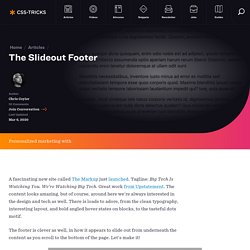
Tagline: Big Tech Is Watching You. We’re Watching Big Tech. Great work from Upstatement. The content looks amazing, but of course, around here we're always interested in the design and tech as well. The footer is clever as well, in how it appears to slide out from underneath the content as you scroll to the bottom of the page. Here's the trick: The main content area is at least 100vh tall. That last one is the fanciest trick, and it's actually fancier than The Markup does it. The fact that that works so easily without magic numbers is pretty rad. Preethi showed us a super similar technique in 2018. #Keyframers Video Stephen did one up!