
UiGradients - Beautiful coloured gradients. Naming Things. There are only two hard things in computer science: cache invalidation and naming things.Phil Karlton Being a professional web developer means taking responsibility for the code you write and ensuring it is comprehensible to others.
Having a documented code style is one means of achieving this, although the size and type of project you’re working on will dictate the conventions used and how rigorously they are enforced. Working in-house may mean working with multiple developers, perhaps in distributed teams, who are all committing changes – possibly to a significant codebase – at the same time. Left unchecked, this codebase can become unwieldy. Coding conventions ensure everyone can contribute, and help build a product that works as a coherent whole. 50 CSS Tools & Resources from 2014. Just as we published in December last year, today we have the 2014 edition of our 50 favorite CSS resources.
It’s a huge post of all of the really cool CSS resources, frameworks, libraries, UI kits and tools that have been released this year. The below resources have been categorized into the following sections: Web-Based Tools & Apps, CSS Button Libraries, CSS Animation Libraries, CSS Typography Toolkits, CSS Loading Spinners Libraries, Material Design Inspired Frameworks, CSS Frameworks, Boilerplates & UI Kits, CSS Icon Generation Tools, CSS Color Palette Tools & Generators, CSS Learning & Reference Resources, and finally, a bunch of miscellaneous CSS tools and apps. Responsive Images For Retina: Using HTML5’s srcset. This past Thursday saw the release of Apple’s new “Retina”-screen iMac, making it official: we are now in the world of desktop high-DPI screens.
This makes the job of designers and developers doubly difficult, expanding an image quality problem that was previously confined to mobile devices and high-end laptops to one that will soon reach computers everywhere. Thankfully, HTML5 now has a solution. But before looking at that, we should have a better understanding of the Retina problem. srcset The ideal solution would be to send high-resolution versions of images to devices that can use them, while maintaining a standard resolution for others.
This delivers the kirkjufell.jpg image to standard screens, and kirkjufell@2x.jpg to those that are 196DPI or higher. Note that the @2x appended to the filename is not required: it’s just a suggested naming convention for high-DPI images. Browser Support Detecting Screen Sizes Which produces: The syntax translates to: Create A Pure CSS Diagonal Menu - Call Me Nick. Get Source View Demo The Age-Old Horizontal Navigation Menu.
50 Visually Appealing CSS Tutorials & Techniques. If you are looking for in-depth articles on the inner workings of flexbox, or a comprehensive explanation for using CSS regions, then this is definitely not the post for you.
Instead, we have squarely put our focus on those CSS tutorials that not only make the smaller details of the web visually appealing, but are also really useful. You know what we mean… fantastic text effects, innovative button styles, space-saving navigation systems, subtly animated form elements… that kind of thing. How to Center Anything with CSS. Updated March 24, 2016.
If you've ever had to build a webpage, you have likely needed to center something in that page. Using Cascading Style Sheets (CSS) is the proper way to center images, blocks of text, and even your entire layout for a Web page. Most of the properties for centering have been in CSS since version 1.0, and they work great with CSS3 and modern Web browsers. CSS Flip Animation. You've all asked for it and now I've added it: Internet Explorer support!
Annoyingly enough, the change involves rotate the front and back elements instead of just the container. Skip to this section if you'd like the Internet Explorer code. IE10+ is supported; IE9 does not support CSS animations. CSS animations are a lot of fun; the beauty of them is that through many simple properties, you can create anything from an elegant fade in to a WTF-Pixar-would-be-proud effect. One CSS effect somewhere in between is the CSS flip effect, whereby there's content on both the front and back of a given container. Quick note: this is not the first tutorial about this effect, but I've found the others over-complicated. The HTML The HTML structure to accomplish the two-sided effect is as you would expect it to be:
CodePen - Front End Developer Playground & Code Editor in the Browser. Cascading SVG Fill Color. One time someone told me their biggest problem with SVG icons is that they didn't match the color of text they were by.
In fact it was such a big problem for them, that despite seeing the advantages of SVG icons they were sticking with icon fonts. I didn't think of it at the time, but there is a pretty easy solution for this. The idea is to use the currentColor value in CSS to pass that text color through to the SVG shapes. For instance: <h1><svg viewBox="0 0 32 32"><use xlink:href="#icon-phone"></use></svg> Call Me </h1> You can simplify this and let the fill cascade to the SVG: So fill cascades eh?
Fill only affects SVG anyway, so it won't be doing anything we don't want it to do, and it's easily overridable by a more specific selector anyway. The trouble is that doesn't quite work as is. Take this example, which is just our original example inside the <body>: <body><h1><svg viewBox="0 0 32 32"><use xlink:href="#icon-phone"></use></svg> You'd think the SVG would fill blue too? Prefix free: Break free from CSS vendor prefix hell! -prefix-free lets you use only unprefixed CSS properties everywhere.
It works behind the scenes, adding the current browser’s prefix to any CSS code, only when it’s needed. The target browser support is IE9+, Opera 10+, Firefox 3.5+, Safari 4+ and Chrome on desktop and Mobile Safari, Android browser, Chrome and Opera Mobile on mobile. Flexible CSS cover images. I recently included the option to add a large cover image, like the one above, to my posts.
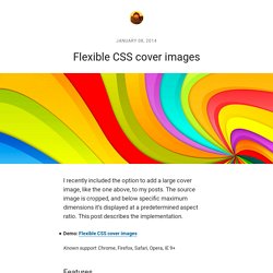
The source image is cropped, and below specific maximum dimensions it’s displayed at a predetermined aspect ratio. This post describes the implementation. Demo: Flexible CSS cover images Known support: Chrome, Firefox, Safari, Opera, IE 9+ Features The way that the cover image scales, and changes aspect ratio, is illustrated in the following diagram. The cover image component must: render at a fixed aspect ratio, unless specific maximum dimensions are exceeded;support different aspect ratios;support max-height and max-width;support different background images;display the image to either fill, or be contained within the component;center the image. TinyNav.js · Convert navigation to a select dropdown on small screen. Code Snippets. Everything You Need to Know About the CSS will-change Property. Introduction If you’ve ever noticed “that flicker” in WebKit-based browsers while performing certain CSS operations, especially CSS transforms and animations, then you’ve most likely come across the term “hardware acceleration” before.
The CPU, GPU, and Hardware Acceleration In a nutshell, Hardware acceleration means that the Graphics Processing Unit (GPU) will assist your browser in rendering a page by doing some of the heavy lifting, instead of throwing it all onto the Central Processing Unit (CPU) to do. When a CSS operation is hardware-accelerated, it usually gets a speed boost as the page rendering gets faster. As their names show, both the CPU and the GPU are processing units. Hardware acceleration (a.k.a. CSS animations, transforms and transitions are not automatically GPU accelerated, and instead execute from the browser’s slower software rendering engine. The Old: The translateZ() (or translate3d()) Hack. CSS Vocabulary. Create a Masked Background Effect With CSS. Today we're going to be stepping through a really cool technique you can use to create an effect that's a little bit like parallax scrolling, yet doesn't need any JavaScript; it can be achieved very simply through pure CSS.
Start by checking out the live demo to see what you're going to learn (you'll need to view on a desktop/laptop to see the effect). This technique could be used to create great product description pages, or even something akin to a Powerpoint/Keynote presentation, and would be a great potential fit for online story illustration. Here's how you do it. Normalize.css: Make browsers render all elements more consistently. Type Rendering Mix. CSS4. Multi-Device Layout Patterns. Through fluid grids and media query adjustments, responsive design enables Web page layouts to adapt to a variety of screen sizes. As more designers embrace this technique, we're not only seeing a lot of innovation but the emergence of clear patterns as well. I cataloged what seem to be the most popular of these patterns for adaptable multi-device layouts.
To get a sense of emerging responsive design layout patterns, I combed through all the examples curated on the Media Queries gallery site several times. I looked for what high-level patterns showed up most frequently and tried to avoid defining separate patterns where there were only small differences. Mostly Fluid The most popular pattern was perhaps surprisingly simple: a multi-column layout that introduces larger margins on big screens, relies on fluid grids and images to scale from large screens down to small screen sizes, and stacks columns vertically in its narrowest incarnations (illustrated below). Column Drop Layout Shifter. Code Beautifier: CSS Formatter and Optimiser. CSS tutorials mmmmm... Today i collected beautiful style design of CSS3 tutorials, examples that available for demo view and download such Text Effects and Layout, CSS3 Animated, CSS3 3D Text, Pure CSS, CSS drop-shadows, CSS image replacement, css background, css rounded corners, border radius, box shadow,css3 inner shadow, css drop shadow, css3 drop shadow and CSS3 slider/slideshow … etc.
CSS 3 are going to be very interesting. They will allow the designer/developer to select on much more specific levels of the document. One of the nice things about this module is that many browsers are already starting to support the advanced CSS 3 selectors, so you can start trying them out now. You can find out more 40 Useful HTML5 Lessons, Tutorial for Learning HTML5 . CSS3 Tutorials has brought about a number of aesthetically impressive new features. Element CSS Loading More Info Stylish CSS3 progress bars Demo More Info.
Ten more CSS tricks you may not know. Our article, Ten CSS tricks you may not know has proven to be such a success that we decided it was time to offer you ten more CSS tricks that you may not know. 1. Block vs. inline level elements Nearly all HTML elements are either block or inline elements. The characteristics of block elements include: Learn HTML5, CSS3, Javascript - video style tutorials. How to create CSS style sheets for printing. Recreating the OS X Dock with CSS - ZURB Playground - ZURB.com. 50 New Useful CSS Techniques, Tutorials and Tools. Advertisement. CSS References, Tutorials, Cheat Sheets, Conversion Tables and Short Codes. An Awesome CSS3 Lightbox Gallery With jQuery. Martin Angelov In this tutorial we are going to create an awesome image gallery which leverages the latest CSS3 and jQuery techniques.
The script will be able to scan a folder of images on your web server and build a complete drag and drop lighbox gallery around it. It will be search-engine friendly and even be compatible with browsers which date back as far as IE6 (although some of the awesomeness is lost). We are using jQuery, jQuery UI (for the drag and drop) and the fancybox jQuery plugin for the lightbox display in addition to PHP and CSS for interactivity and styling. Before reading on, I would suggest that you download the example files and have the demo opened in a tab for reference. So lets start with step one. Step 1 – XHTML The main idea is to have PHP as a back-end which will generate the necessary XHTML for each image. CSS3 Transitions — Thank God We Have A Specification!
35 Useful CSS3 Tutorials To Boost Your Skills. Good CSS3 tutorials can teach you the tricks and techniques used by experienced web designers and developers to implement a specific solution. Learn CSS Layout. CSS3 Image Styles. Web Designer Wall – Design Trends and Tutorials. How To Create a Pure CSS Polaroid Photo Gallery. Magical things can be done by combining various CSS properties, especially when some of the new CSS3 tricks are thrown into the mix.
A complete collection of web safe CSS font stacks. CSS3 Please! The Cross-Browser CSS3 Rule Generator. Creating Polaroid Style Images with Just CSS - ZURB Playground - ZURB.com. Through a combination of browser-specific CSS (2 and 3) integration and some basic styling, we've turned regular old images into cool looking polaroid style images—with no additional markup to show the text. Using the Title Attribute Instead of adding additional markup (more headings or paragraphs), we've opted to reuse the content within the title attribute of the surrounding anchor tag. Since it's good practice to use proper title text, and it's really freaking cool to do stuff with just CSS. Note: this is from the CSS2.1 spec, but browsers haven't implemented it fully. Read up on it here. We have to use the title attribute for the anchor because the alt attribute isn't fully implemented by Safari or Firefox.
Adding "Random" Tilts. All CSS Properties Listed Alphabetically. Original Hover Effects with CSS3. A Simple, Responsive, Mobile First Navigation. How to Create a CSS3 Mega Drop-Down Menu.
Css.maxdesign.com.au - CSS resources and tutorials for web designers and web developers. Bring Your Forms Up to Date With CSS3 and HTML5 Validation. ZenCSSPropertiesEn - zen-coding - CSS-properties and its aliases for Zen CSS plugins - Set of plugins for HTML and CSS hi-speed coding. The Definitive Guide to CSS Transitions. Simple Effects for Drop-Down Lists. Collection of Useful Open Source CSS Resources.