
DEVELOPMENT Versions. Note that this page is only for you if You have not installed R and want to see how the HTML version of R builtin documentation looks like or have installed R, but want to find out if the not yet released versions have changed documentation.
In all other cases, please refer to the official documentation from the CRAN, such as or consider asking on the R help mailing list (details on these) via e-mail . Here are the the html aka "help.start()" versions of the of the manuals from the two unreleased versions of R, i.e., Manuals, Reference, etc, for. Shiny. Shiny. DataScience+ An online community for showcasing R & Python tutorials. Prophet - Prophet. R Consortium. R Server Overview—R Data Analysis. Revolutions. ModernDive. Getting Started - For Students.
The R graph Gallery – Inspiration and Help concerning R graphics. Top Programming Languages Trends: The Rise of Big Data. Now that IEEE Spectrum is into the third year of annually ranking languages, we can start looking at some trends over time.
What languages are ascendant? Which are losing traction? And which of the data sources that we use to create our rankings are contributing the most to these shifts? In this article I’m going to focus on so-called big-data languages, such as Julia, Python, R, and Scala. Most of these are purpose-built for handling large amounts of numeric data, with stables of packages that can be tapped for quick big-data analytic prototyping.
The biggest mover in this category was Go, an open source language created by Google to help solve the company’s issues with scaling systems and concurrent programming back in 2007. The chief reason for Go’s quick rise in our ranking is the large increase in related activity on the GitHub source code archive. Web based graph visualization with D3 and KeyLines. This is the first in a series of blog posts written for D3 developers interested in network visualization Read part 2 My passion for network visualization first became apparent during my PhD in cultural anthropology.
I was investigating how graph tools can be used to empower community members – a process which included building an interactive graph visualization with D3. I found the library to be powerful, but often confusing and counter-intuitive. I was very excited to join Cambridge Intelligence – a company well known for its excellent KeyLines network visualization toolkit. Tessera. R Tutorial. R is a programming language and software environment for statistical analysis, graphics representation and reporting.
R was created by Ross Ihaka and Robert Gentleman at the University of Auckland, New Zealand, and is currently developed by the R Development Core Team. R is freely available under the GNU General Public License, and pre-compiled binary versions are provided for various operating systems like Linux, Windows and Mac. This programming language was named R, based on the first letter of first name of the two R authors (Robert Gentleman and Ross Ihaka), and partly a play on the name of the Bell Labs Language S. This tutorial is designed for software programmers, statisticians and data miners who are looking forward for developing statistical software using R programming. Before proceeding with this tutorial, you should have a basic understanding of Computer Programming terminologies. . # Print Hello World.print("Hello World") # Add two numbers.print(23.9 + 11.6)
RStudio – Open source and enterprise-ready professional software for R. Modern Data. Comparing ggplot2 and R Base Graphics. In R, the open source statistical computing language, there are a lot of ways to do the same thing.
Especially with visualization. R comes with built-in functionality for charts and graphs, typically referred to as base graphics. Then there are R packages that extend functionality. Although there are many packages, ggplot2 by Hadley Wickham is by far the most popular. These days, people tend to either go by way of base graphics or with ggplot2. It’s not that I think one is better than the other. However, last month, Jeff Leek explained why he purposely avoids ggplot2. It seemed like a good time to revisit ggplot2 to make my own comparison.
The problem is that I don’t use the package, making any comparison useless. Yhat: End-to-End Data Science Platform. BallR: Interactive NBA Shot Charts with R and Shiny. [Tutorial] How to Build real-time data visualization with D3, Crossfilter, and Websockets in Python by example. Need a data science and data visualization engineer?
![[Tutorial] How to Build real-time data visualization with D3, Crossfilter, and Websockets in Python by example](http://cdn.pearltrees.com/s/pic/th/visualization-crossfilter-127303205)
Email me: benjaminbb @ gmail or send a message on twitter: @benjaminmbrown What is Real Time Data Visualization The vast majority of data visualization consists of a static set of data that is pulled upon user request. So, the data only gets updated when the user wants it. It is a request-response pattern. GitHub - tdhock/animint: animated and interactive web graphics. Belly dancing mathematics. This is a follow up to our article on Structuredness coefficient to find patterns and associations, featuring an image (animated gif) with rotating dots that simulate waves.
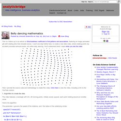
I went one step further here, to create a new data video, where rotating points (by accident) simulate sensual waves, not unlike belly dancing. You'll understand what I mean when you see the video. Here I provide the source code and methodology to create this video. Click here to view the video, including a link to the YouTube version. 1. The video features a rectangle with 20 x 20 moving points, initially evenly spaced, each point rotating around an invisible circle. Here's the algorithm: The parameter c governs the speed of the rotations, and r the radius of the underlying circles. open(OUT,">movie.txt"); print OUT "iter\tx\ty\tz\n";
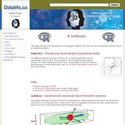
RStudio-Packages. Very Small Waves in R. R Software. This page provides brief descriptions of R packages related to my work on data visualization and the history of statistical graphics. heplots: Visualizing multivariate hypothesis tests The heplots package provides functions for visualizing hypothesis tests in multivariate linear models.
Traffic Simulation in R. This page is a simulation attempt to answer this riddle from FiveThirtyEight: There is a very long, straight highway with some number of cars (N) placed somewhere along it, randomly.
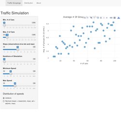
The highway is only one lane, so the cars can’t pass each other. Each car is going in the same direction, and each driver has a distinct positive speed at which she prefers to travel. Each preferred speed is chosen at random. Each driver travels at her preferred speed unless she gets stuck behind a slower car, in which case she remains stuck behind the slower car. In the simulation, N cars are created with random speeds between the minimum and maximun values chosen. This process is repeated I times, given the number of simulations selected. Interactive graphics were created using Plotly, and compiled into an interface using the Shiny framework.