
Labs & Teams. The Concordia Sensoria Research Team is located in the Department of Sociology and Anthropology on the downtown campus of Concordia University.
CONSERT was founded in 1988 by anthropologist David Howes, sociologist Anthony Synnott and cultural historian Constance Classen to provide a platform for exploring the social and cultural life of the senses – facets which are typically overlooked in conventional psychological approaches to the study of sense perception. The membership of the team changes with each project . There have been many projects, from an itinitial focus on aesthetics to a more recent focus on museums and display, and from multisensory marketing to immersive environments using digital. Redditors design worst volume sliders possible. Nine questions for HCI researchers in the making. Authors: Susanne Bødker, Kasper Hornbæk, Antti Oulasvirta, Stuart Reeves Let’s be honest: It’s hard to start a career in HCI research.
Working out what path to take is daunting. Our community is ever growing and ever diversifying. Interactive technologies change quickly and good research can be rapidly forgotten. At some point you might ask yourself: What should I study in HCI and how? This essay distills lessons learned in four workshops focusing on the question of what to study in HCI. But why bother a researcher in the making with even more questions? 1. The short-sighted selection of problems hampers the whole field. The selection of research problems should be done against longer-term, even career-level goals. The mechanics of interface design.
The user reconfigured: On subjectivities of information. Authors: Jeffrey Bardzell Interaction design researchers are increasingly focusing on the changing roles of the user.
By this we do not mean how technologies have changed people. Instead, we refer here to how interaction designers have deployed “the user” as a kind of rhetorical or discursive construct. In an earlier paper [1], which I summarize here, we argued that not only has the field’s rhetorical use of “the user” changed over the past 30 years, but also that interaction design as a field would benefit from a more reflective and deliberate deployment of both the concept and the term.
Origins of Common UI Symbols. Hat do Swedish campgrounds and overuse of the Apple logo have in common?
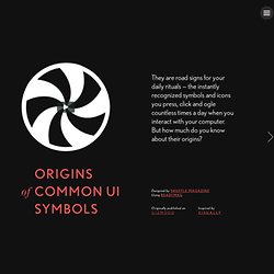
A lot, according to Andy Hertzfeld of the original Mac development team. While working with other team members to translate menu commands directly to the keyboard, Hertzfeld and his team decided to add a special function key. The idea was simple: When pressed in combination with other keys, this “Apple key” would select the corresponding menu command. Jobs hated it — or more precisely the symbol used to represent the button — which was yet another picture of the Apple logo. 19 common UX problems and how to fix them. The Complexity of Simplicity. Every project I've worked on in my 17-year career has had one thing in common.
At some point someone says, "It should be simple. " But what does "simple" actually mean? People can always tell when something is simple, uncomplicated, elegant, not overworked, or a number of other near-synonyms, but can rarely articulate why something is simple. Because simplicity is inherently subjective, achieving it pretty tricky. Fortunately, the discipline of experience design has emerged as a means to help the world realize its need for simplicity and what it takes to achieve it.
Ten Principles of Simplicity Here are ten principles that I've found helpful when trying to ensure something stays simple. 1. If someone goes to your product or website for a specific reason, make sure that you know the reason for their visit and the user can confirm they are in the right place, instantly. 2. 3. This is directly related to #2. 20 FREE ebooks for designing user experience / ux by keepitusable. Here are 20 free online ux books that will help designers to create a better user experience / ux and improved usability. 1 Mental Models in Human-Computer Interaction: Research Issues About What the User of Software Knows by John M.

Carroll and Judith Reitman Olson 2 HCI Models, Theories and Frameworks: Toward a Multi-disciplinary Science by John M. Carroll 3 Search User Interfaces by Marti A. 4 Designing Interfaces by Jenifer Tidwell (patterns only) 5 Designing Mobile Interfaces by Steven Hoober and Eric Berkman 6 Web Style Guide by Patrick J.
User Experience Project. Defining and Informing the Complex Field of User Experience (UX) Courses. Dark Patterns - User Interfaces Designed to Trick People. Design methods & tools. Associations. Usability. People. UX Myths. FatFonts. FatFonts is a graphical technique conceived and developed by Miguel Nacenta, Uta Hinrichs, and Sheelagh Carpendale.
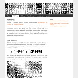
The FatFonts technique is based on a new type of numeric typeface designed for visualization purposes that bridge the gap between numeric and visual representations. FatFonts are based on Indo-arabic numerals but, unlike regular numeric typefaces, the amount of ink (dark pixels) used for each digit is proportional to its quantitative value. This enables accurate reading of the numerical data while preserving an overall visual context. How it works Fatfonts are designed so that the amount of dark pixels in a numeral character is proportional to the number it represents. This proportionality of ink is the main property of FatFonts. Multi-level Digits With the examples above you can only represent numbers from 0 (blank fatfont) to 9. The image above represents a 4-digit FatFont number 4,895. The number of the left shows you the circle that contains each FatFont digit.