
The Human Fabric of the Facebook Pyramid – SHARE LAB. In our previous research, we investigated different areas of the Facebook dispositif:[1] algorithmic and human labor, the digital infrastructure behind the social network, and the exploitation of personal information.
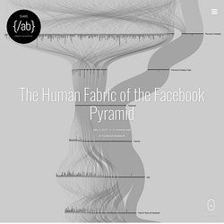
In this article, we will try to map some elements of Facebook’s human fabric, the social structure and the power relations within the company. We will investigate and reflect upon the phenomenon of Facebook in terms of the social networks of its employees. We will also consider the social relations between the members of Facebook’s management board and other spheres of society. This article is a contribution to the contemporary critique of the strong ties between political establishments and global business, i.e. that of the issue of the revolving door.[2] In short, we will deal with the phenomenon of digital capitalism.
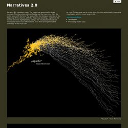
Figure 1: Dinner in the salle des spectacles at Versailles – Eugene Louis Lami Source : Wikigallery.org Figure 3: Facebook Management Graph – PDF Version. How the Circle Line rogue train was caught with data. Roads to Rome. Roads to Romes (US) Following this fact, we adjusted our routing to find the closest Rome to every location in the USA.
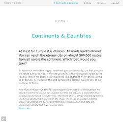
Each color represents routes leading to the closest Rome of this very starting point. Adjusting and coloring the routing to multiple destinations resulted in a very interesting territorial picture. Thus, every location is connected to the nearest Rome according to fastest travel time. Dataviz compilation Netherlands from Above II. Years You Have Left to Live, Probably. Momma always said dyin’ was a part of life.
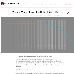
—Forrest Gump The life expectancy for the average woman in the United States is 81 years and 2 months. For men, it’s 76 years and 5 months. These are the most recent estimates from the Centers for Disease Control and Prevention. Just subtract your current age from those numbers for a rough estimate of how many years you have left. OECD Regional Well-Being. Why it matters There is a growing awareness that we must go beyond GDP and economic statistics to get a fuller understanding of how society is doing.
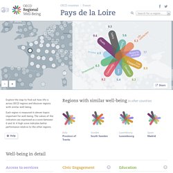
But it is also crucial to zoom in on how life is lived. Where you live has an impact on your quality of life, and in return, you contribute to making your community a better place. ON BROADWAY. Interaction design portfolio. Narrative 2.0 visualises music.
Visualizing MBTA Data. The Genealogy and History of Popular Music Genres. The Ekmans' Atlas of Emotions.
Every Noise at Once. Italian progressive metal deep symphonic black metal christian symphonic metal brazilian classical piano native american spiritual indonesian alternative rock romanian contemporary classical greek contemporary classical classic progressive house. Galileo's Followers. The Evolution of the Web. Analyse textuelle des « Misérables , ou comment conjuguer informatique et humanités.
Dans cet article, nous vous proposons une présentation, suivie d’une critique, de quelques visualisations des Misérables de Victor Hugo.
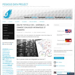
Qui n’a jamais croisé une infographie sur Internet ? Depuis la démocratisation de l’ordinateur personnel surpuissant, et avec la facilitation de l’accès à Internet, on voit maintenant fleurir les infographies diverses, sur les sites de médias comme de simples utilisateurs, avec des approches tantôt sérieuses, tantôt comiques, et à des degrés de pertinence variés. Un des objectifs des Digital Humanities – une “alliance de geeks et de poètes”, d’après le NYT – est de considérer les apports des méthodes numériques dans l’étude des sciences humaines et sociales. Et en particulier de faire cracher aux sources du passé ce qu’elles nous cachent encore. Le champ d’application est vaste, cette science est jeune, et les frontières se précisent un peu plus au fur et à mesure que le temps passe, mais sans être mêmes proches de délimitations précises. L’objet d’étude. Every Day of My Life. Apps Every Day of My Life is a visualization of my computer usage statistics from the last 2.5 years.
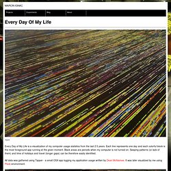
Each line represents one day and each colorful block is the most foreground app running at the given moment. Visualizing MBTA Data. Music Timeline. @comeetie : #Francepixels, carte données carroyées. Worldmapper: The world as you've never seen it before.
8 Great Examples of Complex Data Visualized. As we’ve noted before on this blog, visuals are a powerful way to convey messages, present information, and persuade audiences.
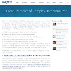
In a previous post we published titled, “6 Powerful Reasons Why Your Business Should Visualize Data,” we provided a handful of stats on the power of visuals. We think they are worth sharing again, so here they are: The brain can see images that last for just 13 milliseconds.Our eyes can register 36,000 visual messages per hour.We can get the sense of a visual scene in less than 1/10 of a second.90% of information transmitted to the brain is visual.Visuals are processed 60,000X faster in the brain than text. If you’re in the process of trying to build a story, persuade a group of people, or better understand your data, consider creating some sort of visual representation to guide your thoughts or the thoughts of others. Need a little inspiration? 1. 2. 3.