
Gregor Aisch – driven by data. Lexical Distance Among the Languages of Europe « Etymologikon™ Posted by Teresa Elms on 4 March 2008 This chart shows the lexical distance — that is, the degree of overall vocabulary divergence — among the major languages of Europe.
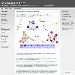
The size of each circle represents the number of speakers for that language. Circles of the same color belong to the same language group. All the groups except for Finno-Ugric (in yellow) are in turn members of the Indo-European language family. English is a member of the Germanic group (blue) within the Indo-European family. So why is English still considered a Germanic language? The original research data for the chart comes from K. ConnectedPRC. Data Visualization Network of Resources. School of Data - mapping company networks. (History) 7 Pioneers of Data Visualization. [Impressive Dataviz] Reshaping New York - Interactive Feature. Loading Celebrating the Waterfront New buildings constructed during Mr.
![[Impressive Dataviz] Reshaping New York - Interactive Feature](http://cdn.pearltrees.com/s/pic/th/reshaping-interactive-feature-64003139)
Bloomberg's tenure as mayor. Celebrating the Waterfront Mr. Brooklyn Bridge Park, 2006 Photo: Alex S. Brooklyn Bridge Park, 2013 Photo: Richard Perry/The New York Times Red Hook Container Terminal Sources: Heights of buildings built before 2010 from an analysis of lidar data by Professor Sean C. By Ford Fessenden, Tom Giratikanon, Josh Keller, Archie Tse, Tim Wallace, Derek Watkins, Jeremy White and Karen Yourish. [Impressive DataViz] BibViz Project - Bible Contradictions, Misogyny, Violence, Inaccuracies interactively visualized. [Expérience MIT] Immersion: a people-centric view of your email life. [Carto temps réel] Watch_Dogs WeAreData. [Carto temps réel] Geneva.
Sometimes bus riding can feel intimidating, but this visualization proves it: everybody's doing it.
![[Carto temps réel] Geneva](http://cdn.pearltrees.com/s/pic/th/geneva-dots-on-the-bus-55313472)
Pick a route off the map and watch a day in the life of the line. Buses speed by, passengers jumping on and off. Some lines are slow, some are hopping, and rush hour is often hilarious. Where's the data from? The Bay Area d3.js user group put out a call for entries for the Urban Prototyping's Urban Data Challenge. We found: Swiss cities have a much higher transit ridership and more vehicles on a line at a given time. Geeky details Cleaning up the data The raw data needed a lot of processing before we could make our pencil and paper sketch real. Visualizing the data From there, d3.js takes over. Clicking a new route on the map loads that route, and the day pulldown switches days, just as you'd expect. Many other awesome things we used. Thanks are in order: The map is the beautiful Pale Dawn map tiles, via CloudMade. We'd love to know what you thought! [Carto] TechList : carte des tech-influenceurs français.
[Carto] The Racial Dot Map: One Dot Per Person for the Entire U.S. Terms of Use Add Map Labels Remove Color-Coding Hide Overlays What am I looking at...?
![[Carto] The Racial Dot Map: One Dot Per Person for the Entire U.S.](http://cdn.pearltrees.com/s/pic/th/the-racial-dot-person-entire-63648641)
Tweet Share Dustin A. [Cartographie] La población argentina en una visualización interactiva. Por Pablo H.
![[Cartographie] La población argentina en una visualización interactiva](http://cdn.pearltrees.com/s/pic/th/visualizacion-interactiva-65577145)
Paladino* Cuando vi el desarrollo de LA NACION Data sobre el censo se me ocurrió que podría utilizar esa misma información, pero con un enfoque distinto. Lo primero que hice fue descargar los datos. El dataset contenía todos los indicadores del censo de 2001 y 2010 de nuestro país, agrupado por localidades. También conversé con Ariel Aizemberg, a quién conocí en OKFNAr. Me pregunté de qué manera podía mostrar los datos de un modo interesante para llegar a las personas que no necesariamente son periodistas, programadores o diseñadores.Entonces, me topé en Twitter con la siguiente imagen: En la zona amarilla, vive apenas el 2% de la población de Australia.
[Infographie] Avance del portal datos.gob.cl en 2013. [Infographie interactive] How Google Search Works ? [Infographie] L’intelligence économique en 5 points clés. L’intelligence économique est souvent considérée comme une notion floue, difficile à définir.
![[Infographie] L’intelligence économique en 5 points clés](http://cdn.pearltrees.com/s/pic/th/intelligence-infographie-52370097)
C’est pour cela que Jean Baptiste Mac Luckie, responsable du pôle pré-diagnostics à Cellie, a décidé de réaliser une infographie pour simplifier cette notion. Pour ce faire, son infographie présente 5 points importants afin de mieux comprendre l’intelligence économique : Définition de l’intelligence économique « L’intelligence économique peut être définie comme l’ensemble des actions coordonnées de recherche, de traitement et de distribution en vue de son exploitation, de l’information utile aux acteurs économiques ». (Rapport Martre, 1994) Le rapport Martre, dont cette définition est extraite, est considéré comme l’un des textes fondateurs de l’intelligence économique en France. Une notion, 4 dimensions De manière schématique, l’intelligence économique comporte quatre dimensions : – Veille – Knowledge Management – Protection des données – Influence.
[Infographie] L'art de manger des sushis. [Entreprise] TraceMedia - Visualisation & Mapping.