
Bootstrap Designer - Generate Bootstrap Templates at the speed of light! The Bootstrap Interface Builder. Divshot. Fitts's law. Fitts's law (often cited as Fitts' law) is a model of human movement primarily used in human–computer interaction and ergonomics that predicts that the time required to rapidly move to a target area is a function of the distance to the target and the size of the target.
Fitts's law is used to model the act of pointing, either by physically touching an object with a hand or finger, or virtually, by pointing to an object on a computer monitor using a pointing device. It was proposed by Paul Fitts in 1954. Model[edit] Fitts's law has been formulated mathematically in several different ways. Responsive Web Design. The English architect Christopher Wren once quipped that his chosen field “aims for Eternity,” and there’s something appealing about that formula: Unlike the web, which often feels like aiming for next week, architecture is a discipline very much defined by its permanence.
Article Continues Below A building’s foundation defines its footprint, which defines its frame, which shapes the facade. Each phase of the architectural process is more immutable, more unchanging than the last. Placeholder images from flickr - flickholdr.com. Stylus. Fluidity - A Modern CSS3 & HTML5 Framework for Node.js & Stylus. Working With Jeet: an Alternative Responsive Framework. Jeet is a lightweight, responsive framework which gets away from presentational classes, instead focusing on markup, style and semantics.
Let me illustrate how Jeet compares to more common framework alternatives (Bootstrap, for example), we'll go over the download and setup procedure, then cover some of its main features. Lastly, we'll demonstrate Jeet in a working environment by rebuilding a responsive prototype of Webdesigntuts+. CorySimmons/jeet. Ceaser - CSS Easing Animation Tool - Matthew Lein. CSS-Tricks.
Animatable: One property, two values, endless possiblities. Animate.css - a bunch of plug-and-play CSS animations. CSS3 Generator. CSS3 Please! The Cross-Browser CSS3 Rule Generator.
Can I use... Support tables for HTML5, CSS3, etc. Absolute, Relative, Fixed Positioning: How Do They Differ? Finsta left a question in the forums: I am fairly new to web design and I could never master the differences in positioning of elements.
I know there are absolute, fixed, and relative. Is there any others? Also do they majorly differ? And when should you use which? Short answer: Yes, there is one more, "static", which is the default. Medium answer: I'm not going to do a "long answer" because there is no need to rewrite what has been written many times before, but I will do a "medium answer" here were we can quickly run through each type. An important concept to understand first is that every single element on a web page is a block. Now that you are picturing every single page element as a block of pixels, we can talk about how positioning is used to get the blocks of pixels exactly where you want them to go.
Static. Share On. Learn CSS Positioning in Ten Steps: position static relative absolute float. 1. position:static The default positioning for all elements is position:static, which means the element is not positioned and occurs where it normally would in the document.
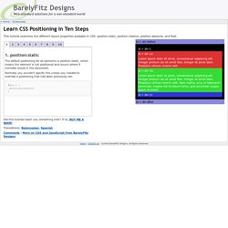
Normally you wouldn't specify this unless you needed to override a positioning that had been previously set. 2. position:relative If you specify position:relative, then you can use top or bottom, and left or right to move the element relative to where it would normally occur in the document. Let's move div-1 down 20 pixels, and to the left 40 pixels: Notice the space where div-1 normally would have been if we had not moved it: now it is an empty space. It appears that position:relative is not very useful, but it will perform an important task later in this tutorial. 3. position:absolute When you specify position:absolute, the element is removed from the document and placed exactly where you tell it to go. Let's move div-1a to the top right of the page: What I really want is to position div-1a relative to div-1.
Footnotes 10. 17,.67,.83,.67) ✿ cubic-bezier.com. 16 Best CSS3 Transitions And Animations Tutorials. CSS3 has changed many of the older techniques, and has made everything more sophisticated and easier.
It helps in making really advanced, effecting and eye-catching deigns for your website. CSS Transitions & Animations make the experience even better, with all the awesome effects. They help you make it even more interactive, beautiful and fun. Quick Tip: Practical CSS Shapes. A Web Designer's Guide to Font Replacement Methods. Fed-up with Arial?
Tired of Times New Roman? Font-replacement methods have improved dramatically over the past 2 years, but it can be often hard to sort out the different methods if you're not constantly reading about it.