
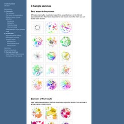
Windowslivewritervisualizingthepowerstruggleinwikipedia-f7c7wikivislowres74.jpg (1200×960) Graphical visualization of text similarities in essays in a book. Early stages in the process.
Gource - software version control visualization. Flame Graphs. MySQL Flame Graph Determining why CPUs are busy is a routine task for performance analysis, which often involves profiling stack traces. Profiling by sampling at a fixed rate is a coarse but effective way to see which code-paths are hot (busy on-CPU). It usually works by creating a timed interrupt that collects the current program counter, function address, or entire stack back trace, and translates these to something human readable when printing a summary report. A Beautiful Poster Packed With a Year of Global Weather Data. The Weather Radials poster is about as much meteorological data as you can cram onto a single sheet of paper.
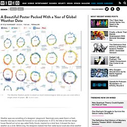
Raureif GmbH Each day of 2013 is represented by a single line. The bottom is the low temp; the top is the high. The color is dictated by the average. Blue circles represent precipitation. Reykjavik looks fairly miserable year round. Mumbai is always hot. Look at Sydney's spiky winter. Seattle's reputation as a rainy city bears out with its steady band of blue, from roughly September to May. 15 Stunning Examples of Data Visualization. 50 Great Examples of Data Visualization. Wrapping your brain around data online can be challenging, especially when dealing with huge volumes of information.

And trying to find related content can also be difficult, depending on what data you’re looking for. But data visualizations can make all of that much easier, allowing you to see the concepts that you’re learning about in a more interesting, and often more useful manner. Below are 50 of the best data visualizations and tools for creating your own visualizations out there, covering everything from Digg activity to network connectivity to what’s currently happening on Twitter. Music, Movies and Other Media Narratives 2.0 visualizes music. DataArt - Visualisations. Mapped historical photos from collections large and small. The Evolution of the Web. Top Colors of year 2010 – infographic. Visualizations - Jim Vallandingham. Sentence Drawings Stefanie Posavec is known for her manually curated and hand drawn visualizations that illuminate variations of structure and form in great works of literature.
In this remix, automation is used in place of thoughtful analysis to recreate a selection of her First Chapters, in which a layout technique she calls "sentence drawings" is used to display the first chapters of classic books. Implemented in D3. Automatic Sentence Drawings Track Tag Love An experiment that allows users to explore their most-listened to songs, and the tags associated with these songs.
Data Visualizations, Challenges, Community. Codeswarm - visualization of project repositories. 6 Great Data Viz Tools (Part 2) Welcome back for the second part of my series on interactive data visualization (dataviz) tools.
In Part 1, we covered three cool tools for visualizing charts and graphs and many other data types on a webpage. In part two, we take a look at three more tools that are a bit more complex but have some incredible data visualization capabilities. 4. Simile Exhibit Exhibit is a very robust and customizable offering. Visualization Types Supported: Line Graphs, Maps, Scatter Plots, Multi-Filterable Lists, Timelines, Timeplots and more…with widgets!
Flexible & Powerful Approach to Design I really like the approach of Exhibit, where data is presented through a “lens” – an HTML template shell that elements are placed into. 6 Great Data Viz Tools (Part 1) Websites are loaded with eye candy these days — from slick user interfaces to interactive maps to cool photo slideshows — all achieved without Flash, just HTML, CSS and Javascript.
And these technologies are free, open and can be utilized in essentially every current web-browsing device. While it’s tempting to just jump in and add the latest cool feature to your site, you have to first make sure it’s a good fit for your users and your brand. In this 2-part series, I’m going to focus on the rapidly changing world of interactive tools for data visualization, or dataviz. These tools are especially useful for nonprofits and financial organizations whose brands rely on sharing metrics to deliver impact and value. Recently, many exciting HTML/CSS/Javascript-based data visualization tools have emerged. In working with clients, we’ve researched and used numerous technologies for interactive charting. 1. jQuery Visualize 2. 3. Our friendly competitors / partners. I made this diagram a few months ago now (for VCs), that shows the world of online data collaboration and scraping from a ScraperWiki point of view.
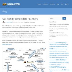
It shows the kind of companies and technologies that, if ScraperWiki were to not exist, people would use instead. Some are there because they do or will need to either provide or integrate with a ScraperWiki-like function. It’s often hard to tell competitors from partners at this stage in a new industry (data hubs). It isn’t meant to be complete, the lists of companies are just indicative. It also isn’t meant to be an overall industry overview – covering just the phrase “Big Data” would make it enormous! Given that, if you can think of significant omissions, or you can improve any of the details, please leave a comment! 50 Great Examples of Data Visualization. Mapping the Human ‘Diseasome’ - Interactive Graphic.