
How To Create Outstanding Modern Infographics. In this tutorial you will learn that data doesn't have to be boring, it can be beautiful!

Learn how to use various graph tools, illustration techniques and typography to make an accurate and inspiring infographic in Adobe Illustrator. Start by using the Rectangle Tool (M) to draw a shape. Give it a subtle radial gradient too. The entire design is based on a grid of four columns. To make the columns first select the rectangle and drag a guide onto the centre of the shape. Condense the shape so it fits within the left-most guide and centre guide. Move the shape over to the right and add another guide to the centre here. Using the Rectangle Tool (M) draw a thin white box on the centre line that will be the width of the gap between the columns.
Data Visualization Blog. Content alone does not make a great video; you need a great video design that make a visual statement combining design and data visualization to deliver a story.

Designers often get a little excited and put too much fancy design to fill in the space. The best content marketing brands are the ones that know how use content to drive conversions and pushing the boundaries. Keep in mind, quality = attention span. “Bosch Envision 360 VR” – Bosch Auto Parts The new Bosch Envision windshield wiper blade sharpens night visibility and offers extreme weather safety. Data Wrangler. UPDATE: The Stanford/Berkeley Wrangler research project is complete, and the software is no longer actively supported.
Instead, we have started a commercial venture, Trifacta. For the most recent version of the tool, see the free Trifacta Wrangler. Why wrangle? Too much time is spent manipulating data just to get analysis and visualization tools to read it. Wrangler is designed to accelerate this process: spend less time fighting with your data and more time learning from it.
10 Awesome Free Tools To Make Infographics. Advertisement Who can resist a colourful, thoughtful venn diagram anyway?

In terms of blogging success, infographics are far more likely to be shared than your average blog post. This means more eyeballs on your important information, more people rallying for your cause, more backlinks and more visits to your blog. In short, a quality infographic done well could be what your blog needs right now. Designing An Infographic Some great tips for designing infographics: Keep it simple! Ideas for infographic formats include: Timelines;Flow charts;Annotated maps;Graphs;Venn diagrams;Size comparisons;Showing familiar objects or similar size or value. Here are some great tutorials on infographic creation: 9 Powerful Free Infographic Tools To Create Your Own Infographics - DATA VISUALIZATION. World Federation of United Nations Associations. Infographics. Interactive Infographic: Your Daily Dose of Water (Scaling)
Community member, Kiss Me I'm Polish. GOOD + Gates Foundation. In the summer of 2010 the folks at GOOD magazine partnered up with the Bill & Melinda Gates Foundation on a collaborative campaign to bring attention to individuals and organizations working to bring about positive change in education, and global health & development.
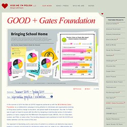
Kiss Me I’m Polish was brought on board to assist with the effort by designing a multi-faceted series of information graphics on topics ranging from the Millennium Development Goals (MDGS), the U.S. Education system, and Polio, to name a few. The resulting diagrams were published on both the GOOD and Gates websites over the course of the year.
Our approach in illustrating such a vast array of content in a cohesive yet distinctive way was to explore a common visual thread for all diagrams within each set, while in turn, differentiating the individual sets from one another. Art Direction + DesignInformation GraphicsIllustration. Malaria: The Drug Resistance Story. Drugs and Diagnostics The current treatment for malaria is artemisinin-based combination therapies (ACTs).
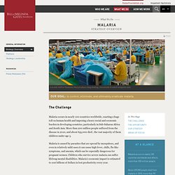
ACTs are effective and are well-tolerated by patients, but because of their high cost, patients often purchase cheaper, less-effective drugs, poor-quality drugs, or counterfeits, all of which can increase the risk that drug-resistant strains of malaria will emerge. Resistance has already been observed in Southeast Asia. Workshop. Infographic of the Day: A Strange, Brilliant Map Of The World's Population.
In the visual syntax of infographics and maps, bigger equals… well, bigger.
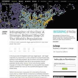
Large dots on a map or bars in a chart correspond to a proportionally large quantity of stuff being visualized--like, for instance, the number of people living in a certain geographic area. But its new visualization of world population density called "Dencity," Fathom turns this basic graphic language on its head. What if bigger dots on a map signified fewer people, sparsely scattered? As it turns out, this counterintuitive approach makes brilliant sense. Fathom, the information-visualization firm cofounded by Processing inventor Ben Fry, created "Dencity" in response to a somewhat ambivalent milestone: the world’s population surpassing 7 billion souls.
[Click to view larger] Conversely, huge patches of barely settled land--like Saharan Africa, northern Asia, and the Australian interior--don’t need that kind of detail to tell the same story. [Eastern China] Infographs. A visual exploration on mapping complex networks. Complex Diagrams. Why are Infographics Important. “infographics” on SlideShare. LLC - Portfolio. 20 Things That Happen Every Minute [Infographic]