
Cohere >>> make the connection. Untitled. Worldometers - real time world statistics. 50 Great Examples of Data Visualization. Wrapping your brain around data online can be challenging, especially when dealing with huge volumes of information.

And trying to find related content can also be difficult, depending on what data you’re looking for. But data visualizations can make all of that much easier, allowing you to see the concepts that you’re learning about in a more interesting, and often more useful manner. Below are 50 of the best data visualizations and tools for creating your own visualizations out there, covering everything from Digg activity to network connectivity to what’s currently happening on Twitter. Music, Movies and Other Media Narratives 2.0 visualizes music. Liveplasma is a music and movie visualization app that aims to help you discover other musicians or movies you might enjoy. Tuneglue is another music visualization service. MusicMap is similar to TuneGlue in its interface, but seems slightly more intuitive.
Newsmap. Update: Jan 20, 2012 My appologies for not updating this site lately.

Flipboard has been keeping me a little busy. I'll try to work something out here soon, but in the meantime, you might want to say hello on Twitter, browse through a few photos here or peek into what it is like designing Flipboard. marumushi.com the life and work of Marcos Weskamp Marcos Weskamp is a Design Engineer who has a deep interest in playing with and visualizing lots of data. In March 2010, Marcos joined a yet-to-be-named startup in Palo Alto, where he designs, sketches, codes, serves coffee, washes dishes and leads the User Experience vision of a product that's going to be so awesome, it's going to blow your pants off.
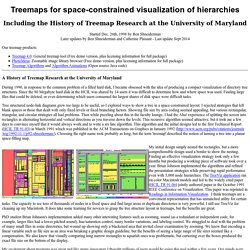
Marcos is based in Palo Alto, California, where right now it is Fri Jun 09, 10:17am and the weather is .contact: marcos@marumushi.com 404, Lalala, Document not found! Fresh From the Lab Latest News tags. Mapping Globalization. Treemaps for space-constrained visualization of hierarchies. Started Dec. 26th, 1998 by Later updates by Ben Shneiderman and Catherine Plaisant - Last update Sept 2014 Our treemap products: Treemap 4.0: General treemap tool (Free demo version, plus licensing information for full package) PhotoMesa: Zoomable image library browser (Free demo version, plus licensing information for full package) Treemap Algorithms and Algorithm Animations (Open source Java code) A History of Treemap Research at the During 1990, in response to the common problem of a filled hard disk, I became obsessed with the idea of producing a compact visualization of directory tree structures.

Since the 80 Megabyte hard disk in the HCIL was shared by 14 users it was difficult to determine how and where space was used. Tree structured node-link diagrams grew too large to be useful, so I explored ways to show a tree in a space-constrained layout. My initial design simply nested the rectangles, but a more comprehensible design used a border to show the nesting. Index. Puter Architecture: Fundamentals ... - Búsqueda de libros de Google. Future computing professionals must become familiar with historical computer architectures because many of the same or similar techniques are still being used and may persist well into the future.

Computer Architecture: Fundamentals and Principles of Computer Design discusses the fundamental principles of computer design and performance enhancement that have proven effective and demonstrates how current trends in architecture and implementation rely on these principles while expanding upon them or applying them in new ways. Rather than focusing on a particular type of machine, this textbook explains concepts and techniques via examples drawn from various architectures and implementations. When necessary, the author creates simplified examples that clearly explain architectural and implementation features used across many computing platforms.
Graphics Press LLC P.O.

Box 430 Cheshire, CT 06410 800 822-2454 Edward Tufte is a statistician and artist, and Professor Emeritus of Political Science, Statistics, and Computer Science at Yale University. He wrote, designed, and self-published 4 classic books on data visualization. The New York Times described ET as the "Leonardo da Vinci of data," and Bloomberg as the "Galileo of graphics. " He is now writing a book/film The Thinking Eye and constructing a 234-acre tree farm and sculpture park in northwest Connecticut, which will show his artworks and remain open space in perpetuity.
Topics covered in this one-day course include: A new, widely-adopted method for presentations: meetings are smarter, more effective, 20% shorter. Martin Graham's Page of Links. HCIL - Visualization. We believe that the future of user interfaces is in the direction of larger, information-abundant displays.

With such designs, the worrisome flood of information can be turned into a productive river of knowledge. Our experience during the past eight years has been that visual query formulation and visual display of results can be combined with the successful strategies of direct manipulation. Human perceptual skills are are quite remarkable and largely underutilized in current information and computing systems. A visual exploration on mapping complex networks.