

A non-responsive approach to building cross-device webapps. Media queries are great, but...
Media queries are awesome, a godsend for website developers that want to make small tweaks to their stylesheets to give a better experience for users on devices of various sizes. Media queries essentially let you customize the CSS of your site depending on screen size. Before you dive into this article, learn more about responsive design and check out some fine examples of media queries usage here: mediaqueri.es.
As Brad Frost points out in an earlier article, changing the look is only one of many things to consider when building for the mobile web. If the only thing you do when you build your mobile website is customize your layout with media queries, then we have the following situation: Webapps need more than media queries Don't get me wrong. As the UIs you build increase in complexity, and you gravitate toward single-page webapps, you’ll want to do more to customize UIs for each type of device.
What device classes are you targeting? A potential solution. Cool Kitten: A parallax scrolling responsive framework. Jalxob.com Buy this domain The owner of jalxob.com is offering it for sale for an asking price of 600 USD!

Related Searches This webpage was generated by the domain owner using Sedo Domain Parking. Disclaimer: Sedo maintains no relationship with third party advertisers. Responsive Website Design SEOTA Frisco, TX serving USA. Mobile and Responsive Website Design Raleigh, NC. Mobile and Responsive Website Design from Coalmarch.
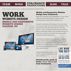
Responsive web design is device independent web design, which means your website will be built for a variety of devices including desktops, laptops, iPads, smartphones, etc. Internet browsing habits are continuing to evolve, this means more and more people are browsing websites differently. From sitting on their couch with a tablet while they watch their favorite t.v. show to Googling something on their smartphone while at a traffic light- people use the web differently than even 5 years ago. Responsive Website Design. What is Responsive Website Design?
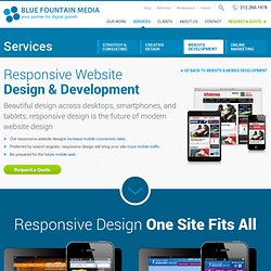
A responsive website is a single website that adapts to the device of each unique visitor, whether desktop, smartphone, or tablet. A responsive website dynamically re-sizes its content and imagery for a variety of different screen sizes in order to ensure the website is effective and easy to use on any device. Beginner’s Guide to Responsive Web Design. Whether you’re a beginner or a seasoned web professional, creating responsive designs can be confusing at first, mostly because of the radical change in thinking that’s required.
As time goes on, responsive web design is drifting away from the pool of passing fads and rapidly entering the realm of standard practice. In fact, the magnitude of this paradigm shift feels as fundamental as the transition from table based layouts to CSS. Simply put, this is a very different way of designing websites and it represents the future. Responsive Website Design for Hotels - Is It Your Only Option? - By William Bellis III, Senior Corporate Marketing Manager, Vizergy. It’s more about reaching targeted travel shoppers online with the right content in the right format than it is about responsive web design for hotels.
And in most cases, the combination of a traditional and mobile website is just as productive as responsive design. What is responsive design? Let’s leave the technical lingo to IT for now. In fact, even moving forward, you should leave the technical side of design to your digital marketing partner. Responsive Website Design, Get Responsive web design - 1 website auto compatible to all possible devices, PC, mobiles & tablets. COMPARE MOBILE WEBSITE Vs RESPONSIVE WEBSITE Do you know its been projected that there will be more mobile/tablet users by end of 2013 than the PC users in Australia?

We can help your business build a website which is truely compatible to each and every device. A Few OF our Responsive Design Projects With responsive design websites will be compatible with PCs, mobile phones and tablets keeping the single source for the content. If you want to see this in action then you can check above or our website on different devices and you will see that the website will adjusts itself according to the device. 60 Examples of Responsive Website Design. The digital age is here to stay, and we must adapt in order to compete.
The growth of smart-phones, tablets(let’s be honest, iPad), and netbooks is increasing every year. While moving into the so called “post-PC era,” the job of a modern web designer is getting tad more difficult. Currently, Responsive Website Design is the talk of the neighborhood. Designers and developers are pushing the boundarie every single day. Meanwhile seamless cloud storage is right around the corner. HTML5 - Responsive Web Design. It all started with Responsive Web Design, an article by Ethan Marcotte on A List Apart.
Essentially, the article proposed addressing the ever-changing landscape of devices, browsers, screen sizes and orientations by creating flexible, fluid and adaptive Web sites. Instead of responding to today’s needs for a desktop Web version adapted to the most common screen resolution, along with a particular mobile version (often specific to a single mobile device), the idea is to approach the issue the other way around: use flexible and fluid layouts that adapt to almost any screen. Core Concepts. Perfect Full Page Background Image. Learn Development at Frontend Masters This post was originally published on August 21, 2009 and is now updated as it has been entirely revised.
Both original methods are removed and now replaced by four new methods. The goal here is a background image on a website that covers the entire browser window at all times. Let’s put some specifics on it: Fills entire page with image, no white spaceScales image as neededRetains image proportions (aspect ratio)Image is centered on pageDoes not cause scrollbarsAs cross-browser compatible as possibleIsn’t some fancy shenanigans like Flash Image above credited to this site.
Awesome, Easy, Progressive CSS3 Way We can do this purely through CSS thanks to the background-size property now in CSS3. Find that tricky breakpoint. Dive into Responsive Prototyping with Foundation. There are hundreds of devices out there right now that can access the full web, as Steve Jobs once put it. These devices come with different capabilities and constraints, things like input style or screen size, resolution, and form.
With all these devices set to overtake traditional computers for web traffic next year we need tools to help us build responsively for these devices. There are many tools to accelerate front-end design, such as Blueprint or 960.gs, but, until recently, the tools for responsive design—design and implementation that accounts for all these different devices and capabilities—were few and far between. There’s Andy Clarke and Keith Clarke’s 320 and Up, and Columnal, a responsive grid system. Recently, Twitter Bootstrap went responsive. Today, we’ll take a look at how you can dive into responsive design using Foundation, a light front-end framework that helps you rapidly build prototypes and production sites.
A “light” framework#section1. Adaptive Images. Limitations I think this is one of the most flexible, future-proof, retro-fittable, and easy to use solutions available today. But, there are problems with this approach as there are with all of the one’s I’ve seen so far. In the case of Adaptive Images they are these: This is a PHP solution. I wish I was smarter and knew some fancy modern languages the cool kids discuss at parties, but I don’t. Fixed vs. Fluid vs. Elastic Layout: What's The Right One For You? Advertisement The problem has boggled the minds of Web designers for years: fixed, fluid, elastic or a hybrid layout design? Each option has its benefits and disadvantages. But the final decision depends so much on usability that it is not one to be made lightly.
A simple set of templates for any project. Responsive Design with CSS3 Media Queries. Screen resolution nowsaday ranges from 320px (iPhone) to 2560px (large monitor) or even higher. Users no longer just browse the web with desktop computers. Users now use mobile phones, small notebooks, tablet devices such as iPad or Playbook to access the web. So the traditional fixed width design doesn't work any more. Web design needs to be adaptive. The layout needs to be automatically adjusted to fit all display resolution and devices. Images - Stop wordpress from hardcoding img width and height attributes.
Remove IMG height and width with jQuery « WP Wizard. Responsive Web Design How-To, Useful frameworks, Showcase. Introduction. Responsive Design: Progressive Enhancement, Part Deux! 20 Useful Tools for Responsive Web Design. Nowadays people are dependent on Internet. They’re using laptops, netbooks, tablets, smartphones and even TVs to surf Internet. These devices have different screens and resolutions and it can be really hard to create website which works properly on all of these devices. But there is a solution. Frameless. How to make WordPress Themes Responsive. Responsive Websites become a must in 2012. This tutorial demonstrates how to make your WordPress Theme Responsive. Design Lunatic. Responsive Navigation Patterns. Update: I’ve also written about complex navigation patterns for responsive design.
Top and left navigations are typical on large screens, but lack of screen real estate on small screens makes for an interesting challenge. 8 Responsive jQuery Slider Plugins. Whether you’re already a pro at creating responsive web sites or your just learning what it’s all about, it’s good to have some scripts handy that you can easily integrate into your site. We all know how popular image and content sliders are now, and for good reason. Create a Responsive Slider Plugin With FlexSlider for WordPress. Sliders seem to be all the rage these days, and for good reason! You can add photos, content, videos, and more to an eye-catching, animated area of your website. While there is a wealth of slider plugins out there (my current favorite is the one for Nivo Slider), there is not one for FlexSlider, a slider that has keyboard shortcuts and works with swipe on touch screens. In this tutorial, we'll create that plugin! Step 1 Plugin Setup The first thing we need to do is set up the plugin.
Responsive web design. If you’ve been working in the web design field for the past couple of years you should know that designing a fixed interface for a widescreen computer is not enough. Making Wordpress images responsive - Blissful Interfaces. Method 1: The CSS Add the following code to your CSS file. That will make the images scalable according to screen size.
Beating Borders: The Bane of Responsive Layout. 用 jQuery Preload 預先載入圖片. 一個幫助你預先載入圖片的 jQuery 插件 說明. Responsive & Adaptive Web Design. Responsive Web Design Techniques, Tools and Design Strategies - Smashing Magazine. Skeleton: Beautiful Boilerplate for Responsive, Mobile-Friendly Development. Amazium - The responsive web framework..! Responsive Web Design. 開發行動版網頁遇到的挑戰. 11 Reasons why responsive web design isn't that cool! Responsive Web Design: What It Is and How To Use It - Smashing Coding.