background preloader

Visual literacy

Facebook Twitter

40 Useful and Creative Infographics. Six Revisions Menu Main Categories CSS HTML JavaScript Web Design WordPress Web Development Design Inspiration UX Design UI Design Freebies Tutorials Tools Links About Contact Advertise RSS Twitter Facebook 40 Useful and Creative Infographics By Jacob Gube Information graphics (or infographics) are graphical depictions of data and information. In this collection, you’ll find forty beautiful and educational infographics, displaying the uncommon spectacle of "art meets science". 1. The proportion of ingredients for popular coffee drinks and their pronunciation keys. 2. This infographic showcases the history of the Swine Flu, starting from 1976. 3. 4. 5.

The top breweries and beers in the U.S. 6. 7. 389 Years Ago A rundown of the historic events in African-American culture. 8. 9. 10. 11. An illustrated guide at how the Global Warming phenomenon works. 13. A packed visual piece on tobacco chemicals and tobacco trade worldwide. 14. 15. 16. A graphical representation of consumer spending across the globe. 17. 37 Data-ish Blogs You Should Know About. You might not know it, but there are actually a ton of data and visualization blogs out there.

I'm a bit of a feed addict subscribing to just about anything with a chart or a mention of statistics on it (and naturally have to do some feed-cleaning every now and then). In a follow up to my short list last year, here are the data-ish blogs, some old and some new, that continue to post interesting stuff. Data and Statistics By the Numbers - Column from The New York Times visual Op-ed columnist, Charles Blow, who also used to be NYT's graphics director.Data Mining - Matthew Hurst, scientist at Microsoft's MSN, also the co-creator of BlogPulse.Statistical Modeling - We might disagree on certain things, but Andrew's blog is one of the few active pure statistics blogs.The Numbers Guy - Data-minded reporting from Carl Bialik of the Wall Street Journal.Basketball Geek - Like statistical analysis and basketball? Statistical/Analytical Visualization Maps Design & Infographics Others Worth Noting. 
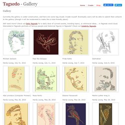
How to Choose the Best Chart for Your Data. Gallery.

Michael Jackson Hardy Leung, July 31, 2010 Paul the Octopus Hardy Leung, July 11, 2010 Frida Kahlo Hardy Leung, July 7, 2010 Dalmatian Hardy Leung, June 8, 2010 Ada Lovelace (Computer Pioneer) Hardy Leung, May 26, 2010 Rosa Parks Hardy Leung, May 26, 2010 Eleanor Roosevelt Hardy Leung, May 26, 2010 Martin Luther King Jr. Country Populations Hardy Leung, April 1, 2010. Visuwords™ online graphical dictionary and thesaurus.