
Tripline. Tuto : Créer des cartes personnalisées (polygones) avec Tableau Public – joel matriche. Alors que Google Fusion tables et CartoDB créent facilement des cartes choroplèthes à partir, respectivement, de fichiers kml ou shp, Tableau Public ne fait pas montre de la même souplesse.
Mais on peut facilement y remédier. Explication et démonstration avec les 589 communes belges. En texte, images et vidéo. Une carte choroplèthe, c’est un nom compliqué pour désigner une représentation géographique que tout le monde connaît : des territoires (pays, régions, communes, départements…) sont colorés ou remplis d’un motif en fonction d’une mesure statistique (densité de la population, revenus, résultats électoraux…) @joelmatriche » Le blog de jo. L'objectif : produire des cartes (dans un premier temps, non dynamiques) originales, qui changent des traditionnels plans de rues ou vues satellites.
A cet effet, je me suis inspiré des très réussis plans de villes diffusés chaque semaine par M Le Mag, le supplément hebdomadaire du Monde. Il ne s'agit pas de vouloir reproduire au pixel près les cartes de M Le Mag mais de s'en inspirer avec le plus de fidélité en ne se servant, pour l'essentiel, que d'outils cartographiques gratuits.
Lorsque le processus a été compris, de nombreuses variantes sont bien sûr possibles et souhaitées, la voie est libre pour des cartes sur mesure. Attention au fait que dans cette première étape, la carte est statique, elle est délivrée sous la forme d'un fichier jpeg. Florent Daudens — Cartographier rapidement des photos prises avec un... Cartographier rapidement des photos prises avec un téléphone Vous avez pris plein de photos avec votre iPhone, Samsung ou autre appareil et voulez les mettre sur une carte qui puisse être intégrée sur votre site ensuite?
Il y a plusieurs options, notamment avec Picasa, mais qui permettent peu de personnalisation. Alors on va se tourner naturellement vers du script et Leaflet. What Country has the Most Unsustainable Debt? (hint: not Greece) Créer une carte. How to build an interactive choropleth map with barely any code. Patrick Garvin, a designer and graphic artist with The Boston Globe, has built a handy web application called Mr.
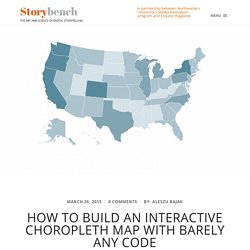
Map Generator to build interactive maps of the United States. You supply the data you want to visualize and Garvin allows you to customize how the states are shaded and how many shades you want to use. You can preview your map and then copy and paste the simple Javascript into a set of files he provides. Upload to your website and voilá: an interactive choropleth map of the United States: Tweet to Map - A Twitter to Google Maps jQuery Plugin. StoryMap JS - Telling stories with maps.
Data Visualization. STORYMAPPING. Cinemacity. LocalFocus: Datajournalistiek platform voor nieuwsredacties. Google maps tutorial (part 5/5): How to create Fusion Tables heat map. Tutorial goals: understand the ideas behind Google Fusion Tables heat maps; create an interactive map showing state-by-state U.S. population, as shown in the sample below.
(This post is part five of a 5-part tutorial on creating Fusion Tables intensity map; the other parts are listed as related posts at end of this post) How Fusion Tables works to create heat maps It is essential that you understand the idea and the steps in creating a Fusion Tables map; otherwise, you will easily get lost when working on the demo map in this tutorial. In its simplest form, a Fusion Tables map is a fusion, or merger, of two tables. In the U.S. population example, I have two tables: one contains state-by-state population numbers, the other one contains geographic information of each state (i.e., shape and boundary). The typical workflow is that you manage to get hold of two tables, upload them to Fusion Tables, merge the two tables, visualized the new table on a map, style the map, then share it.
Step 1. Videos, articles, and tips to help you succeed, from the world's leading experts. Find out where you are on the Cyberthreat map / Узнай, где сейчас кипит кибервойна. Maperitive. Using IFTTT and Google Drive to create a JSON API by Nick Moreton on CodePen. JSON APIs are a pretty powerful way of connecting your frontend app to a dataset through Javascript.
Most of the big web apps provide their API in JSON format (Facebook, Twitter, Instagram) however, as you may know if you've ever tried to use these, they often require an OAuth login in order to access the API. This obviously isn't ideal if you don't want your users to have to log in to their Twitter/Facebook/Instagram account every time they view your app or website! Well, I've found a little bit of a workaround that may get you working with data in your front end without having to worry about stuff like OAuth. A few months back I needed to deliver a Designing With Data class and began experimenting with JQuery and JSON APIs. Mapping murder throughout the world. Comparing murder rates of countries can really highlight the countries with problems - the ones in seriously need attention.
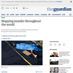
A high murder rate gives a "tip off" that something needs to change. The UNODC have collected together all the national data on homicide for 207 countries. But of course nothing is ever simple when bringing together national statistics. Countries have different definitions of murder and the data is collected at different times and using different methods. Scorecard.inrix.com/scorecard/default.asp. Charted. 9 free mapping tools and resources for visual storytelling. The resources available for working with data and visualising it have become more numerous and more accessible in recent years.
"We find ourselves in this perfect storm where suddenly journalists, everybody, is paying attention to data and the ability to collect data and create new data," Vizzuality's Andrew Hill told Journalism.co.uk earlier this year. Vizzuality created open source mapping tool CartoDB, and the team also set up "the map academy" where journalists can access free resources to learn more about online mapping.
Mapping can be a powerful storytelling tool, which journalists can use to take their audience on a journey following a narrative storyline, or to illustrate and make sense of fast moving breaking news events. Here is a list of 11 mapping tools reporters can use to add an extra dimension to their reporting and to build a more immersive experience for readers. EarthExplorer. Odyssey.js. Dotspotting - Welcome! Fichiers kml, shp, excel et autres pour vous aider dans la réalisation de vos cartes. Tripline. My Maps.
UX Patterns for Maps. Story Maps. OpenStreetMap. uMap. The Gulf/2000 Project - SIPA - COLUMBIA UNIVERSITY. Maps and Statistics Collections All maps and their accompanying texts that are hosted by this Gulf/2000 web site are original, authored and produced by Dr.
Michael Izady who retains exclusive copyright to them all. They are frequently upgraded by him as well as new ones being posted. These maps may be used for personal use by noting the origin as Dr. Izady (as the author) and Gulf/2000 (as the host). Let us look at the map, for maps, like faces, are the signature of history. Will Durant New Postings Ethnographic and Cultural Economy, Natural Resources and Environment Clarence Strait, Strait of Hormuz and Qeshm Island Ecosystem Small | Large Persian Gulf, Morphology and Bathymetry Small | Large Oil and Gas Deposits in the Persian Gulf and the Caspian Sea Basins in 2014 Small | Large Historical Military and Strategic. METRO MAP CREATOR. Carte chloropethe communes belges - Google Fusion Tables. Maptimize New Release. Home - TimeMapper - Make Timelines and TimeMaps fast! - from the Open Knowledge Foundation Labs.
GeoFlow Takes Data for a 3-D Drive. In November, during the SharePoint Conference 2012, attendees received a Public Preview of project codename “GeoFlow” for Excel, the latest business-intelligence (BI) functionality to be integrated with Microsoft Excel 2013 later this year.
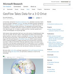
As an Excel add-in, GeoFlow provides interactive, 3-D geospatial and temporal data visualizations. Snazzy Maps - Free Styles for Google Maps. Précis de visualisation de données: Google Fusion Tables et CartoDB - Carnets de vie. Kartograph.org. Polymaps - Population Density. Create beautiful dynamic data driven maps. MapBox. Google Maps.