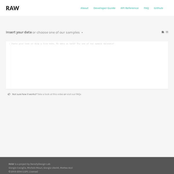


http://app.raw.densitydesign.org/
Related: Business Information DesignCSV To JSON Converter Convert CSV to JSON Use the tool on this page to convert CSV data to JSON From CSV/Excel To CSV/Excel Data Tools Tutorials · mbostock/d3 Wiki Wiki ▸ Tutorials Please feel free to add links to your work!! Tutorials may not be up-to-date with the latest version 4.0 of D3; consider reading them alongside the latest release notes, the 4.0 summary, and the 4.0 changes. Introductions & Core Concepts Chartist - Simple responsive charts You may think that this is just yet an other charting library. But Chartist.js is the product of a community that was disappointed about the abilities provided by other charting libraries. Of course there are hundreds of other great charting libraries but after using them there were always tweaks you would have wished for that were not included.
Debategraph The Views menu lets you toggle between different visualizations of the map or parts of the map – with each type of view having specific strengths and uses. You can also vary the behavior of each View type using the Options menu. The Bubble views let you browse quickly and dynamically through the structure of a map, and are designed to help you develop an initial feel for the content of the map and of the web of relationships between clusters of connected maps. Folium: Python Data. Leaflet.js Maps. — Folium 0.1.2 documentation Folium builds on the data wrangling strengths of the Python ecosystem and the mapping strengths of the Leaflet.js library. Manipulate your data in Python, then visualize it in on a Leaflet map via Folium. Concept Folium makes it easy to visualize data that’s been manipulated in Python on an interactive Leaflet map.
Visualization of Relationship Data Before uploading a data file, check the samples gallery to make sure that your data format is compatible. Your file must be plain text. Your data values must be non-negative integers. Introducing the Data Visualization Checklist This post has been a long time coming. Ann Emery and I knew some time ago that evaluators and social scientists had a thirst for better graphs, a clear understanding of why better graphs were necessary, but they lacked efficient guidance on how, exactly, to make a graph better. Introducing the Data Visualization Checklist. Download this checklist and refer to it when you are constructing your next data visualization so that what you produce rocks worlds. Method: Data visualization with D3.js and python - part 1 - Next Genetics View the demo hereHTML source is at the bottom of the post Computers and the internet have changed academia in dramatic ways from greater sharing of data to a larger sense of community. Science journals are now all digitized and available online either through your web browser or downloadble as a .pdf. Even with all the technology available for presenting data, most published papers still only contain static figures. I am not undervaluing the importance of having nicely formatted figures and graphs. But I do want to show how data can be presented with all the tools available now.
GoJS Diagrams for JavaScript and HTML, by Northwoods Software GoJS is a JavaScript and TypeScript library for building interactive diagrams and graphs. GoJS allows you to build all kinds of diagrams and graphs for your users, from simple flowcharts and org charts to highly-specific industrial diagrams, SCADA and BPMN diagrams, medical diagrams like genograms, and more. GoJS makes constructing JavaScript diagrams of complex nodes, links, and groups easy with customizable templates and layouts. GoJS offers many advanced features for user interactivity such as drag-and-drop, copy-and-paste, in-place text editing, tooltips, context menus, automatic layouts, templates, data binding and models, transactional state and undo management, palettes, overviews, event handlers, commands, and an extensible tool system for custom operations. We maintain hundreds of sample diagrams, detailing different examples of interactivity, templates, and user logic for you to start from.
Give Mockup presentations on your iPad/iPhone with Link Viewer – Mockups Product Blog – Balsamiq Hello Balsamiq friends! Today we asked Eileen and Max of Link Viewer to write up a blog post introducing their app for testing iOS Mockups. Enjoy! Understanding Data Visualisations - Seeing Data Home » Understanding Data Visualisations This resource aims to help people make sense of data visualisations. It’s for the general public – people who are interested in visualisations, but are not experts in this subject. Each section tells you something different, and it attempts to build your confidence and skills in making sense of data visualisations. You can work through the sections in any order you like.
Gallery · mbostock/d3 Wiki Wiki ▸ Gallery Welcome to the D3 gallery! More examples are available for forking on Observable; see D3’s profile and the visualization collection. Please share your work on Observable, or tweet us a link! Visual Index Mobile BI Design Framework: The Use of Colors - The Decision Factor Blog In mobile business intelligence (BI) design, the use of colors plays an important role because colors are some of the easier components to incorporate into our mobile assets. However, this ease of use often leads to misuse and, subsequently, ineffective design of our mobile solutions. I often find that the oversight happens not because we lack the knowledge or technical capability, but because we make the wrong assumptions.